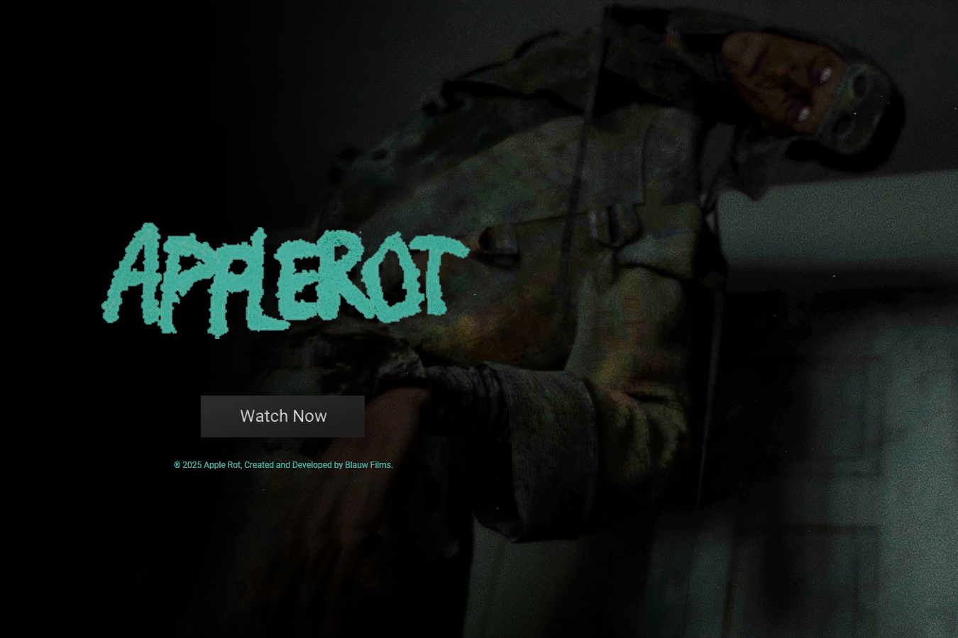
How We Created Apple Rot
A 3D Animated Transcendental Horror Film
Blauw Films
April 7, 2026


Case Study Breakdown
This case study is a complete breakdown of the production of Apple Rot, a transcendental 3D animated horror short film. It covers the full pipeline including:
Creative Vision & Concept Development
Screenwriting & Storyboarding
Character & Environment Design
Technical Pipeline & Resource Development
Production & Rendering
Post-Production & Sound Design
Throughout the sections there are links to dedicated articles that explore specific aspects of the production in greater detail.
Overview
The idea to create Apple Rot came to us in early 2022. It was clear that this was going to be an exploration of Transcendental Style in horror cinema. The aim was to create a short film that blended psychological tension with dreamlike pacing and minimalist quietness. However, it wasn’t until the summer of 2025 that the right conditions aligned: time, team and strategic partners.
The three years of passive pre-production proved absolutely invaluable. It allowed us to refine the concept, visual language and how we were going to approach the production with complete clarity. Once production was greenlit, the film was completed in approximately 3 to 4 months.
This high leverage execution was only possible because every major creative and technical decision had already been explored, tested and aligned within the team in advance.
Key Insights
Apple Rot was developed over 3 years and produced in 3–4 months
Built using a lean, multi-software 3D production pipeline
Relied heavily on custom resources and real-world textures
Created on limited hardware and scaled through cloud rendering
Distributed through a direct-to-consumer ecosystem
Supported by industry partners including RebusFarm and Chaos Group
The Creative Vision
Ideas are unapologetic. They arrive without preparing you for it. Often at the most unexpected moments. And once they do, they change you. They stay with you until you find a way to express them.
The idea for Apple Rot came during the research and development phase of our science-fiction film Syntactic Labyrinths. And it didn’t come from a brainstorming session or a structured concept phase. It came from an awful dream.
During a holiday in Salvador, Brazil, I found myself in a state of physical exhaustion and underlying anxiety. We had just moved out of our apartment in Amsterdam without a clear next step. Financial pressure was quietly building in the background. It was the perfect cocktail for a deep, dark sleep.
Several hours later I felt my body waking up. But I couldn’t move. It wasn’t unfamiliar. It was sleep paralysis. But this time, something was different…
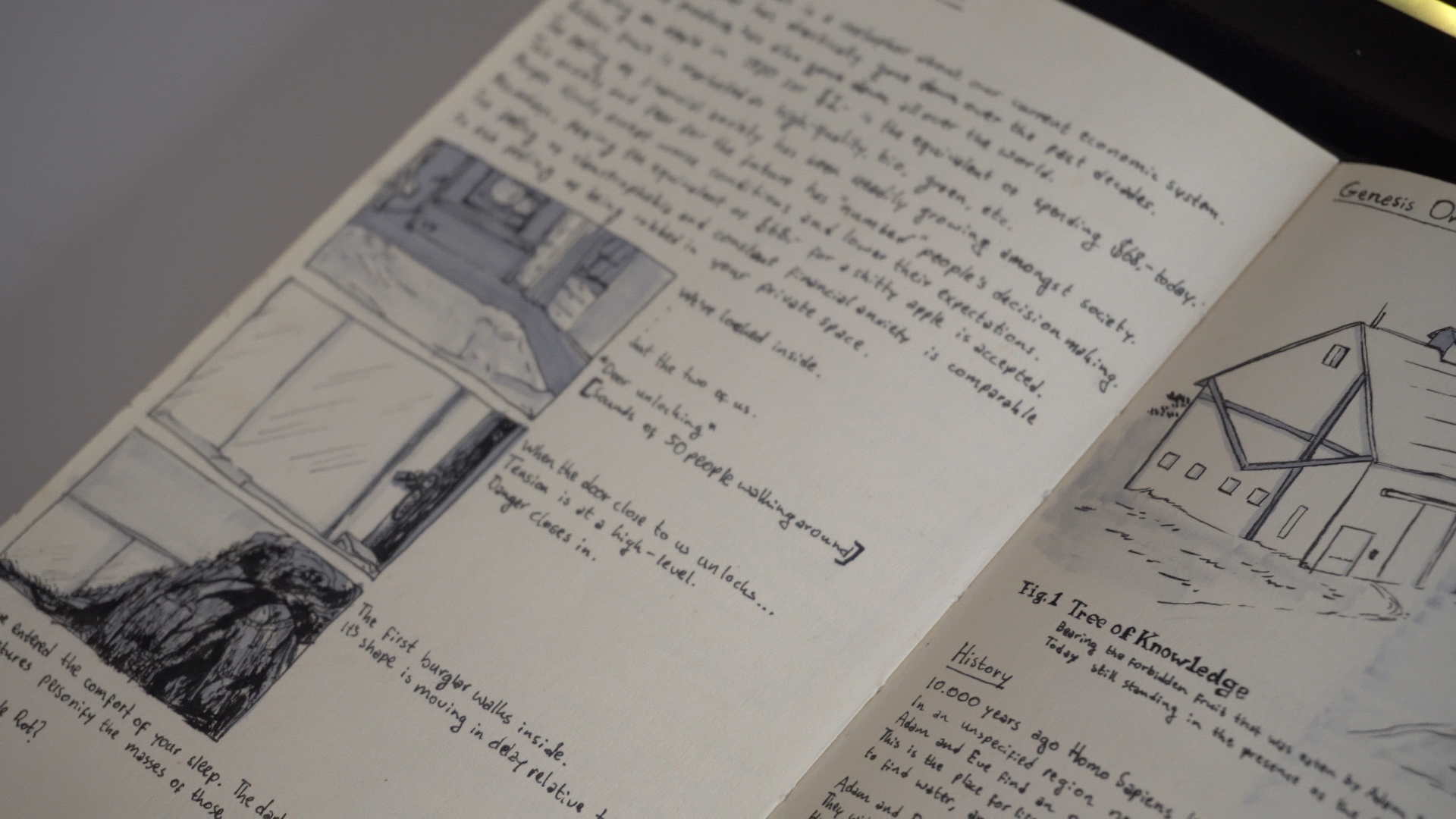
I heard the front door unlock. A rush of blood made my body fill with adrenaline. But I couldn’t move. Even though part of me understood it might be a dream, the situation felt entirely real. People had entered the apartment.
Slowly I heard footsteps approaching. Charlotte was lying next to me. Which only made me more worried about what could happen. Then the bedroom door opened.
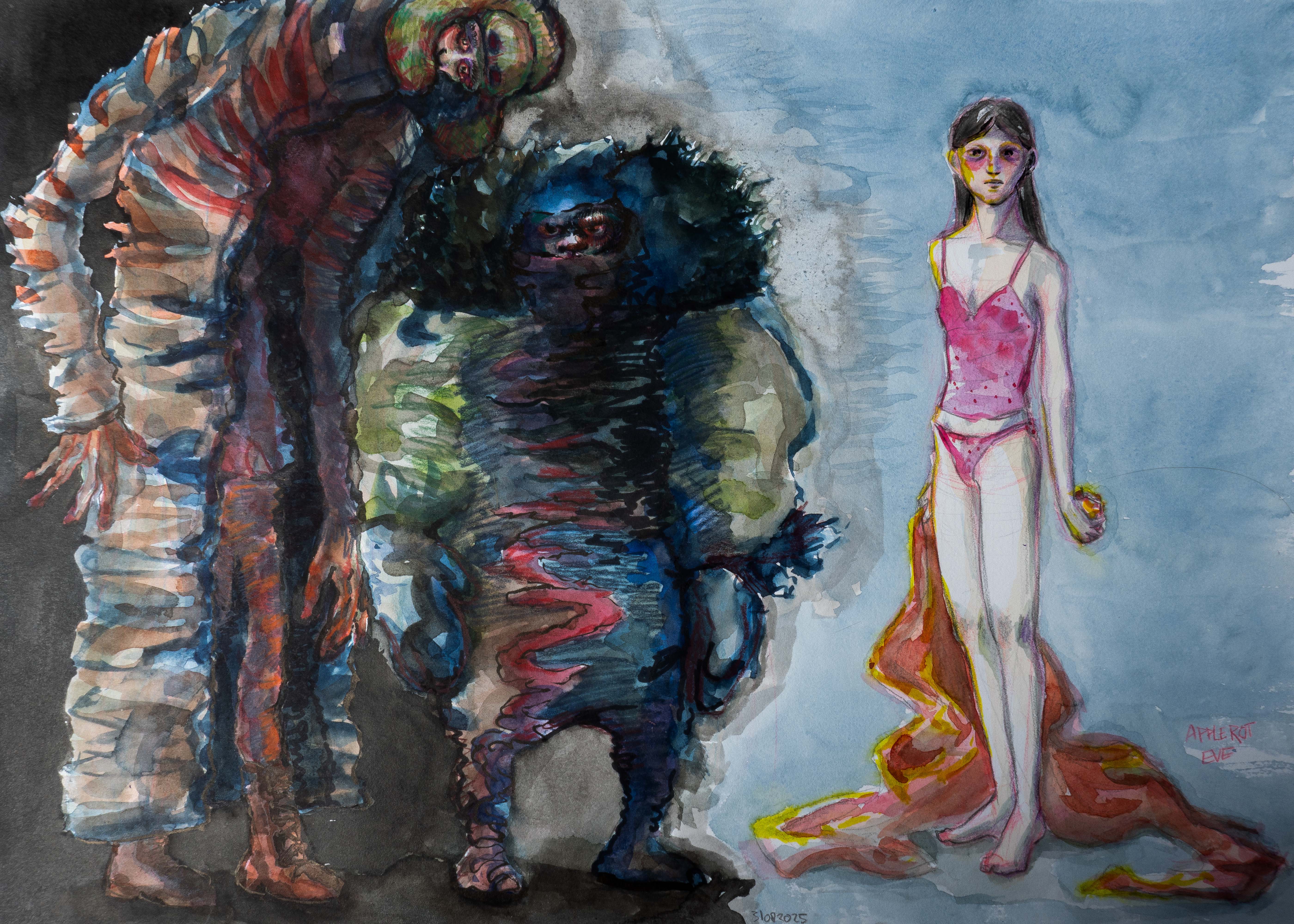
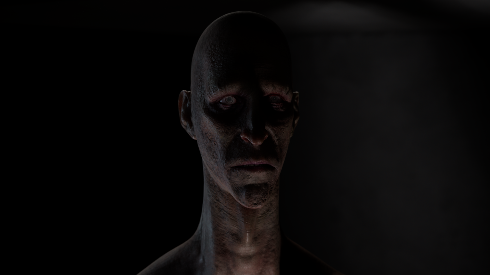
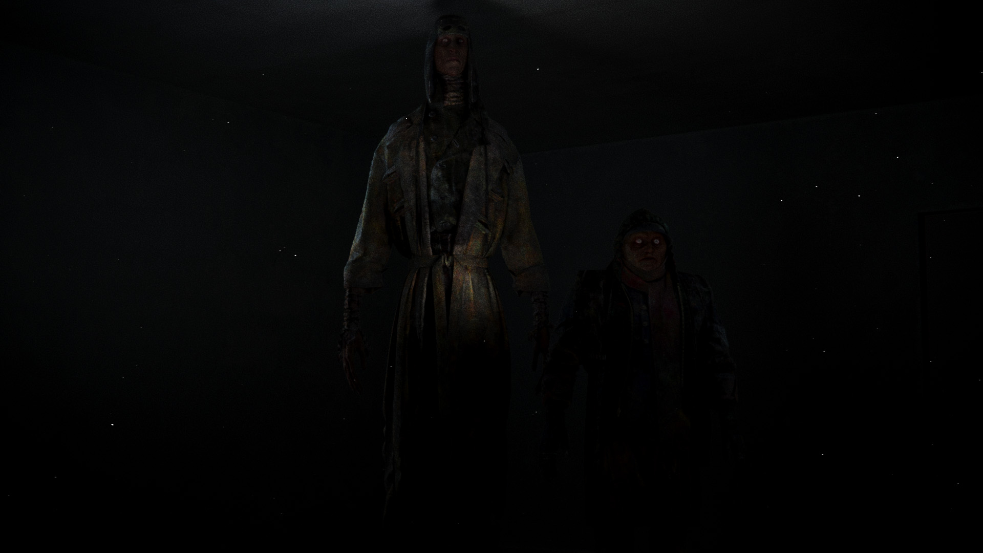
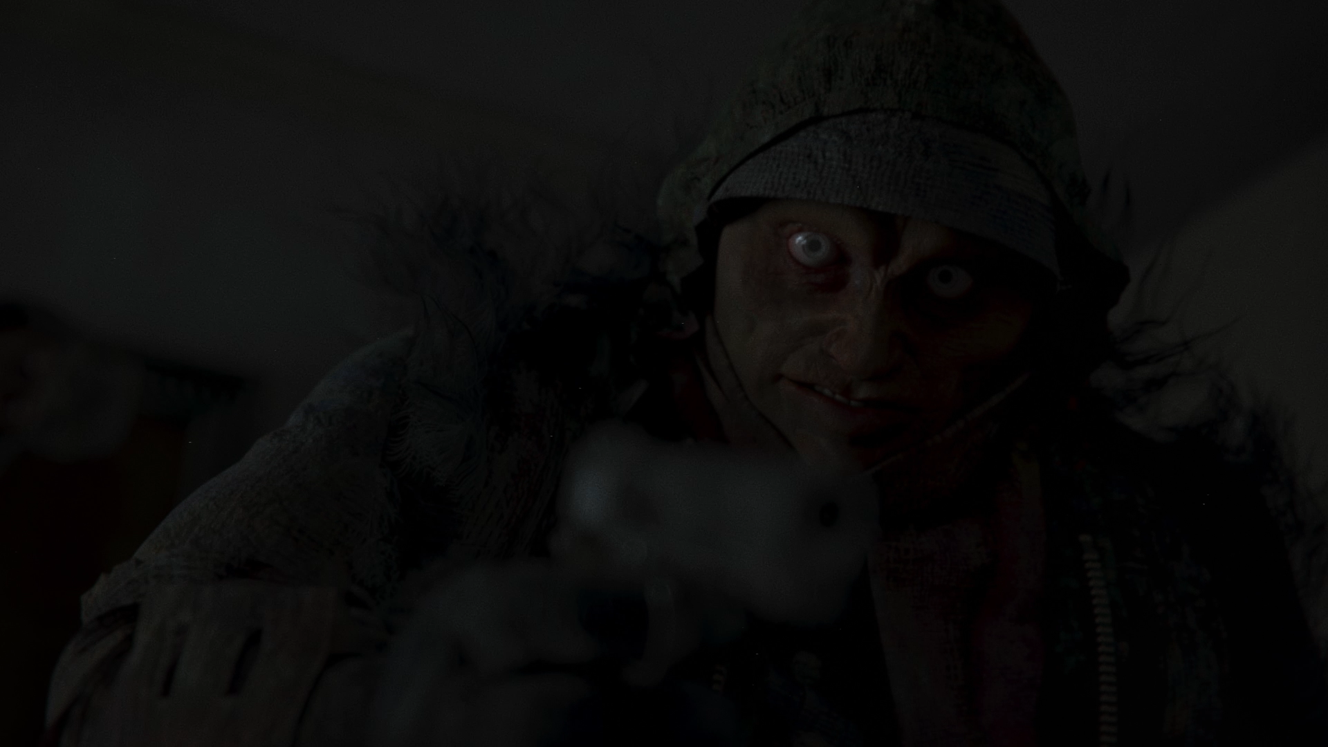
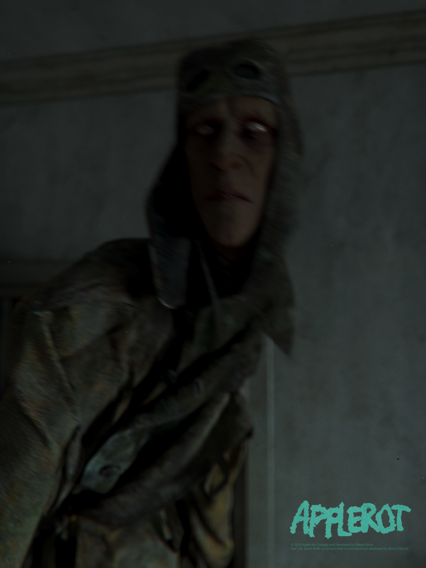
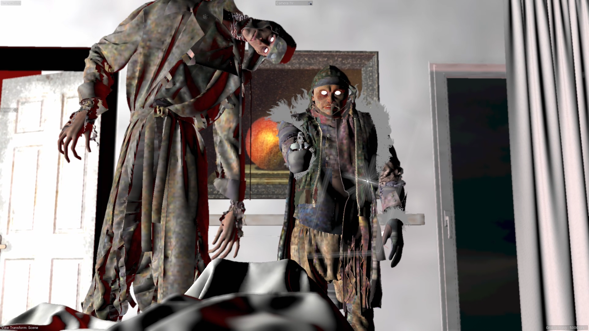
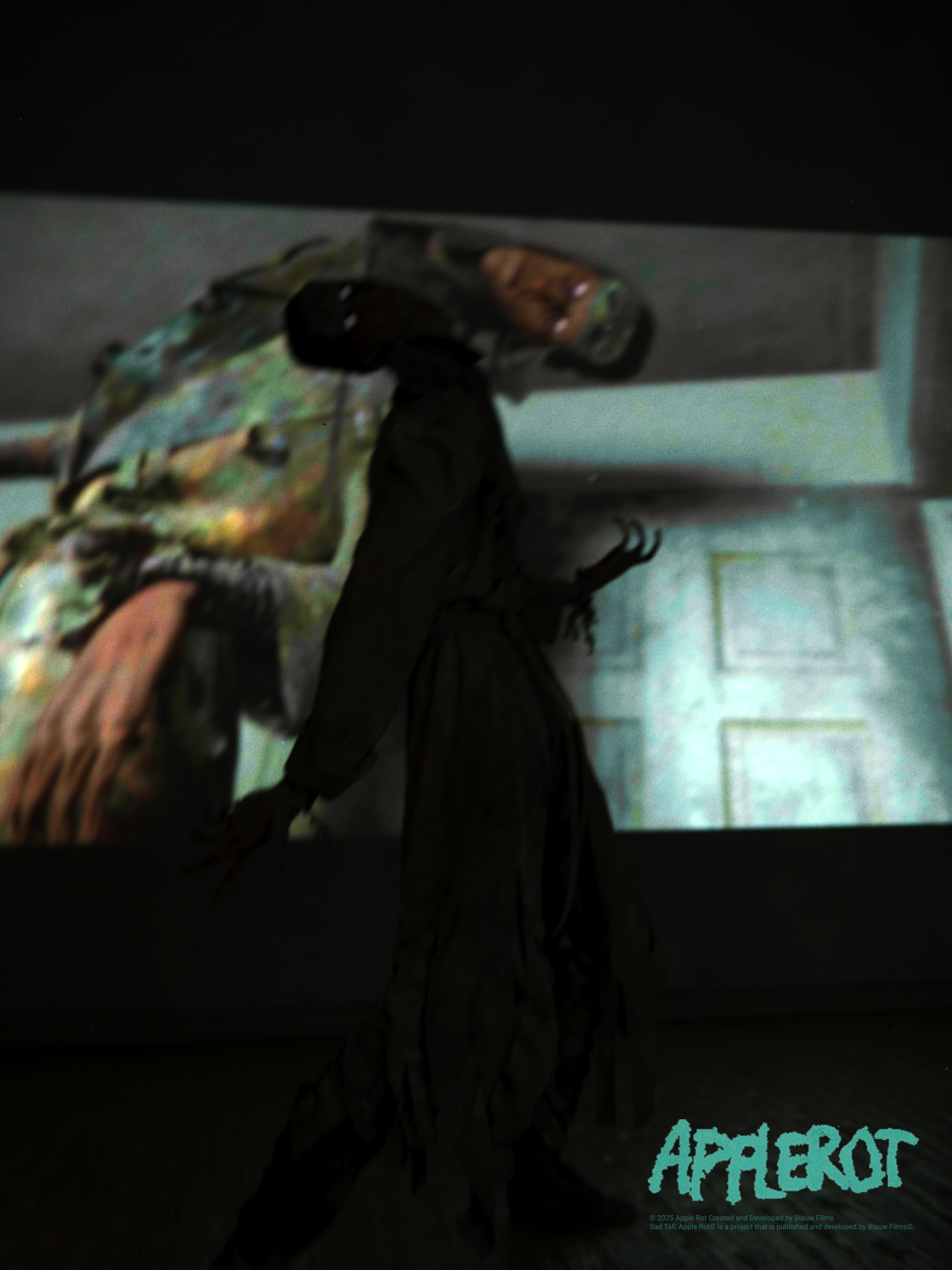
A tall figure entered the room. It radiated sadness. It was too tall for the space, forced to twist unnaturally to fit inside. Everything about it felt wrong. A second figure followed. This one was shorter, but filled with anger. I couldn’t see it clearly at first, but I could feel its presence.
The two began discussing whether we were going to be killed. The shorter figure reached into its breast pocket and pulled out a gun. Even within the dream, it was clear as day. It was an old silver Colt M1911. It approached slowly, carefully adjusting its aim.
Then, for a brief moment, I saw its face.
A gunshot. An ice-cold shiver all over my body. And then, silence. It was finally over. But what did I just witness?
There was a story.
What stood out was not just the fear of the experience, but the structure within it. There was clear intent in the actions of the figures. There was logic in how the moment unfolded.
That’s what made it different from a typical nightmare. It felt designed. And in some moments it also felt as if it was equal parts sleep-paralysis and lucid dreaming.
That realization is what made it worth exploring as a film. Not to recreate the dream exactly, but to understand the depth behind it.
The next day, I told Charlotte everything. Over the following week, the experience kept coming back to me. The characters felt real. They had to be explored.
At that point, it became clear: We had found our next film.
Concept Development
Apple Rot was born as an expression of anxiety, financial pressure and the psychological weight of instability in your life. These themes symbolically reminded us of the Garden of Eden. An environment that appears abundant and giving, yet ultimately reveals itself as deceptive and rotten.
At the center of this thematic world is the rotten apple. It’s a visual and narrative device that reflects over-consumption while directly representing societal decay. We conceived of the Genesis Orchard, a fictional place deep within the Garden of Eden. Here the value is distorted. With the purchase of rotten apples from the Genesis Orchard participants knowingly overpay for something inherently worthless, yet remain trapped in the system. This mirrors real-world financial anxiety, where we are constantly surrounded by flawed systems that demand our participation.
These themes are designed into the structure of the film itself. Apple Rot exists in a liminal space between dreams and reality. Transitions are fluid. The pacing of the film is minimalist and atmospheric. The audience is never given a clear point of reference of what is reality, reinforcing the emotional disorientation at the core of the story.
We are intentionally applying the core principles of the Kuleshov effect. Through the juxtaposition of imagery, we guide the viewer into a constant state of uncertainty. Is what they are seeing real, remembered or imagined? Are we dreaming?

As the concept evolved, we expanded the narrative through collaborative worldbuilding. Together with Charlotte and Harry, we explored foundational questions:
- What is the origin and function of the Apple Rot?
- How does the Genesis Orchard operate as a system?
- What motivates Sad Tall and Short Angry within this world?
Instead of isolating disciplines we let every area of development occur in parallel. Worldbuilding, character design, storyboarding and early writing informed one another continuously. Trust within the core team is essential. It enables us to explore, while ensuring that every decision remains aligned with the intent of the film.
We consciously avoided making these themes too explicit. A more literal approach would have made the message clearer, but also less engaging.
By keeping the structure abstract and allowing meaning to emerge through juxtaposition, the audience is asked to be active in interpreting the film. A balanced tension between literal storytelling and ambiguity is essential to the experience we were aiming for.
Screenwriting and Storyboarding
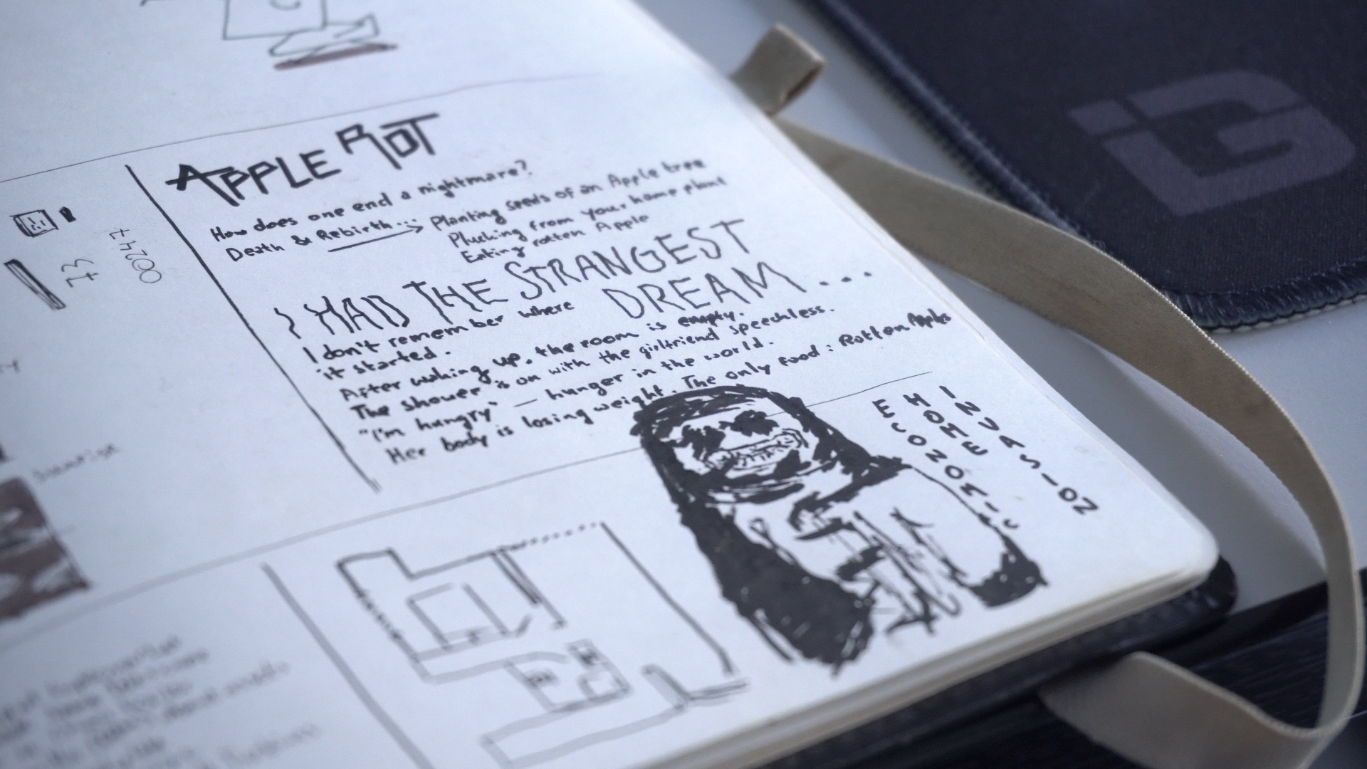
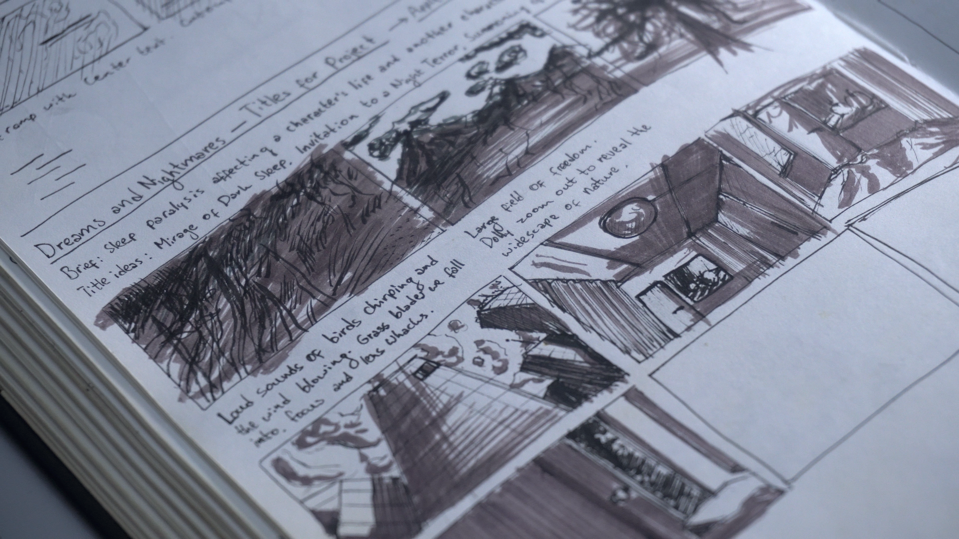
The writing process for Apple Rot was fluid. I personally enjoy the process of writing fragmented notes in my notebook. These are short ideas capturing tone, imagery, and emotional direction. They are not structured narrative outlines. These notes serve as a foundation for understanding the story we’re trying to tell at an intuitive level before turning it into a screenplay.
The screenplay is a blueprint for the story that will be told as a film, instead of being the story itself. I’m telling a story. The sequence of events does not have to be rational. It’s instead mostly an emotional decision. Is the way the story is being told interesting? Each moment is evaluated based on its ability to sustain intrigue, tension, and thematic cohesion.
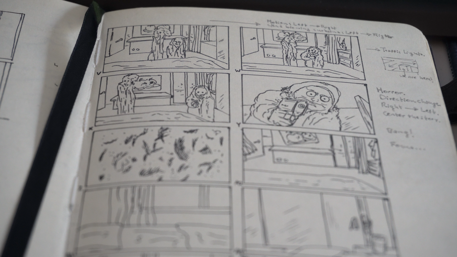
The notes in my notebook are often accompanied by simple storyboards. At this stage I’m exploring how the story is communicated to the viewer through images. This allowed us to immediately test how ideas translated visually, ensuring that the intended meaning was effectively communicated through composition, timing, and shot relationships.
This fragmented approach is very intentional and it’s applied in pretty much all of our Worlds. Writing in disconnected pieces allows ideas to be evaluated based on feeling rather than logic.
A more structured approach early on would have forced the story into limitations too quickly. It gives you the benefit of hindsight to let the ideas stand the test of time. The structure is then built around what remains, resulting in a more streamlined story while being told in an interesting manner.
Maintaining clarity in how the Kuleshov effect influences perception was critical throughout this process. Because film is inherently sequential, even minor shifts in shot order or duration can significantly alter the audience’s interpretation.
For this reason I often write snippets of the screenplay in parallel to making sequential drawings. Slowly but surely these ideas start taking shape. The film starts becoming clear to you.

An important part of this process was verbal storytelling. By presenting the story informally to friends and peers, we were able to observe real-time reactions. Especially when the mood is light, and people are interested in what you’re working on, it’s a good time to tell the story. These moments directly informed the final revisions of the story.
The final screenplay was completed over three drafts, developed collaboratively between myself, Charlotte, and Harry. Each iteration involved reviewing narrative structure, refining character motivations, and aligning the story more closely with the established worldbuilding.
Charlotte had already started on creating the character designs by now. This started with ink blot studies and initial sketches, defining silhouettes and emotional presence. Followed by the first rough sketches of the character’s faces. These visual developments fed directly back into the writing process.


Once the screenplay was locked, it was translated into a full production storyboard, carefully considering pacing, framing, and atmosphere. This process took approximately half a day and resulted in a complete visual blueprint for the film.
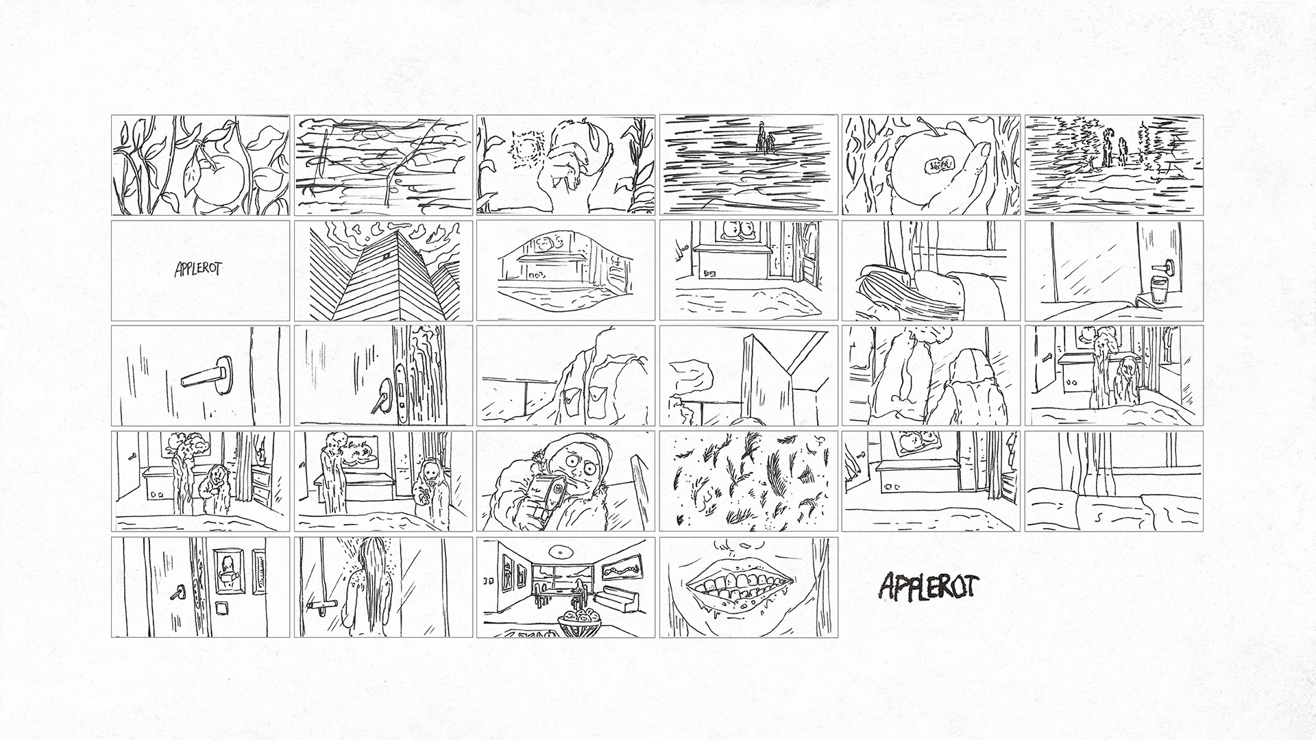
From there, Harry developed a detailed shot list and script breakdown, preparing the project for production. This process is essential to every film production we start. It's at this stage that it becomes clear what the scope of the film is and more importantly what exactly needs to be created.
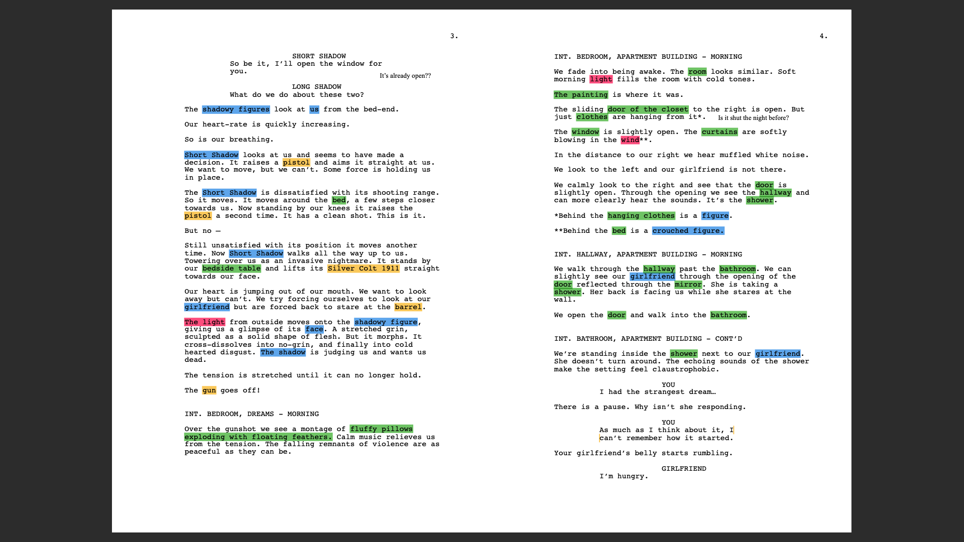
The Script Breakdown is broken up into 4 categories:
- Characters (Blue)
- Props (Yellow)
- Locations (Green)
- Effects (Pink)
At this stage, the entire team shared a clear and intuitive understanding of both the narrative and the emotional intent of Apple Rot.
We were now ready to truly start Pre-Production.
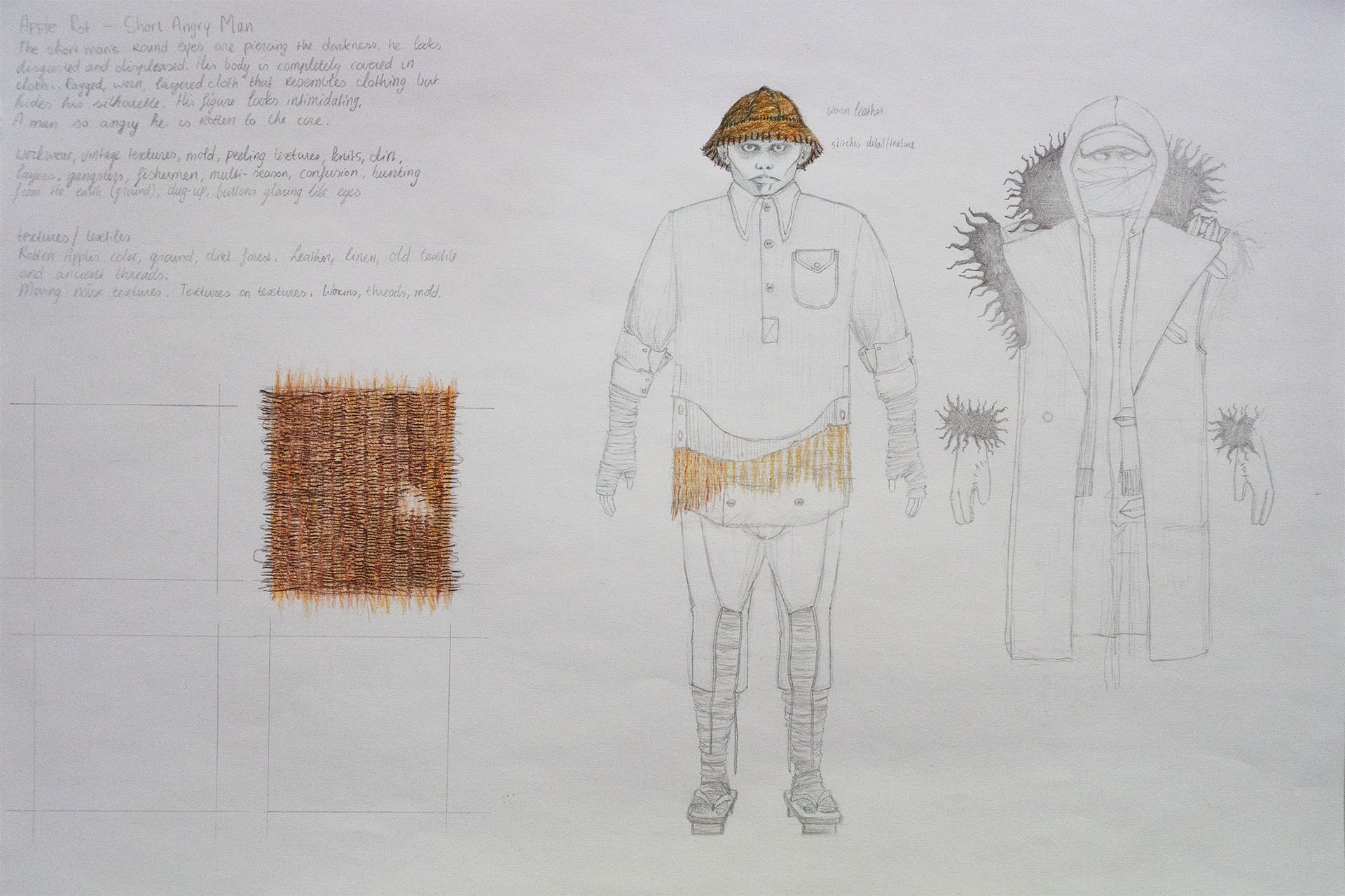
Character and Environment Design in Apple Rot
The design of Apple Rot was built on two primary pillars: Character Design and Environment Design. Rather than relying heavily on extensive pre-visualization or concept art, we made a deliberate decision to prioritize direct communication, iteration and trust within the core team.
To ensure we were aligned as early as possible, we developed a comprehensive Style Guide that defined not only the visual identity of the film, but also its tone, thematic boundaries and promotional direction. This document allowed us to move quickly, make confident decisions, and maintain consistency across all aspects of the production and its surrounding ecosystem.
Character Design Process
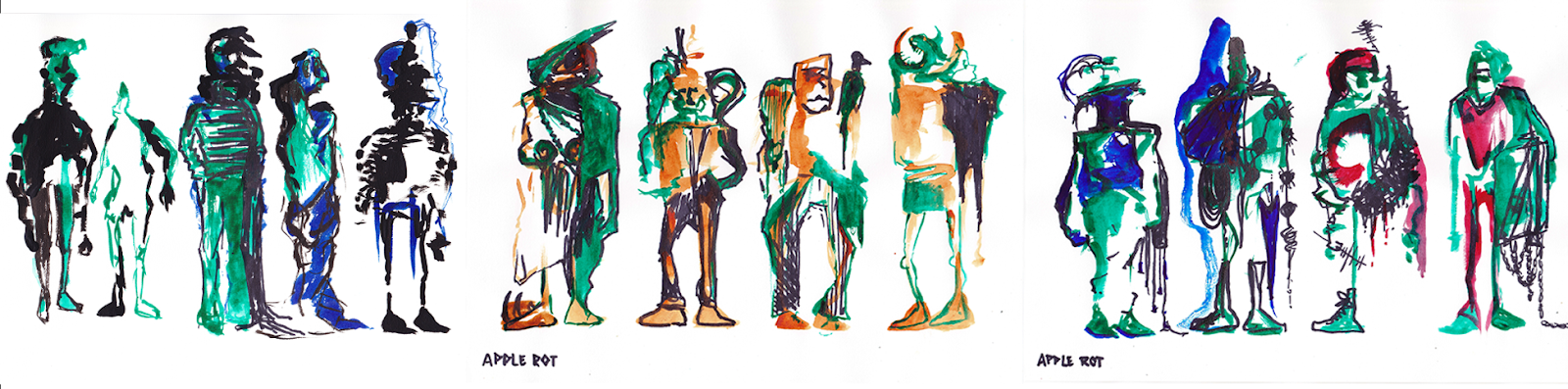
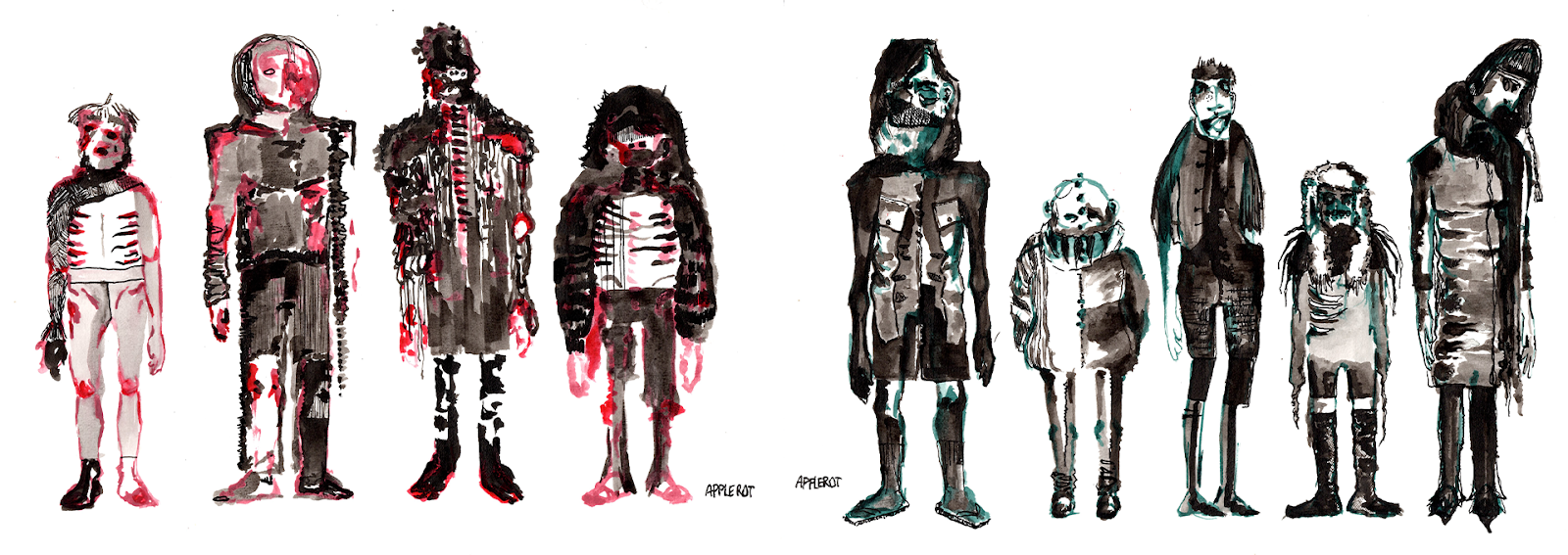
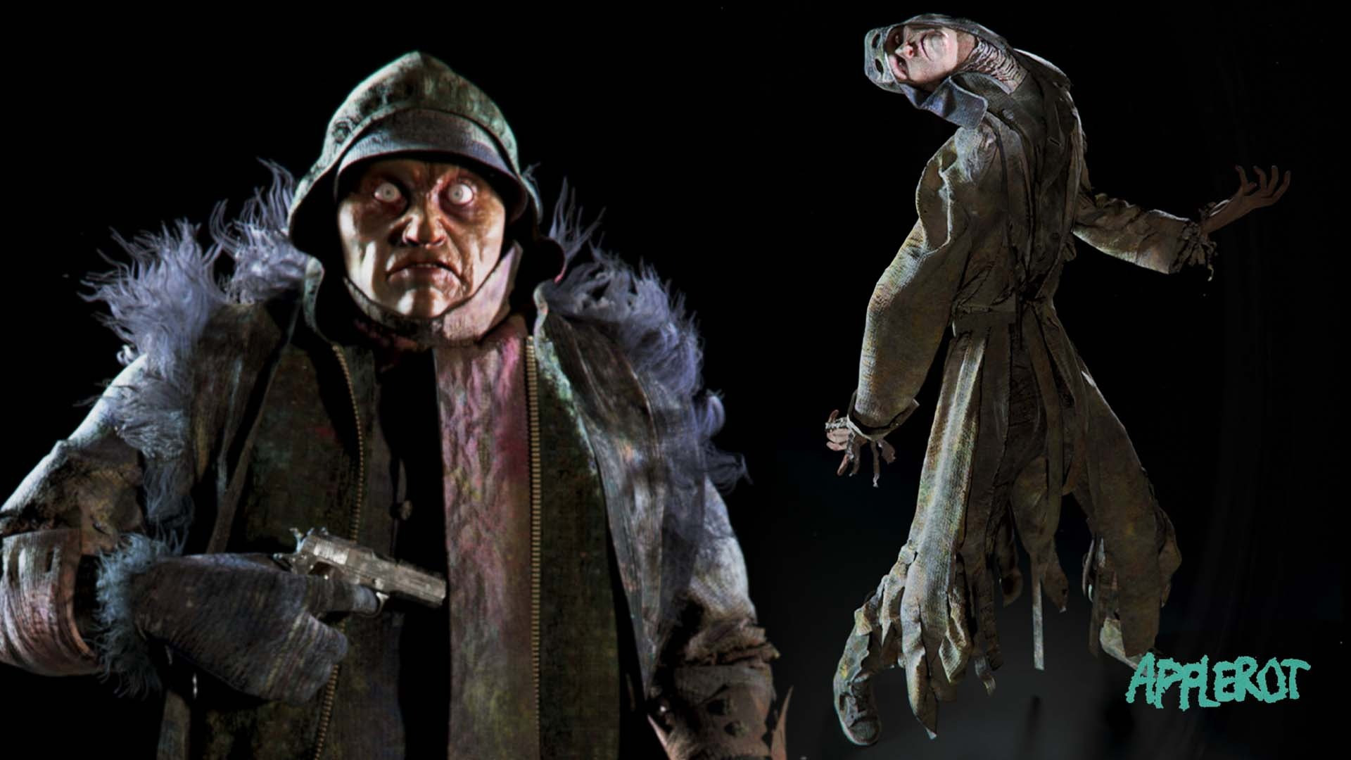
Charlotte begins the character design in the physical world. Initial explorations were created through traditional drawings and paintings, allowing for a more organic discovery process. The physical process welcomes accidents, textures and imperfections. All of these elements are essential to the visual language of Apple Rot.

After the first set of characters were designed it was time to make an important decision. Which elements of each design best matched the intention of the story? We knew they looked layered, and dirty. Disintegrated, almost. Rotten. Through an iterative process, Charlotte made a second batch of character illustrations pushing the concepts further into distortion, abstraction, and “rottenness.” Clothing became heavier, silhouettes more obscured, and facial features increasingly hidden.
This direction was not purely aesthetic. We aimed to design characters that would behave unpredictably under animation and lighting conditions. Combined with low-light environments and moving light sources, this should result in a subtle visual distortion. Nightmarish forms appear to shift, blend and dissolve over time.
This unpredictability is not just visual. It directly affects how the audience reads the characters. When a silhouette cannot be fully understood at a glance, the viewer keeps searching for details. Looking deeper into the frame. Heightening their focus on the film. That constant re-evaluation creates tension, even when the character is standing still.
In that sense, the design itself becomes part of the performance.
As Charlotte put it herself in 2023:
“The technical execution of two characters wearing a mountain of clothes is an interesting challenge. Conceptually, it’s great. Technically, in terms of animation and simulation, it’s the seven stages of Hell.”
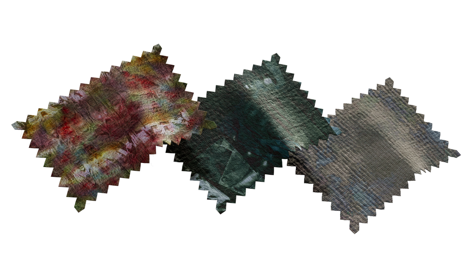
Real-World Texture Development
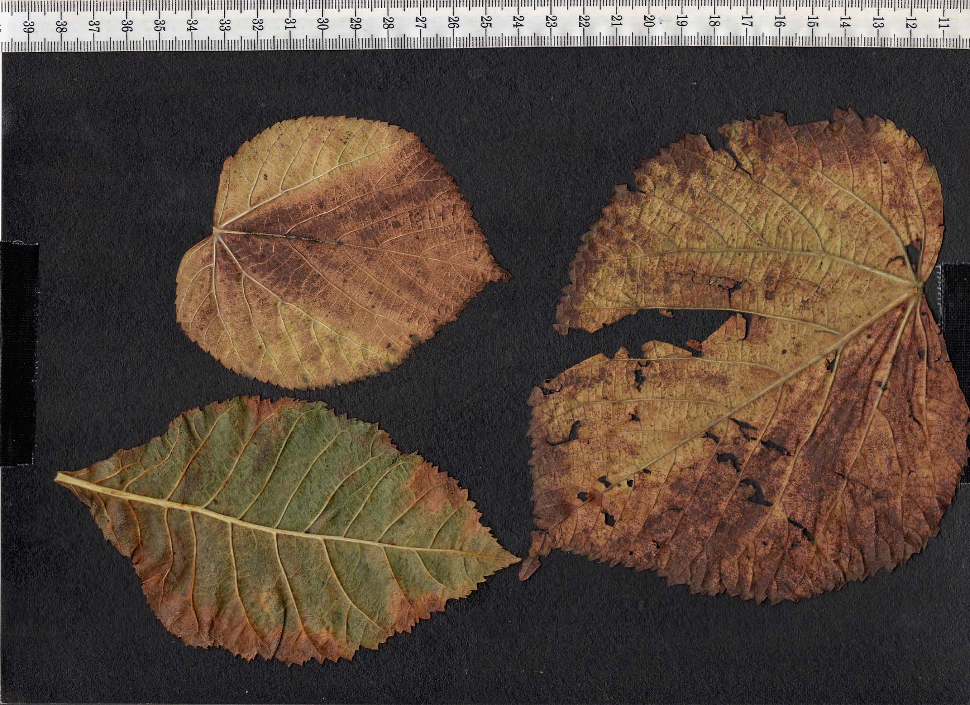
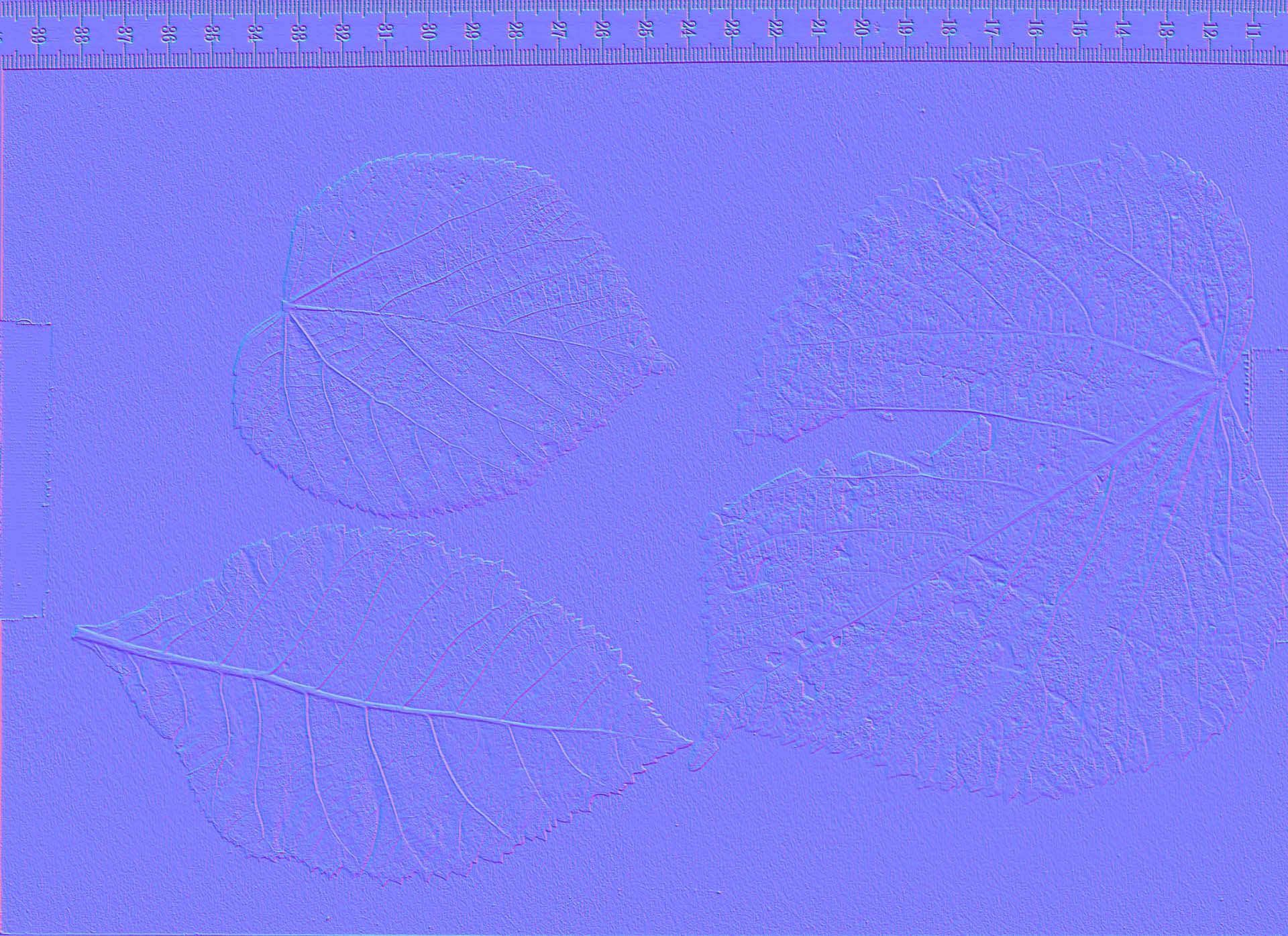
Around this time we also made the decision that many of the textures in the film had to come from real textural details. To achieve the desired level of decay and variation, we physically created our own texture library by collecting natural elements, such as leaves and overripe apples, and allowing them to decompose over time in controlled environments. The results were incredibly rich and dynamic patterns and colors that we couldn’t have come up with ourselves. Nature did what it does best.
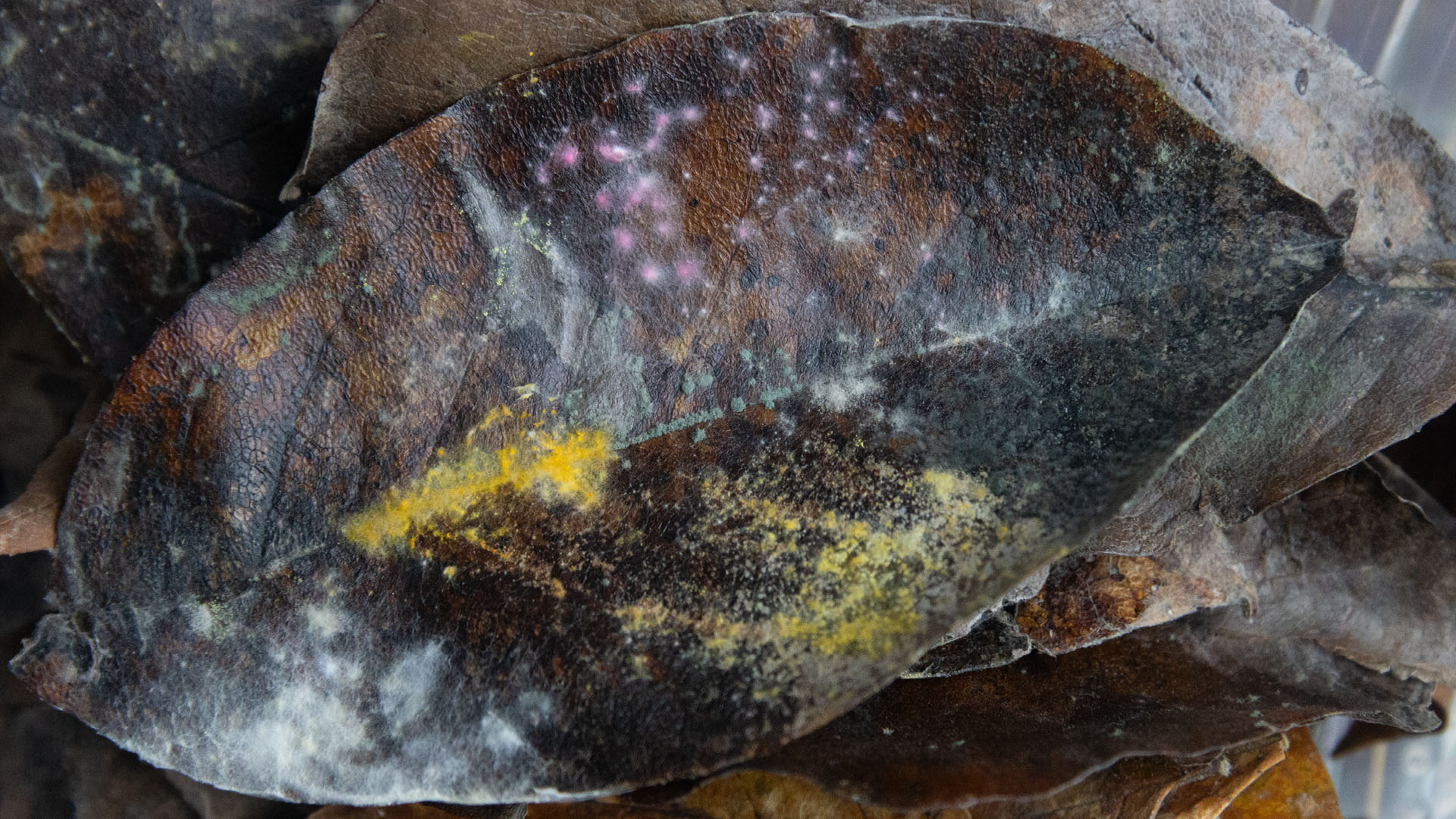
These photographs gave us the confidence we needed that during texturing, each asset was going to look unique. These textures became a foundational layer in the visual identity of the film, ensuring that each asset carried a sense of uniqueness and authenticity.

To emphasise the organic nature of the textures, Charlotte dedicated herself to painting a wide variety of materials. The natural blending of paint on irregular surfaces creates effects that are difficult to replicate purely digitally. By knotting weathered fabrics and layering paint on to them, the effect is incredibly organic once unwrapped. These textures were then scanned and turned into PBR texture sets.

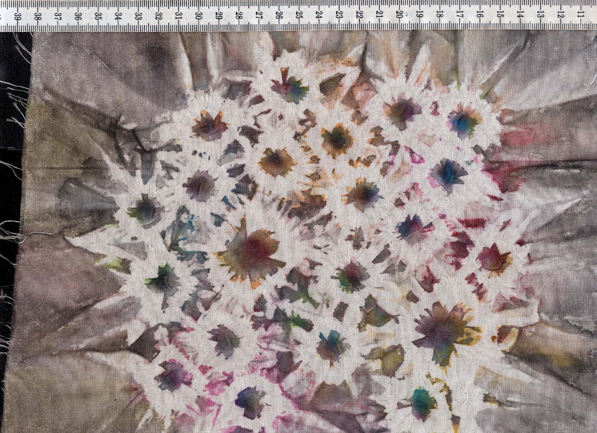
The more variation in textures we had that we could layer in Adobe Substance 3D Painter, the better. To create the distorted look of Apple Rot Charlotte continued the exploration process with different materials.
Tissues were layered with watercolor paints and scanned as well. And to reflect the corrupted capitalistic backbone of Apple Rot, Charlotte slightly burned receipts with an iron to create dark grey and blue gradients.
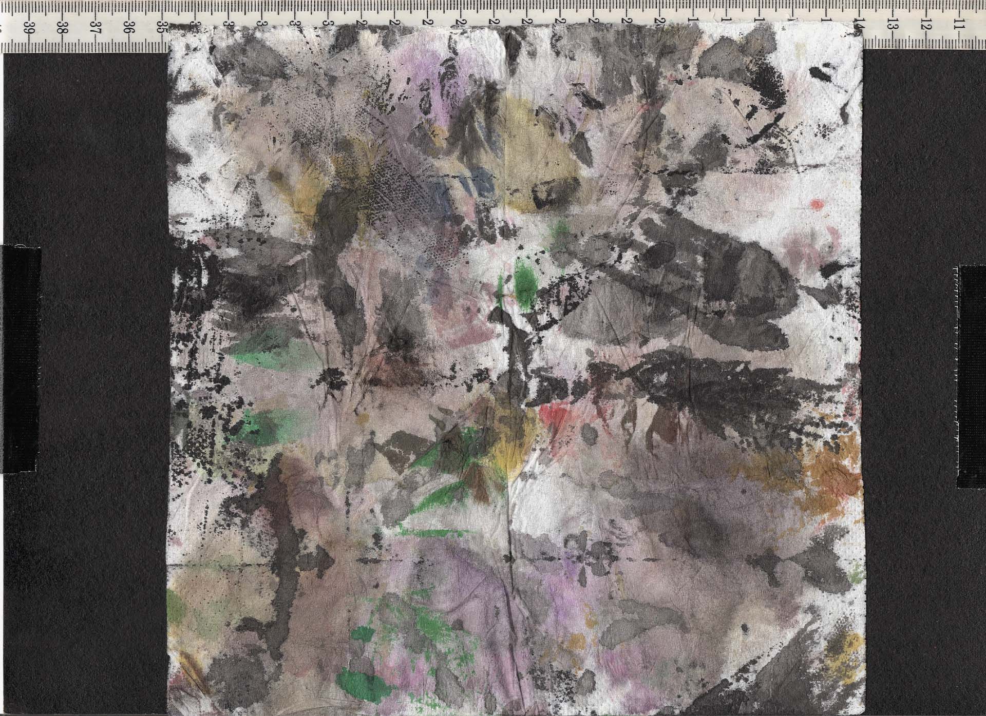
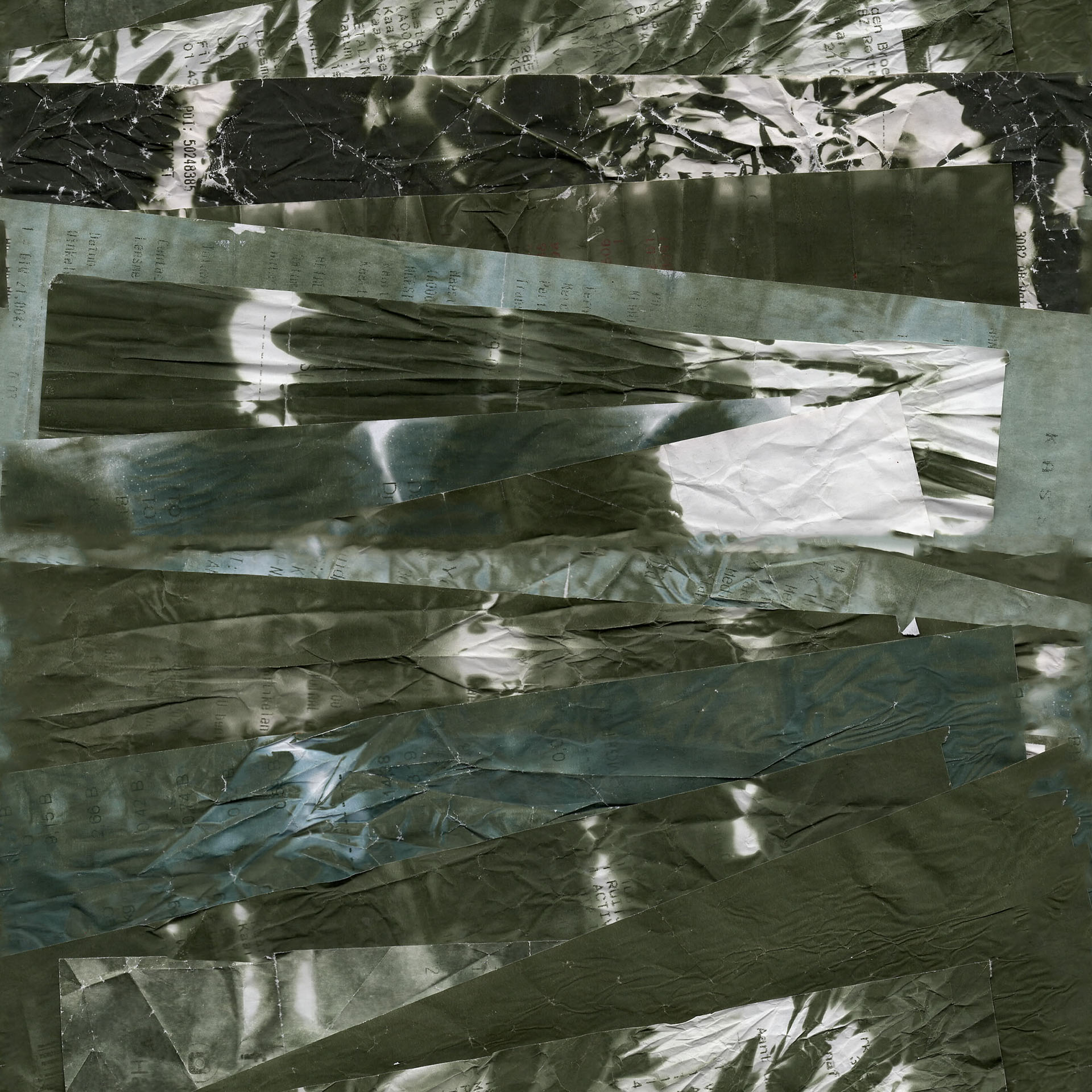
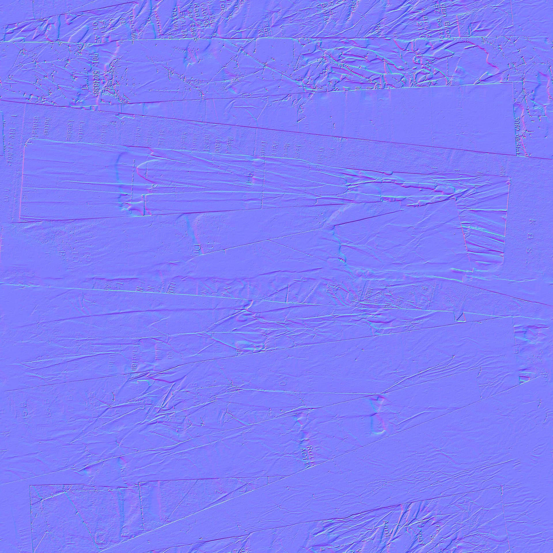
The process was purely explorative. Certain colors, patterns and textures immediately spoke to us. Anything that evoked a sense of rot or distortion became the driving factor for more exploration in that area.
In the end we also captured an extensive library of fallen autumn leaves. They were originally intended for a sequence that was cut from the storyboard as it would interrupt the flow of the film. However, we are planning on future expansion of the Apple Rot film universe and these will come especially handy when exploring the Genesis Orchard.
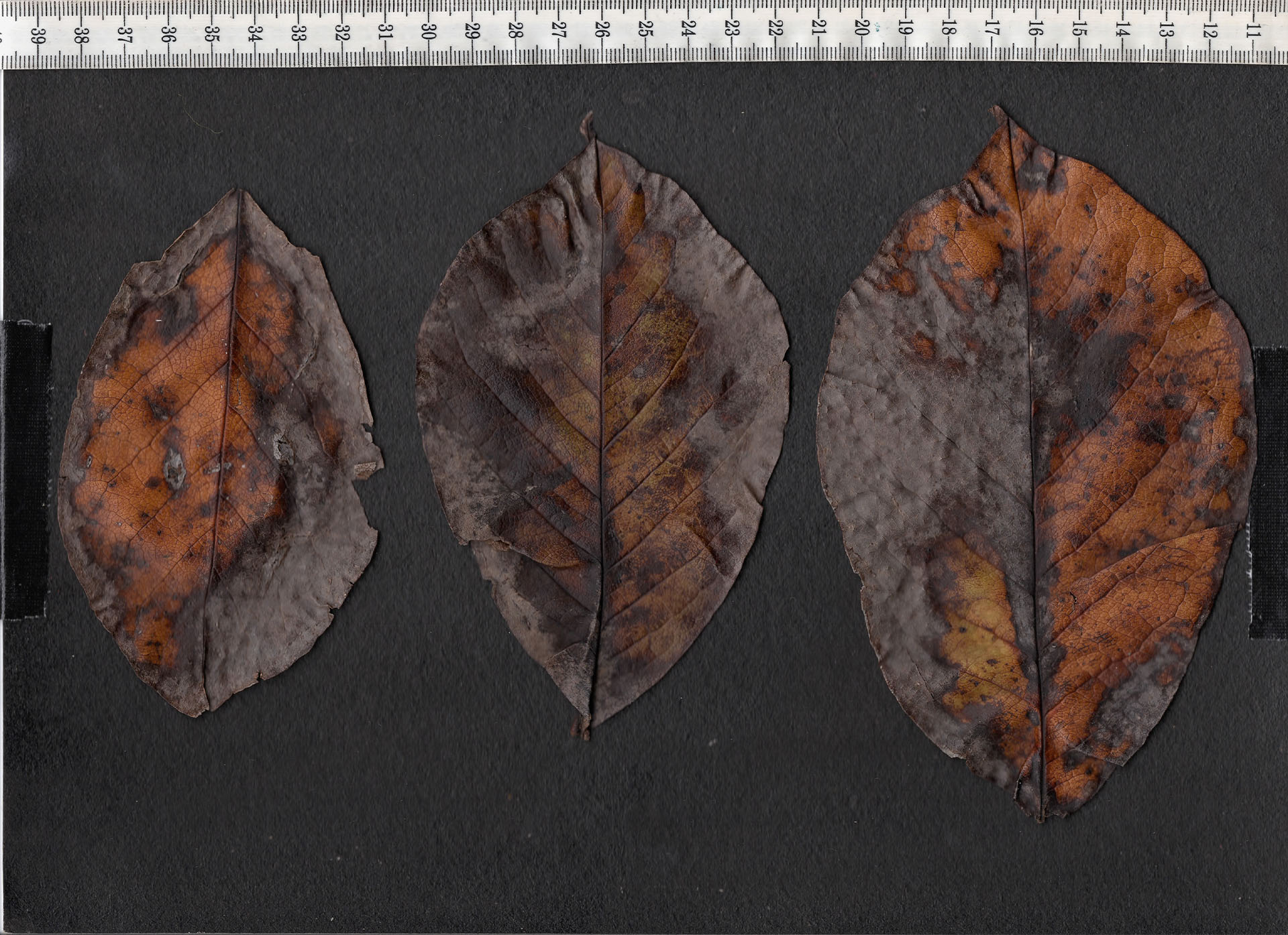

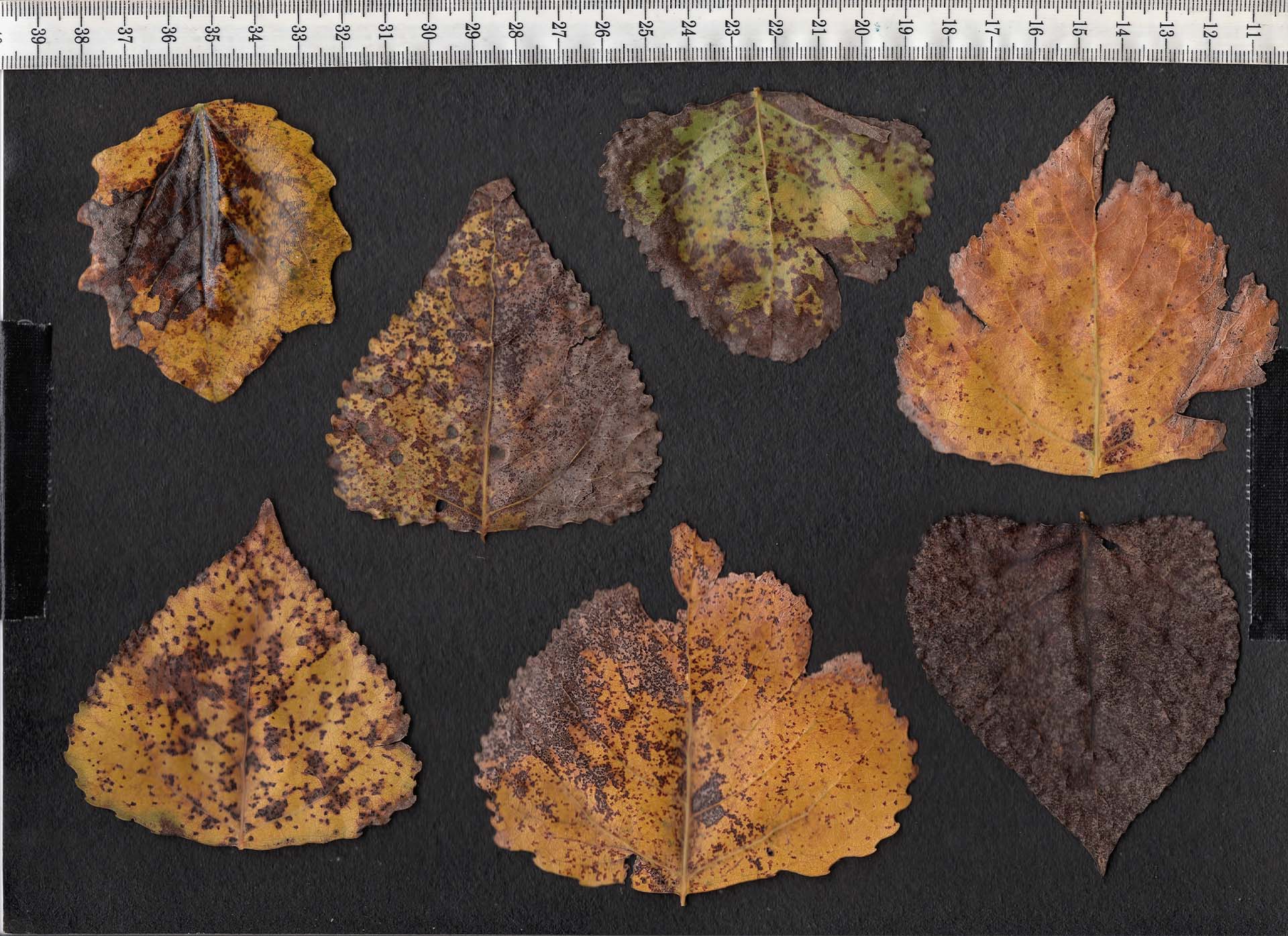
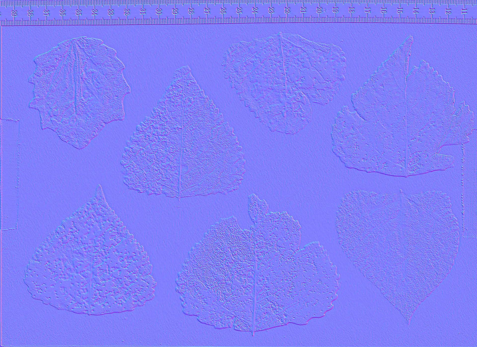
We did find use for the rotten leaves as additional textures that were used during painting the characters and their outfits.
This approach reflects a broader principle: originality in IP is often achieved through being very specific about what you want in your execution. By investing time into sourcing and creating bespoke materials, we ensured that Apple Rot would remain visually distinct and interesting. As the IP is expanded through Transmedia, the design language still remains recognisable.
Designing Eve
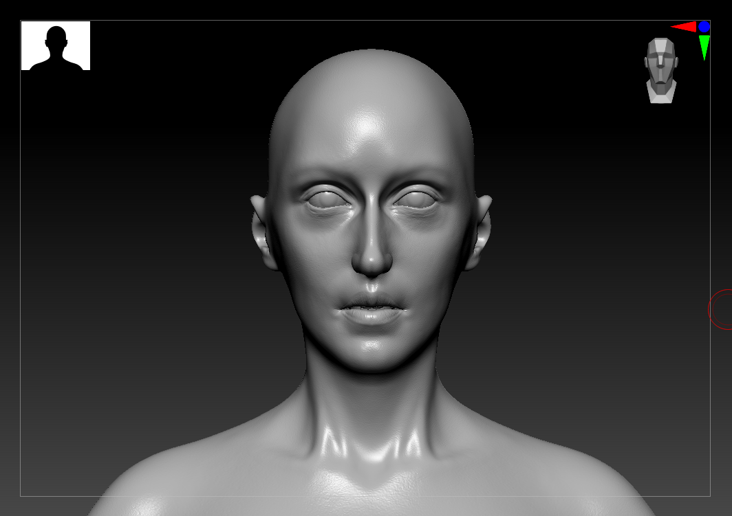
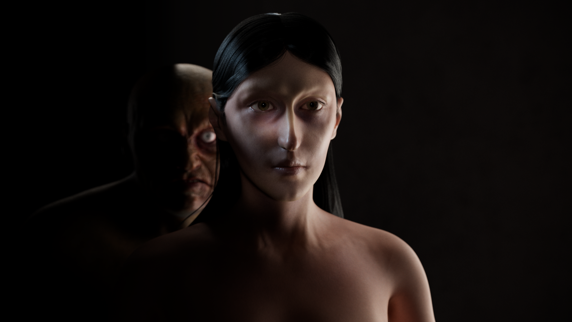
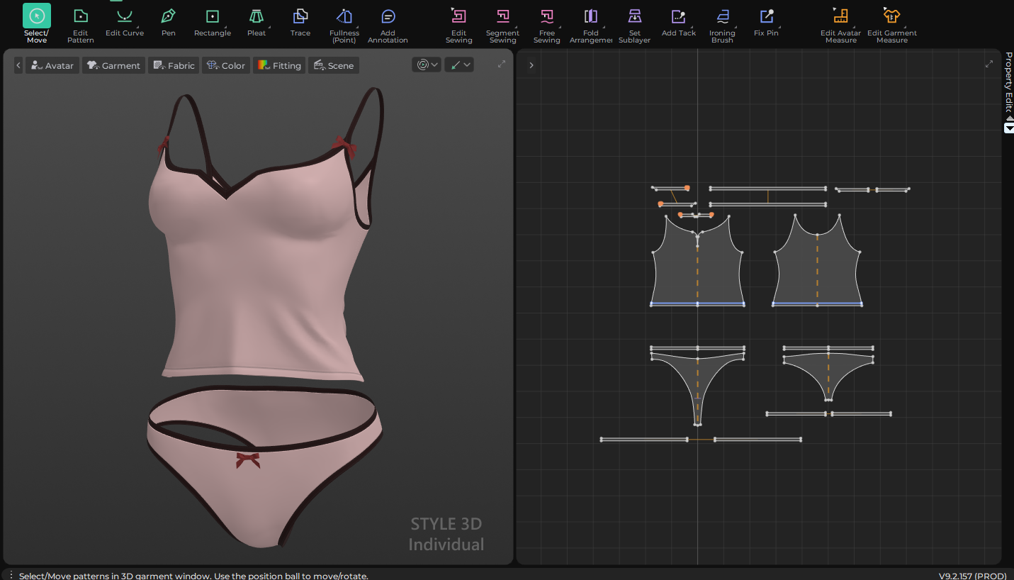
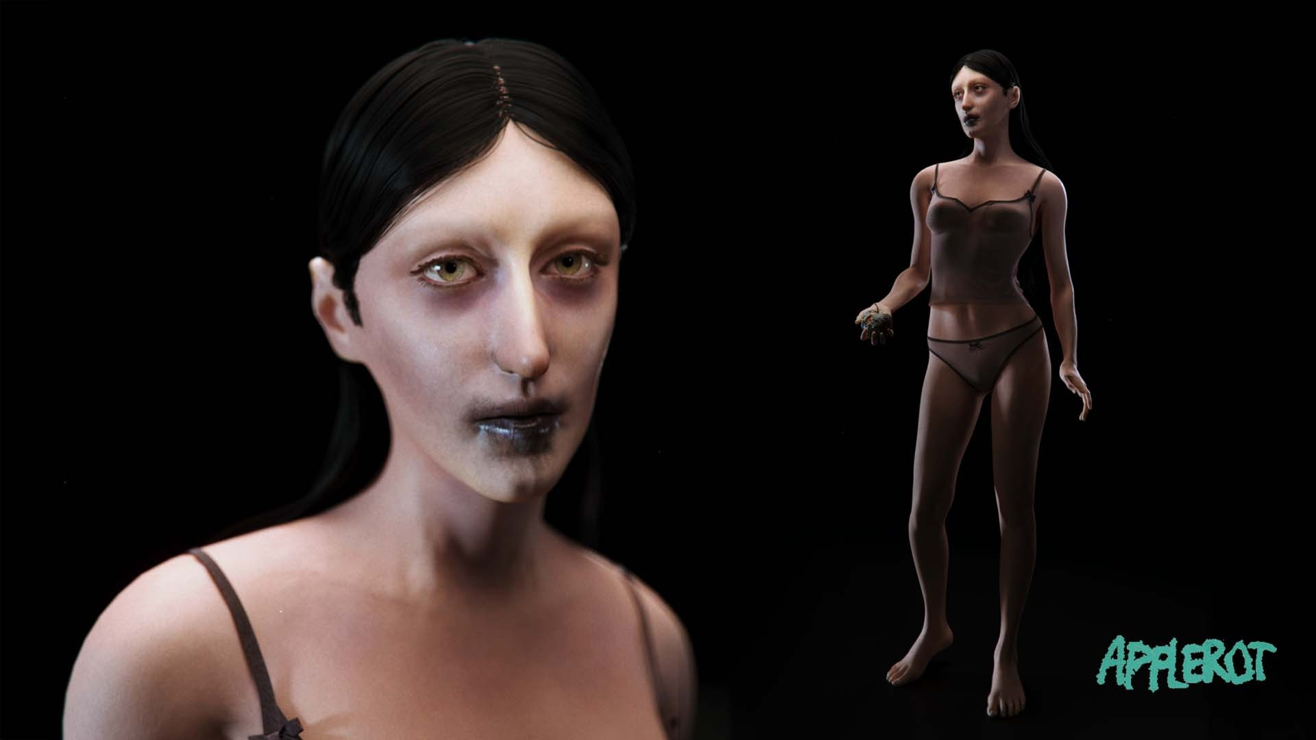
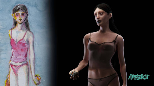
While the screenplay does not explicitly define Eve’s appearance, her design was informed by ongoing narrative discussions. In a way we were looking for the classic J-horror inspired possessed woman. Long black hair and pale skin. But while grounding the character in the internal logic of the story.
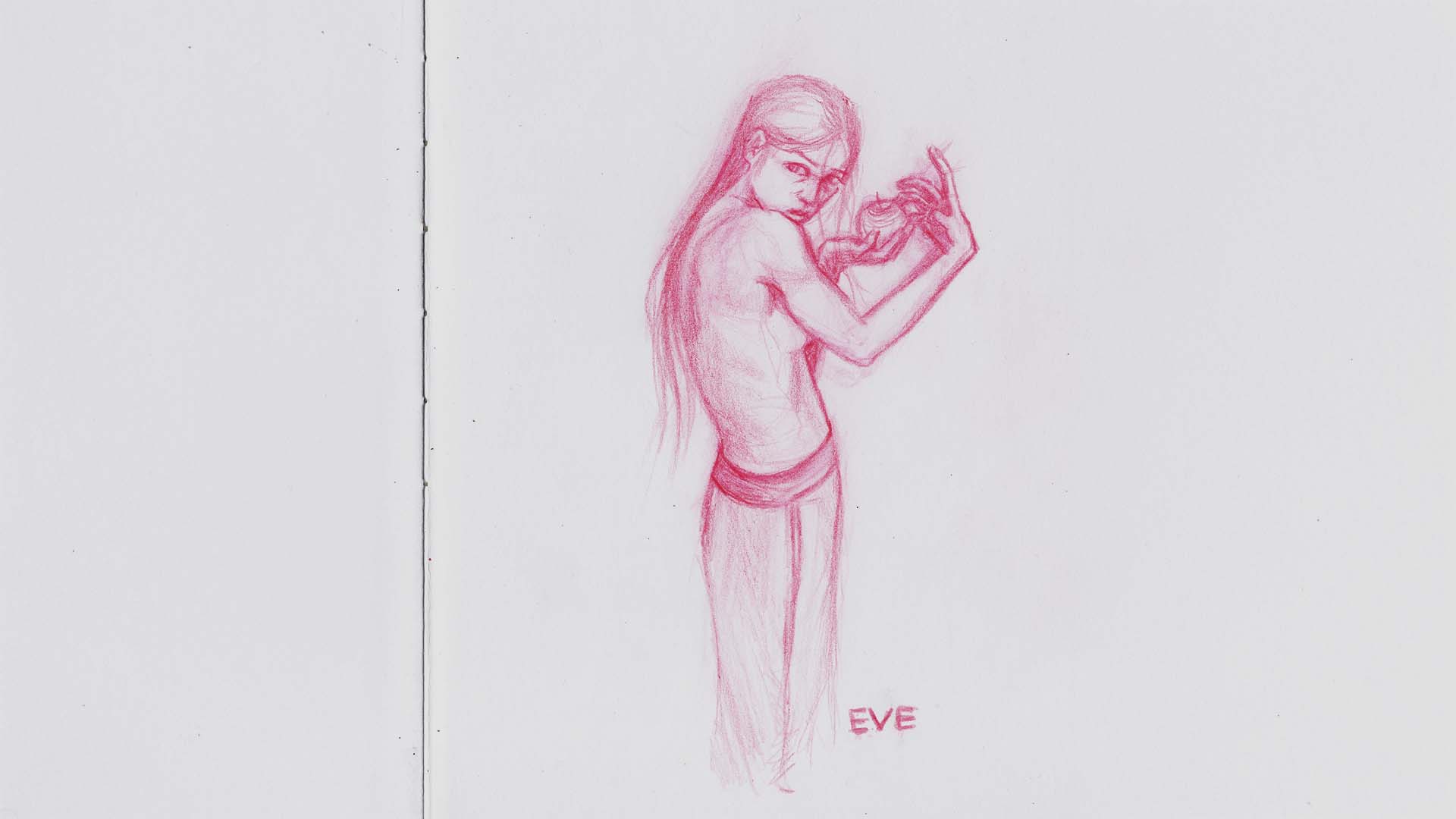
The first sketches of Eve represent her as a woman with hollow eyes, endlessly staring into the distance. Detached from our world. Thick eyebags from troubled sleeps. Existing in a liminal state between awareness and absence.

Her wardrobe reflects this. She is wearing a casual pyjama set made up of underwear and a top. Charlotte settled for a simple tank top with spaghetti straps, that exude this relaxed, young and cute feeling. The minimal outfit reinforces both vulnerability and realism, contrasting with the more complex and obscured designs of the other characters.
Environment Design Strategy
Environment design was approached with a balance between efficiency and atmospheric control.
Based on the storyboard, environments were divided into clearly defined locations:
- Genesis Orchard
- Apartment Exterior
- Bedroom
- Hallway
- Bathroom
- Living Room
Each environment presented unique technical and narrative challenges.
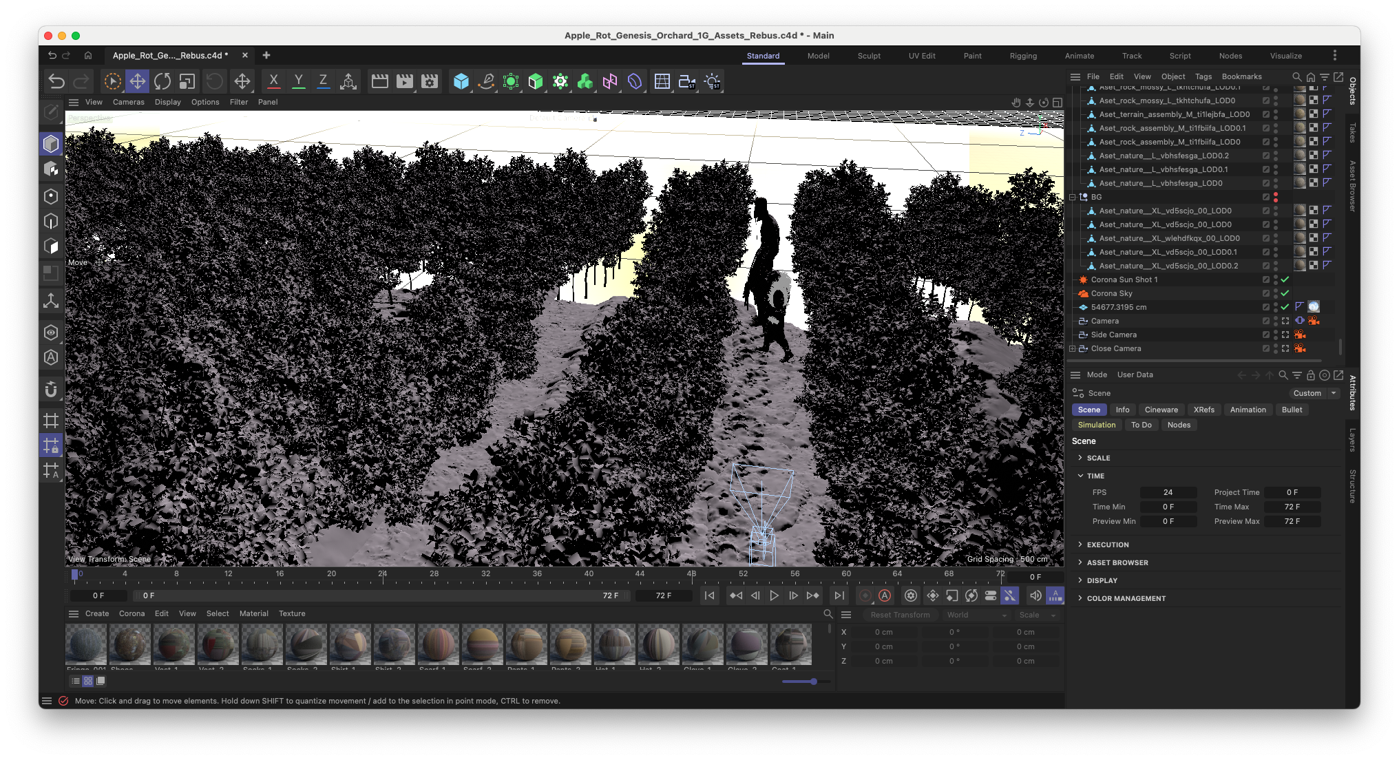
The Genesis Orchard
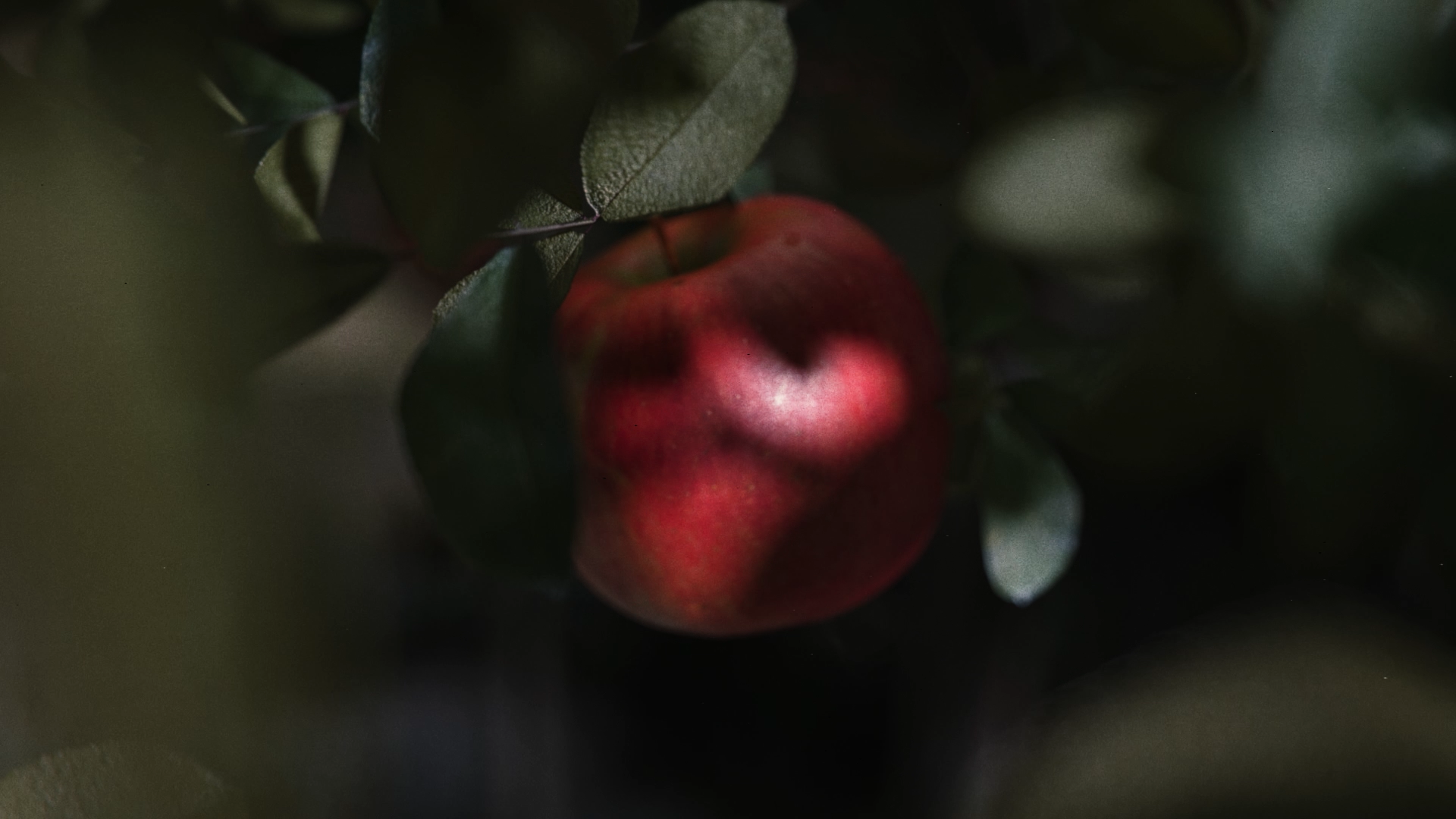
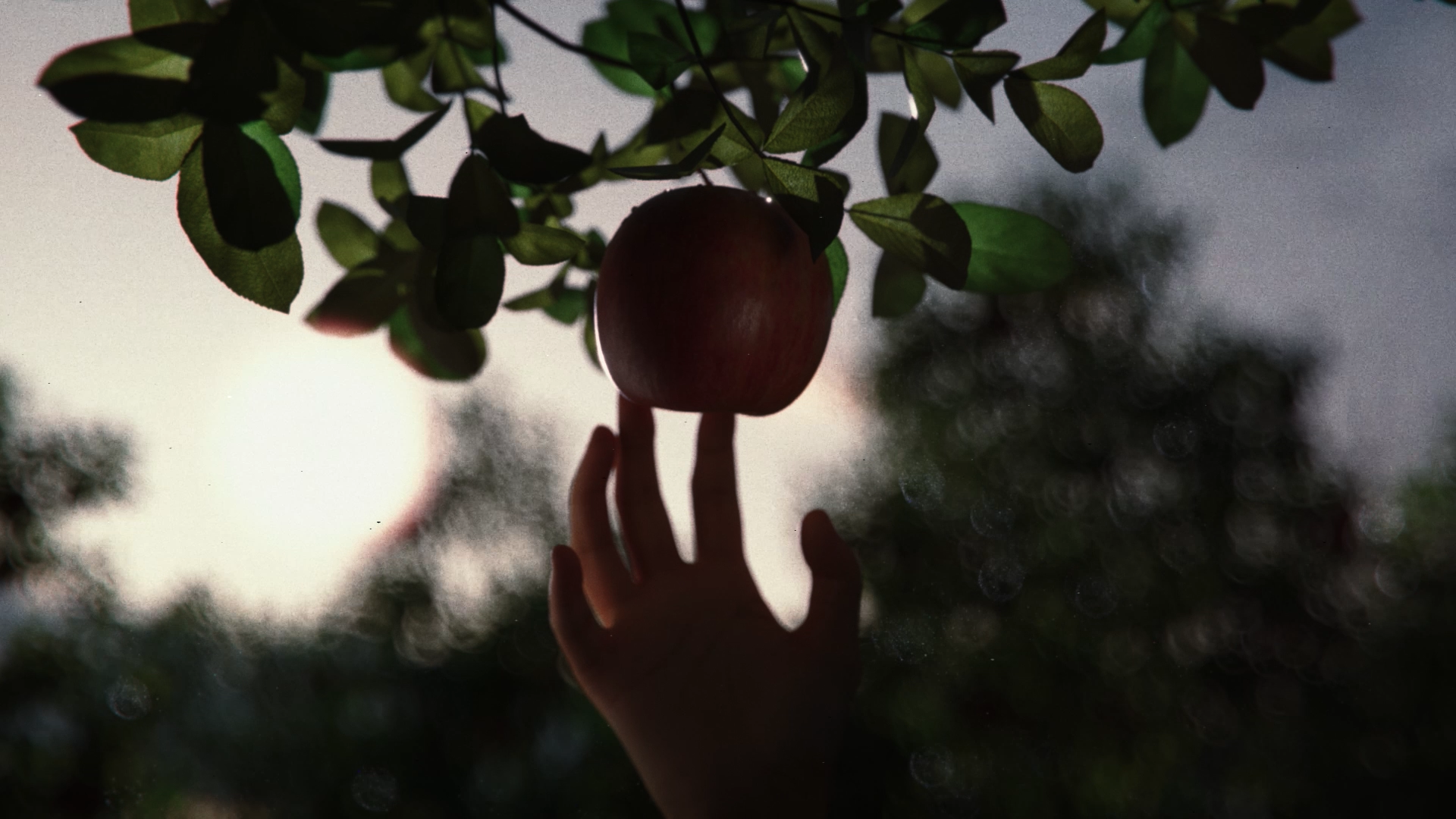
The film starts off at the Genesis Orchard. This would require vegetation and large scale environments, so the best would be a hybrid approach, combining detailed foreground assets with matte-painted backgrounds to efficiently create a sense of scale. By prioritizing high-quality assets only where necessary (such as close-ups), we maintained both visual fidelity and production efficiency.

The opening sequence of the film can be broken down into two types of shots. Close-ups of the apple being plucked and motion blurred lateral shots.
For the close-ups of the apple it was important to look at the background. One should add enough detail variation behind the subject that’s in focus to ensure that there is enough visual interest when it’s blurred out. This also included adding a simple wind effect to the grass assets on the floor. This was achieved by animating the force fields that were affecting a Bend Deformer. Finally, it can’t be underestimated how important it is to set the right Translucency values for the leaves. Especially when there are backlit shots, leaves look completely different with and without Translucency.
For the motion-blurred shots it was important to showcase many rows of apple trees, as well as a convincing horizon line. For the latter we reached out to Ab Wienk to create a matte painting. By having this background asset early in the production we could reverse engineer the layout of the apple tree orchard.
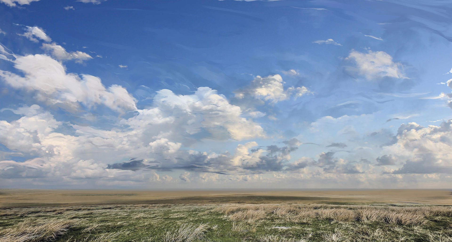
Using Instances of the different apple tree models, we could create the long rows of trees. By curving the treeline downwards to dip below the horizon they would reveal the matte-painting and naturally transition into it.
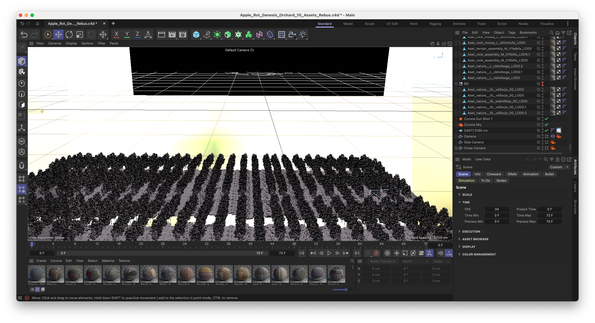
Sad Tall and Short Angry have been animated into a walk cycle and are then made a child of the camera. Thus creating the illusion of them moving alongside the viewer, even though the distance travelled is much more than the motion of their legs should be covering.
When these shots are intercut we achieve a surreal introduction to the dream world of Apple Rot.
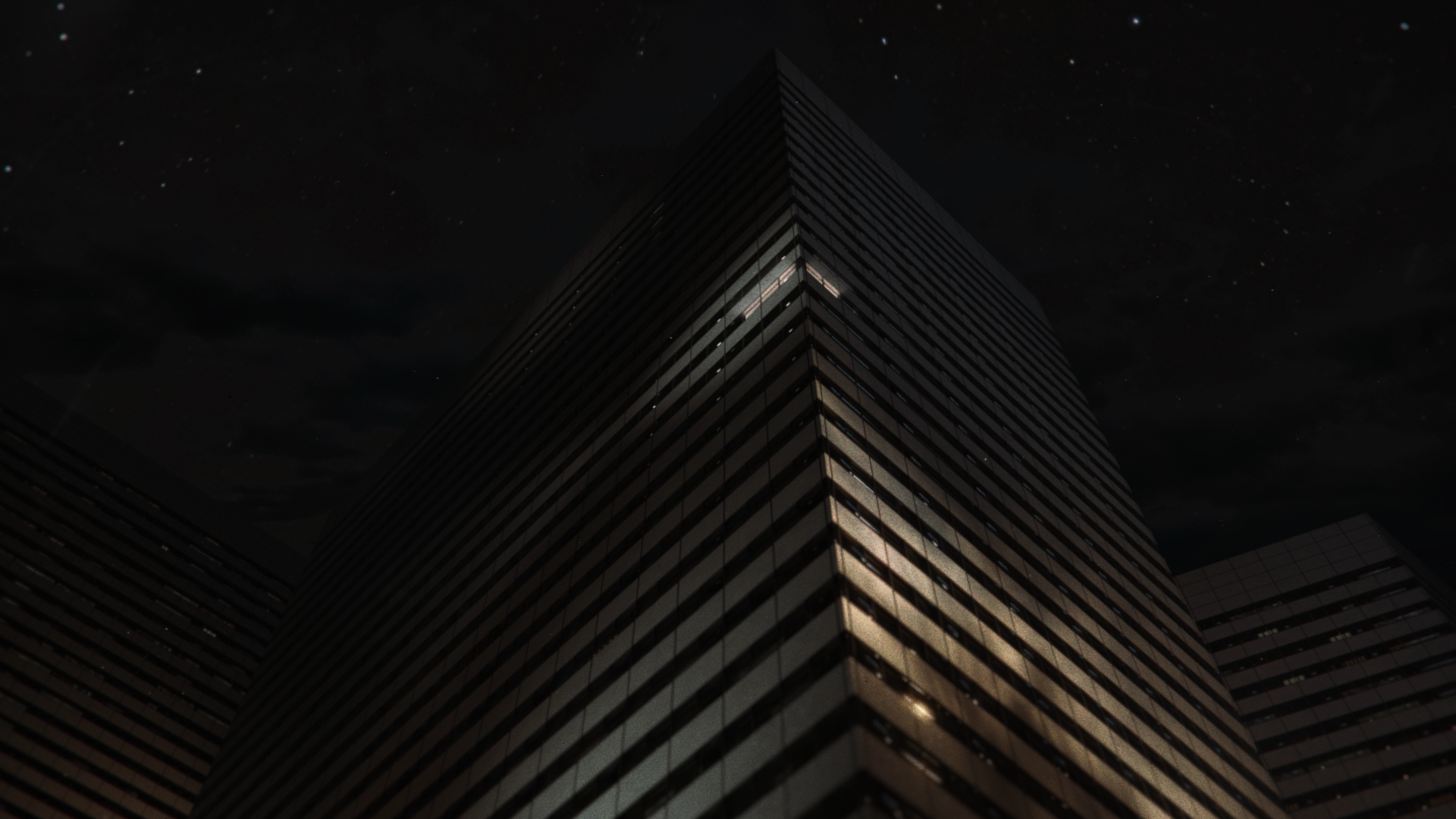
The Apartment Exterior
Then there is a short transition which shows the outside of the apartment building of You and Eve. I knew this was going to be a static shot with the motion being only in the lighting and the clouds. So this was one of the simplest scenes to create. We purchased an apartment building asset, retextured it and it was pretty much ready to go. Only a good looking matte-painting with some stars was needed for the sky.

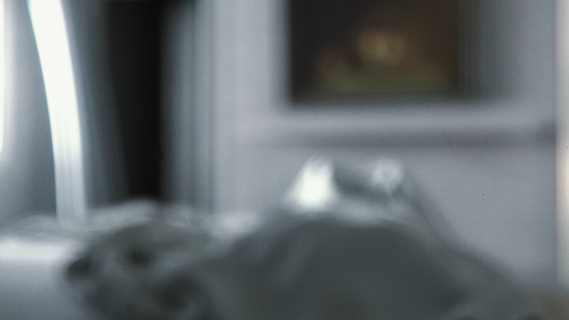
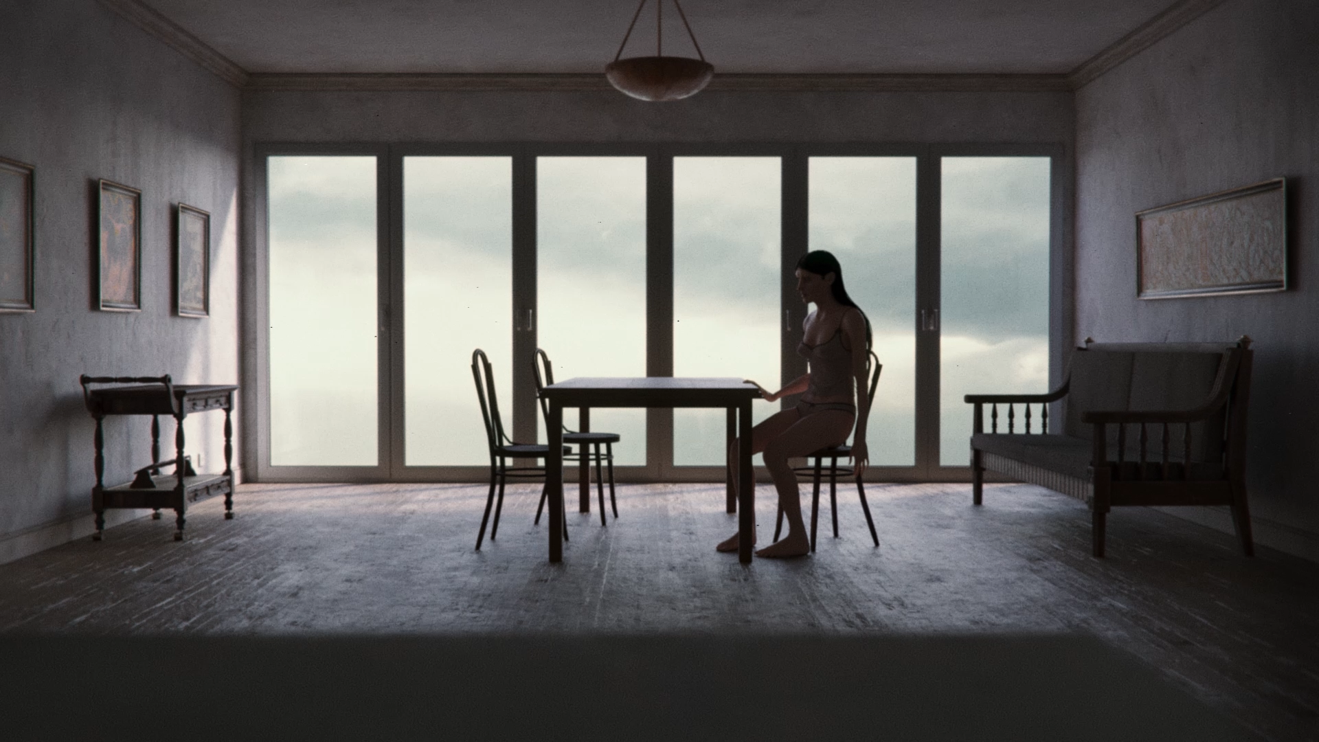
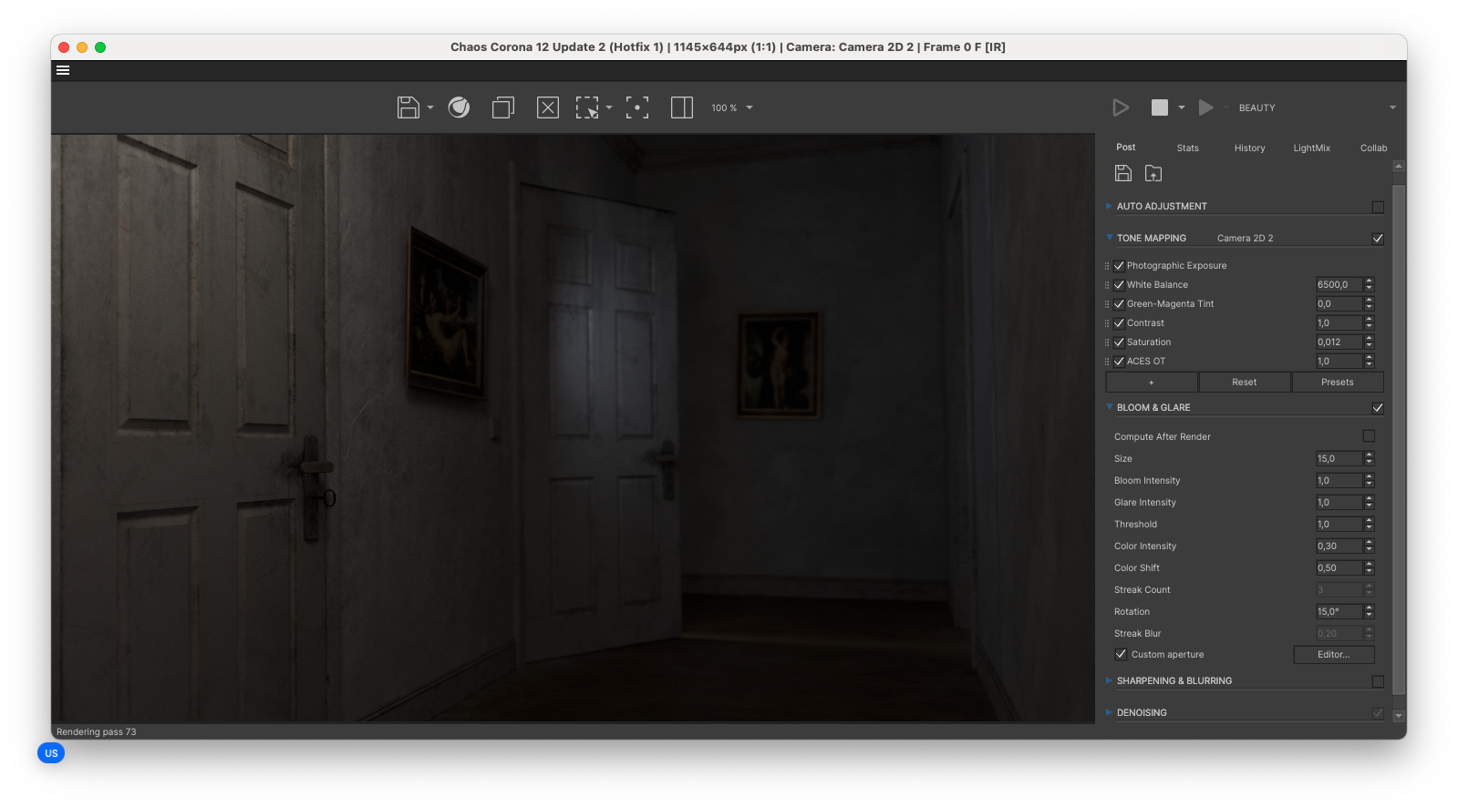
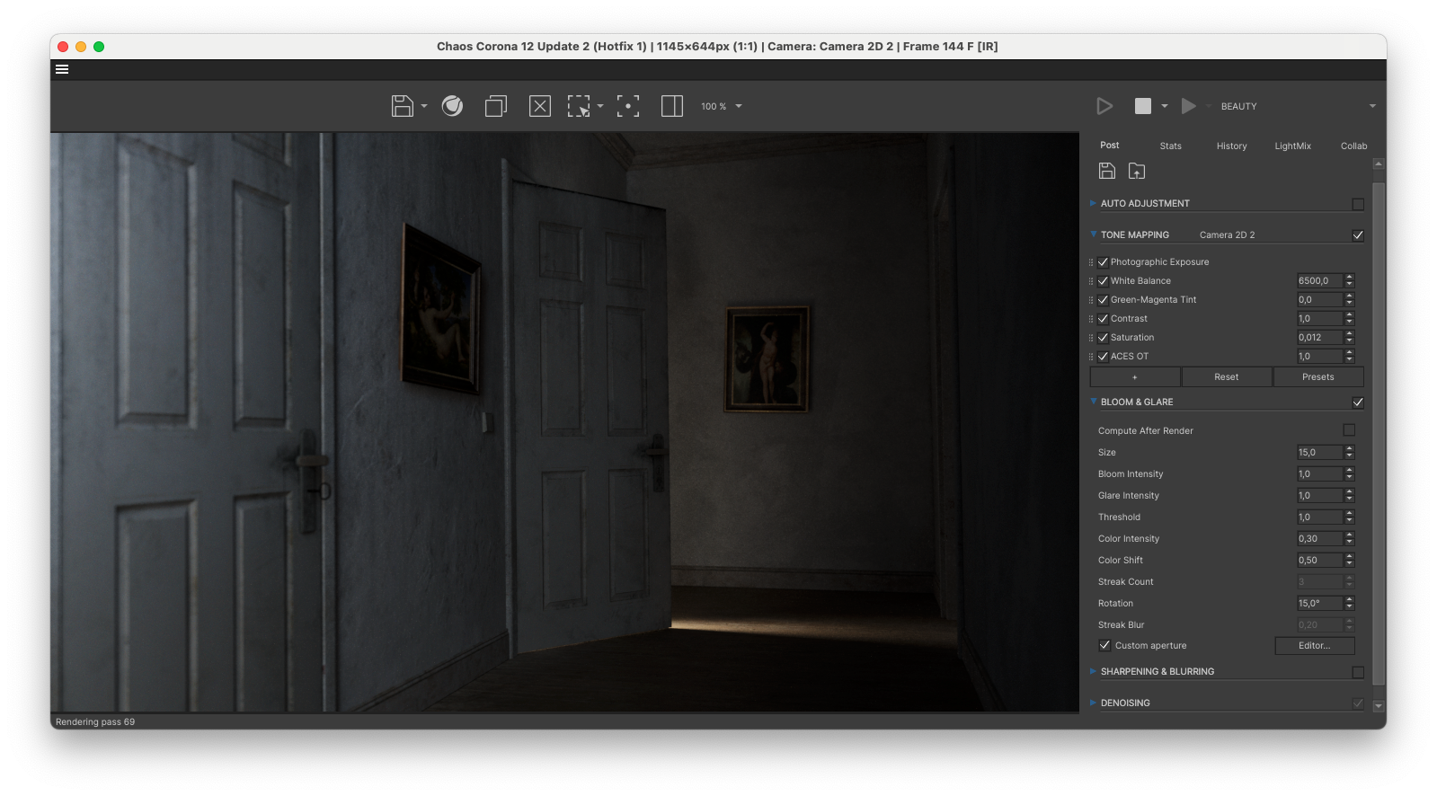
The Bedroom
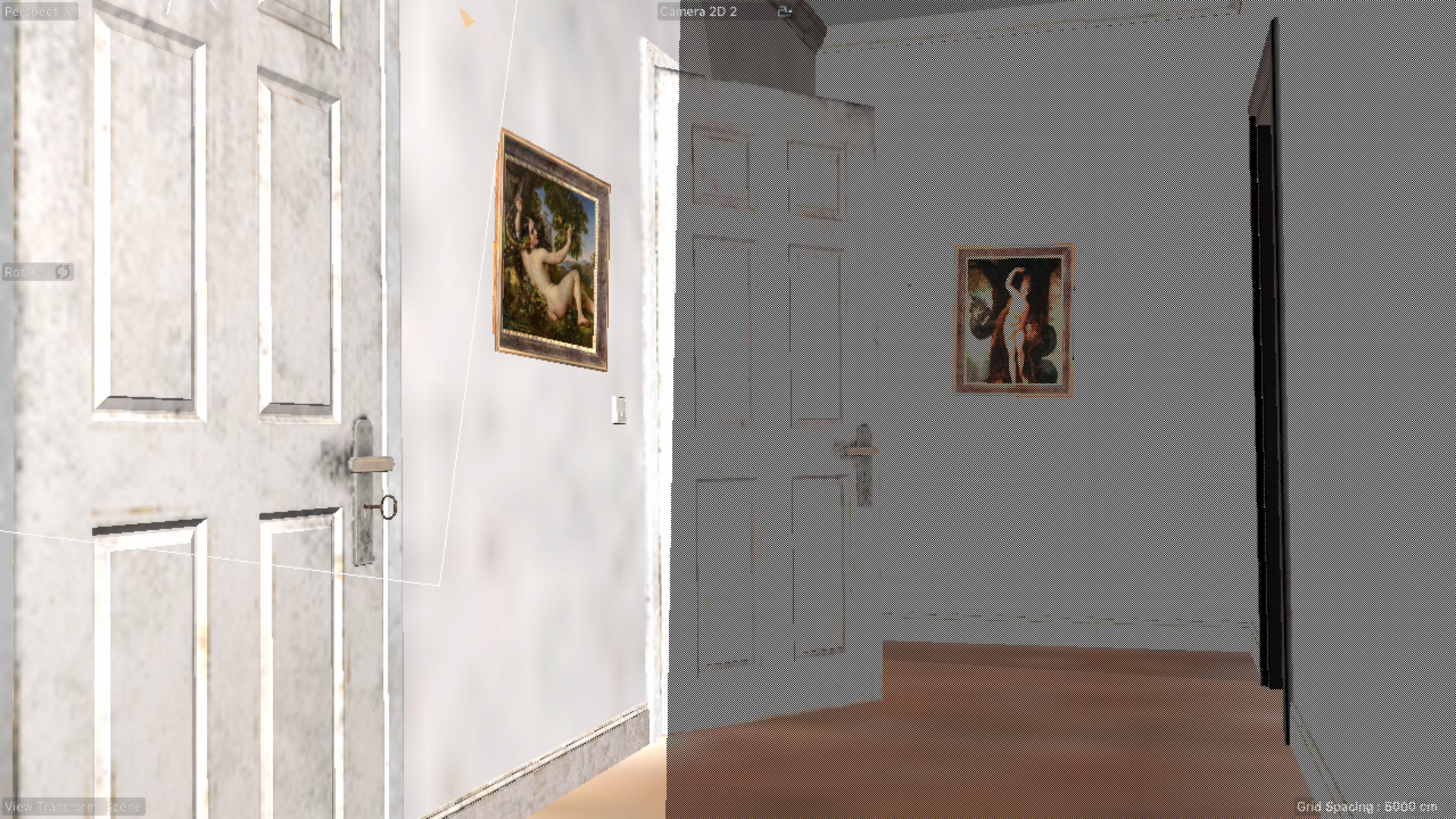
Inside the apartment, each room was treated as a separate environment. This decision was critical for optimizing performance in a 3D workflow. By reducing memory use we could be improving iteration speed, and it would allow for higher-resolution textures where needed.

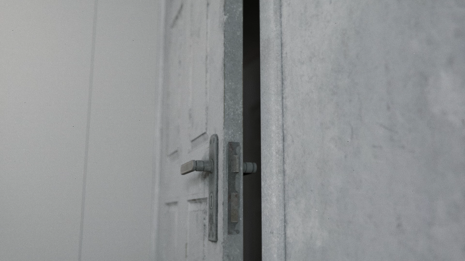
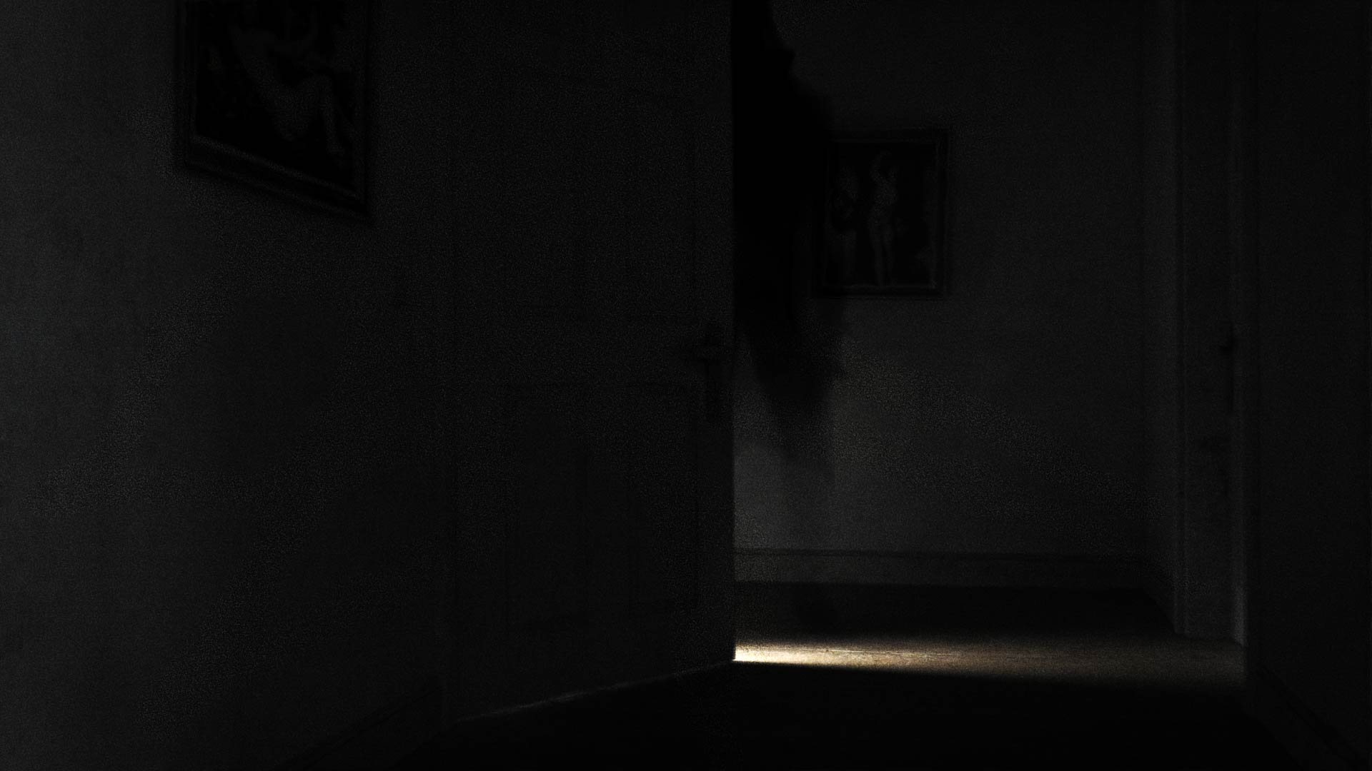
The design and layout of the bedroom could easily be extracted from the initial storyboards. However, the question remained: how does one give life to an environment built on stillness? The bedroom is a quiet place that might initially not feel like it had much opportunity for motion. We quickly figured out that by adding a simple Vibrate Tag to the Rotation of the doors we would add a subtle uncanny movement in the room. Especially in darkness and when the camera is mostly stationary this helps accentuate the eerie mood.
The same is true for the motion of curtains. In this case Charlotte simulated the curtains with a very subtle wind inside of Style 3D. We exported different versions with varying levels of wind intensity which we used depending on the shot.
The Apartment Hallway and Living Room
Except for the bathroom, the other spaces in the apartment served the purpose of empty spaces. The aim was always to cut-away from scenes through the use of pillow shots. This made the primary function of these spaces to be atmospheric.

Across all environments, mise-en-scène played a central role. Spatial proportions, material choices and lighting conditions were all designed to reinforce the film’s emotional tone. By subtly exaggerating reality we can create discomfort without breaking believability.
The design philosophy followed a “realism-first” approach. I started by collecting real-world references to which the environments were built before adding stylization. This ensured that even the most abstract locations felt uncannily familiar.
Grounding the environments in reality is what allows the surreal elements to feel unsettling.


When the environment feels believable, even small distortions begin to feel wrong. That contrast is what creates the uncanny effect we were aiming for. For the atmosphere of Apple Rot it is important to morph into the uncanny from this unsuspecting level of realism and naturalism.
At this stage I was pretty much ready to start building custom Resources for our 3D production pipeline to achieve specific effects we wanted. It was becoming time for testing, and testing and even more testing.
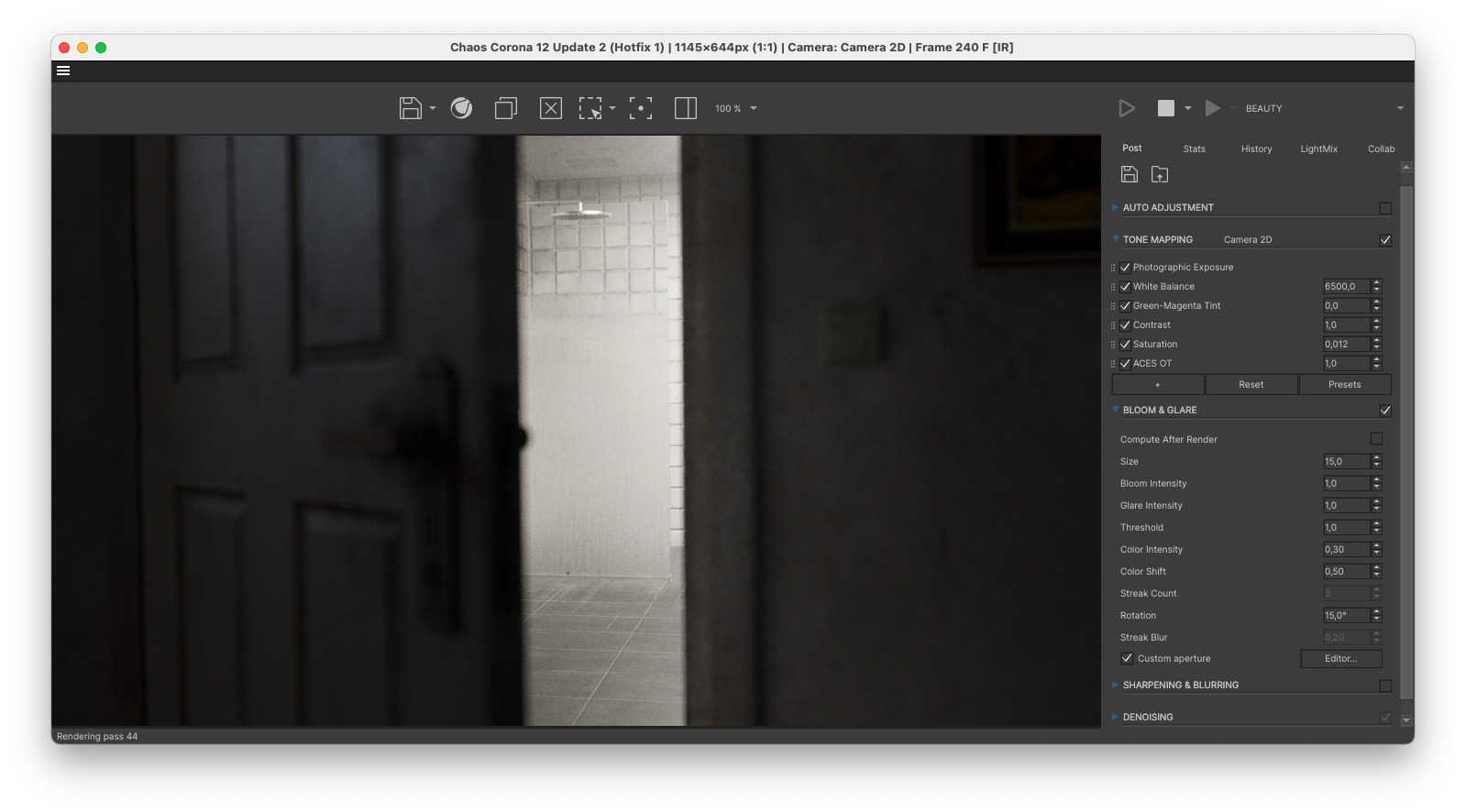
The Bathroom
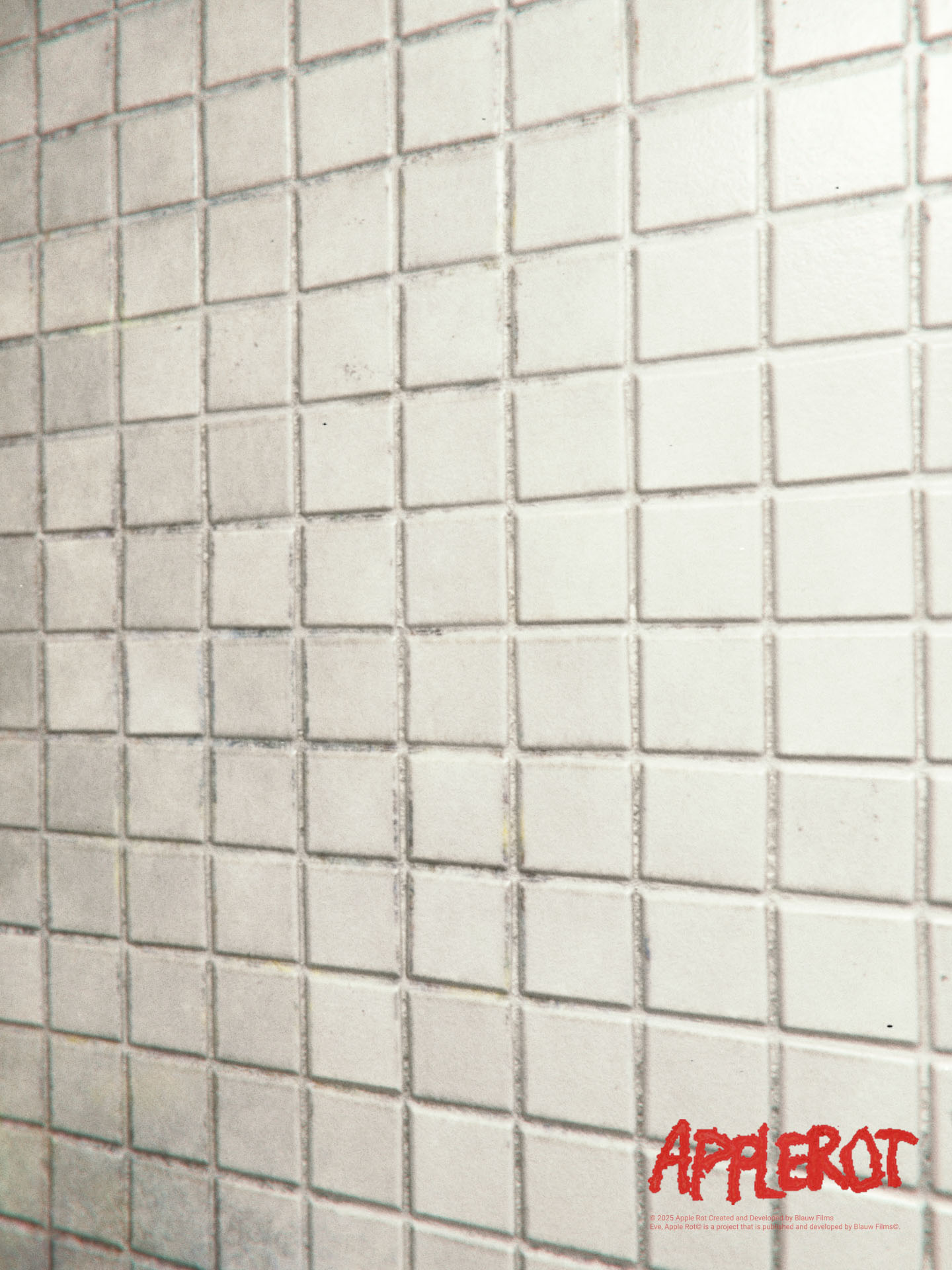
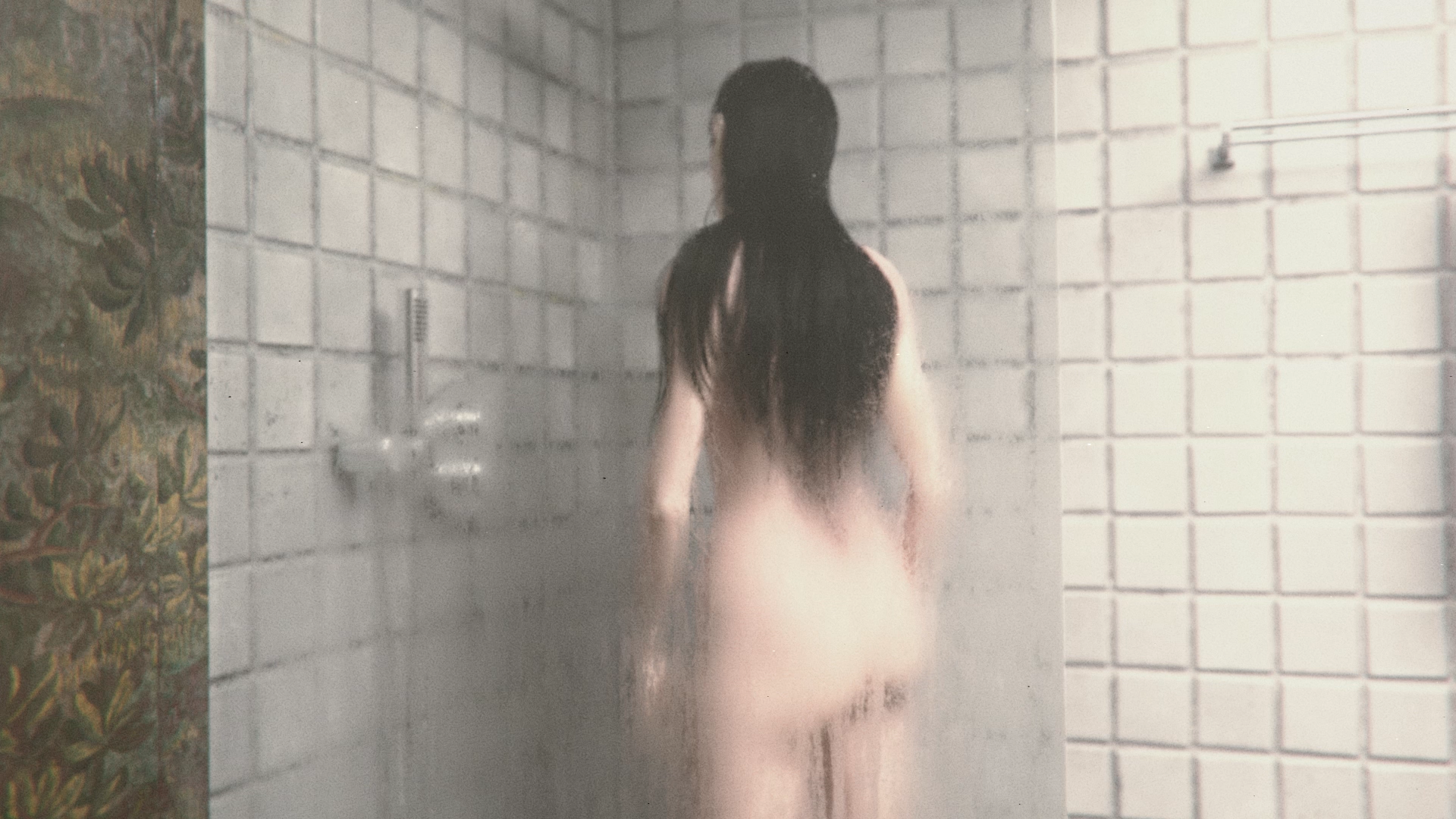
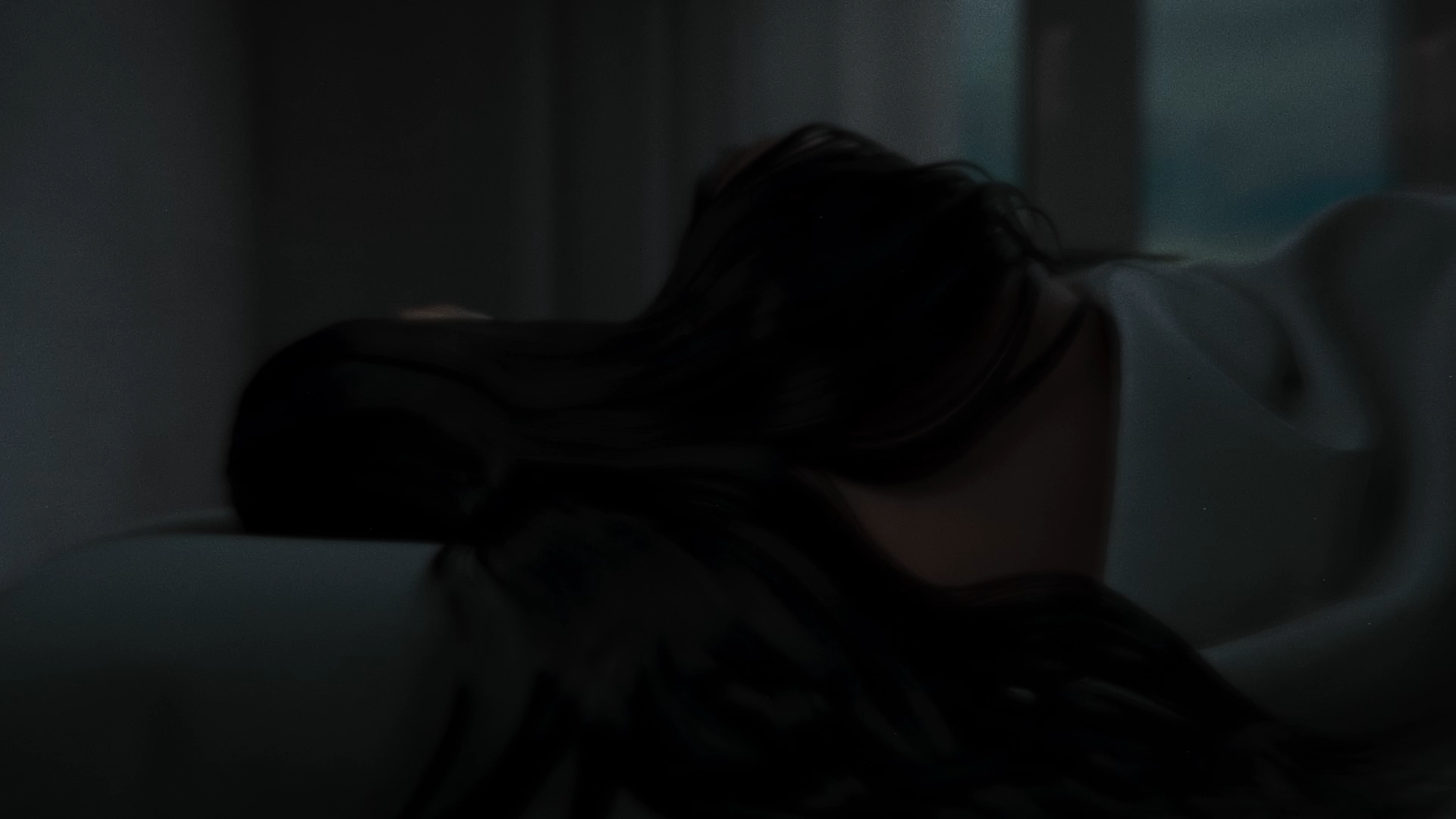
Finally we have the bathroom. This is the location where we find Eve taking a shower in the morning. We wanted the room to have bright white bathroom tiles. This would serve as a visual contrast from the darkness we’ve been accustomed to up till this point in the film.
The bathroom tiles were textured to have mouldy patches in between the grooves.
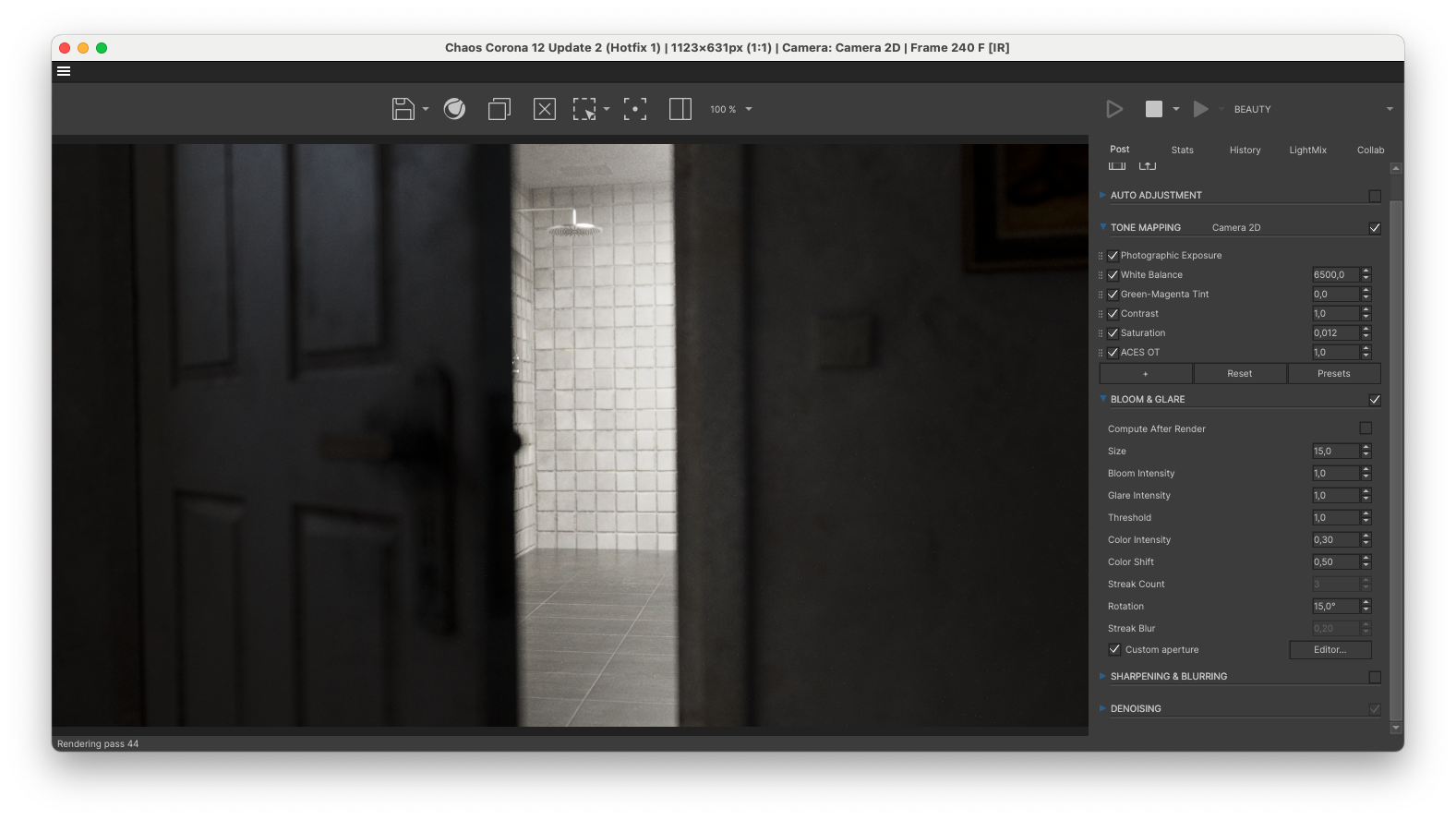
To create the illusion of Eve having just finished taking a shower, the environment was filled with a subtle Volume. This gave the scene the feeling of water vapor being present in the air. By being a volumetric effect rendered inside the 3D scene, it has the additional benefit of softening the shadows.
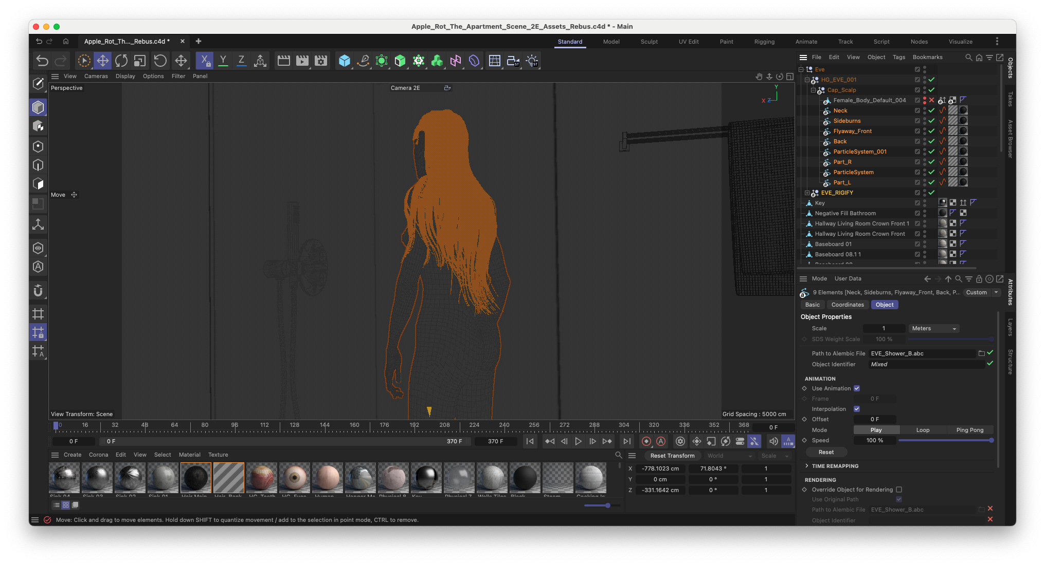
Finally, every asset in the scene was textured to include condensation, limescale and mould. Then the animated Eve asset was imported into the scene as an Alembic .abc file.

Expanding the Visual Language
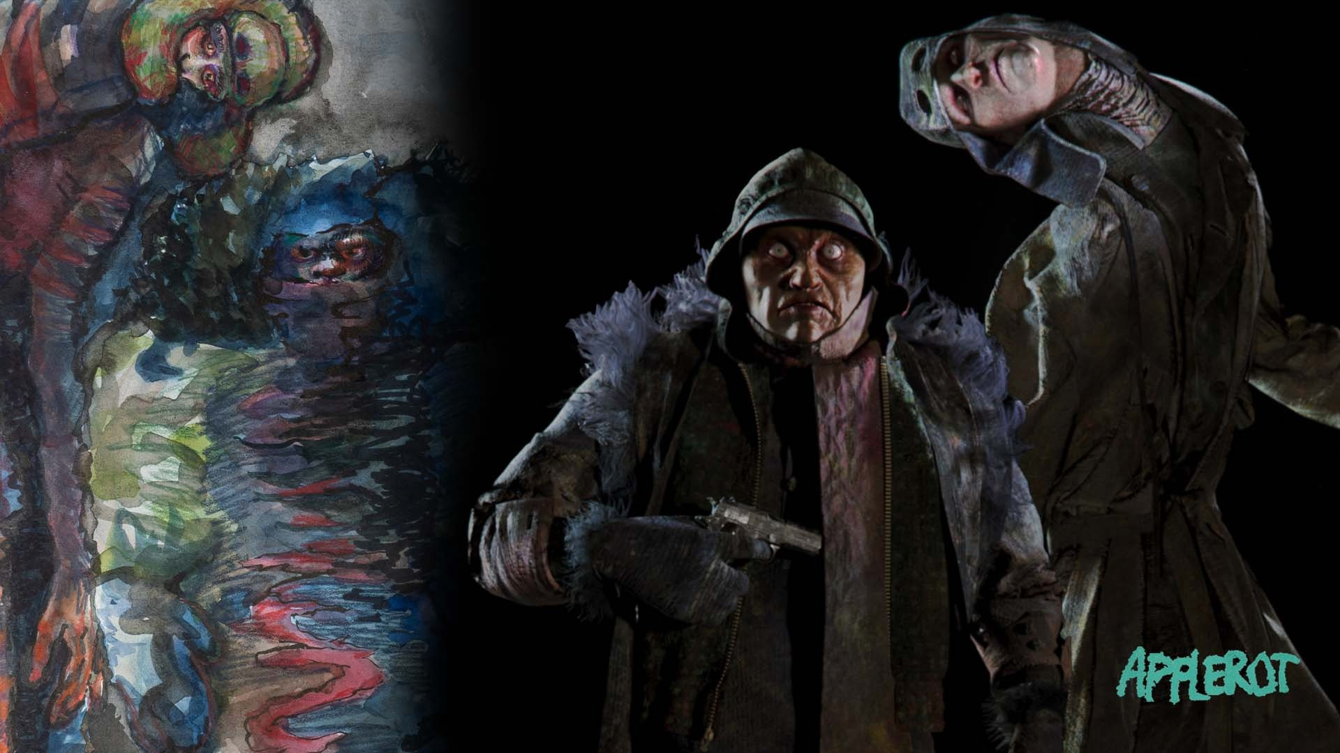
In the meantime Charlotte started working together with concept artist Ab Wienk on further defining the exact look of Sad Tall and Short Angry. Charlotte made a large scale canvas painting of the two sleep paralysis demons. This grim but toon-like painting was essential in demonstrating how the characters could exist beyond the constraints of the film while remaining recognizable.
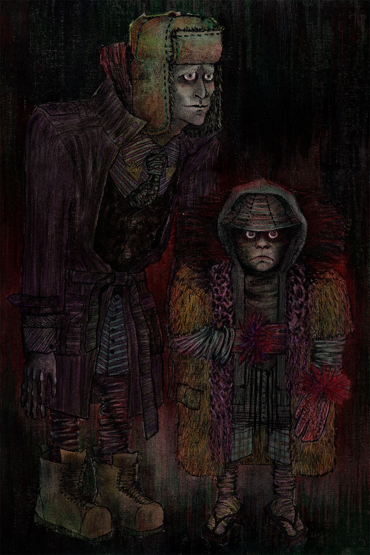

An important aspect of Transmedia is that the IPs style guide has enough flexibility to stay recognisable in a wide variety of mediums. A strong IP must retain its identity across different formats, styles and mediums. These additional interpretations acted as stress tests, validating the flexibility and recognizability of the characters.

Each iteration made the final designs even clearer, ensuring that the characters could function not only within the film, but across the broader Blauw Films ecosystem.
Technical Resources
When creating a 3D animated film you often run into technical challenges that are holding you back creatively. To truly achieve the desired effect you’ll have to dedicate a certain amount of time to Research and Development.
Beyond the immediate needs of the film, developing these resources is a long-term decision.
Each tool we build reduces friction in future productions and strengthens the visual identity of our IP. Over time, this creates a compounding effect where both efficiency and originality improve simultaneously. Due to all of our Resources being open-source, this stimulates a feedback loop. Other creators improve upon them and use them in their own productions.
Custom Resource Philosophy
At Blauw Films we are always developing digital Resources aimed to improve the production pipeline of 3D animation. Resources are not treated as one-off solutions, but as evolving tools that improve with each project. A resource developed for one production is refined, expanded, and redeployed in the next, creating a compounding effect over time.
There were several things we knew from the start that we truly wanted for Apple Rot. Organic looking textures and lots of grunge that makes the film almost feel like found footage.
If we look backwards from the final stages of compositing all the way to the texturing of the characters we knew we had pretty much all custom resources developed to make Apple Rot. Custom resources also help make the film feel truly yours while achieving the look and feel you desire.
Digital Camera Noise Overlays
It was essential for us to break away from the clean, synthetic look that you get from unprocessed 3D renders. To create a strong grunge we knew we were going to use the Digital Camera Noise pack. Unlike traditional film grain, these overlays consist of aggressive RGB noise patterns. They introduce digital banding, color variation and imperfect sensor texture into the image. This helped degrade the digital sharpness of the renders while adding a unique distorted look.
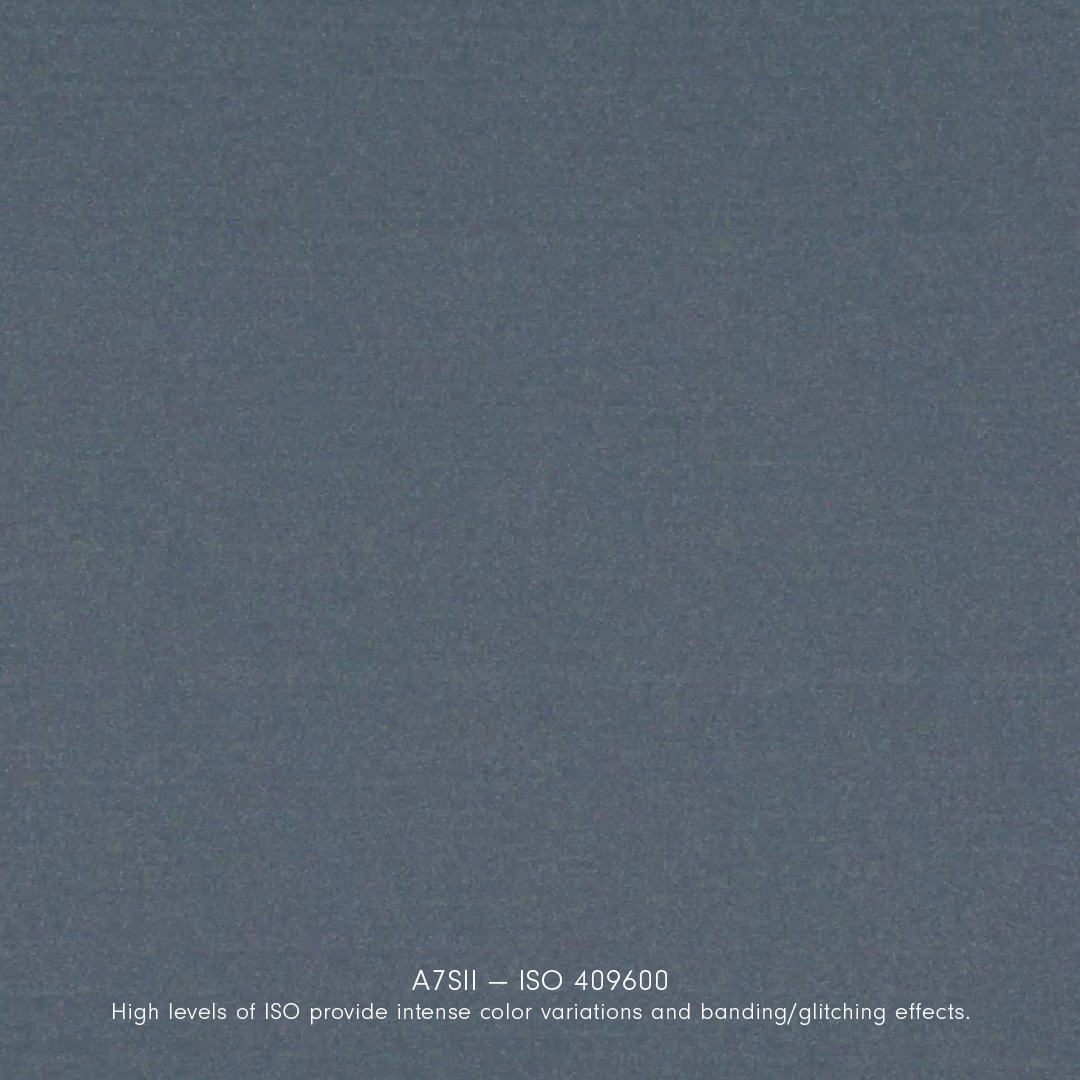
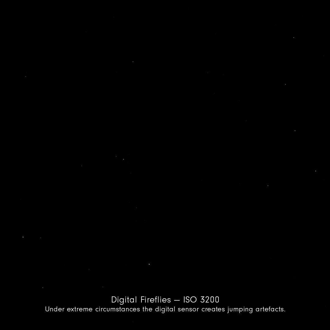
The assets were captured from different cameras in every ISO:
- Subtle application for realism and integration
- Heavy application for stylization or surveillance aesthetics
For Apple Rot, we intentionally pushed the effect much further. Reaching the limit of where the digital noise takes over the footage. We have noticed that especially on a compressed upload such as on YouTube the film becomes quite pixelated due to the noise. However, for any high-fidelity viewing experience such as on the Blauw Player, Blu-Ray or cinema screening you can truly appreciate the digital noise.
Bokeh Builder Workflow
The effect of noise and grain is most notable on large surface areas without sharp detail. So to amplify the effect of the noise overlays, we leveraged our custom Bokeh Builder tool.
Bokeh refers to the visual quality of out-of-focus areas in an image, defined by the shape and behavior of the lens aperture. Our Bokeh Builder resource is the easiest way to customize your aperture maps that are used to render out the bokeh in 3D.
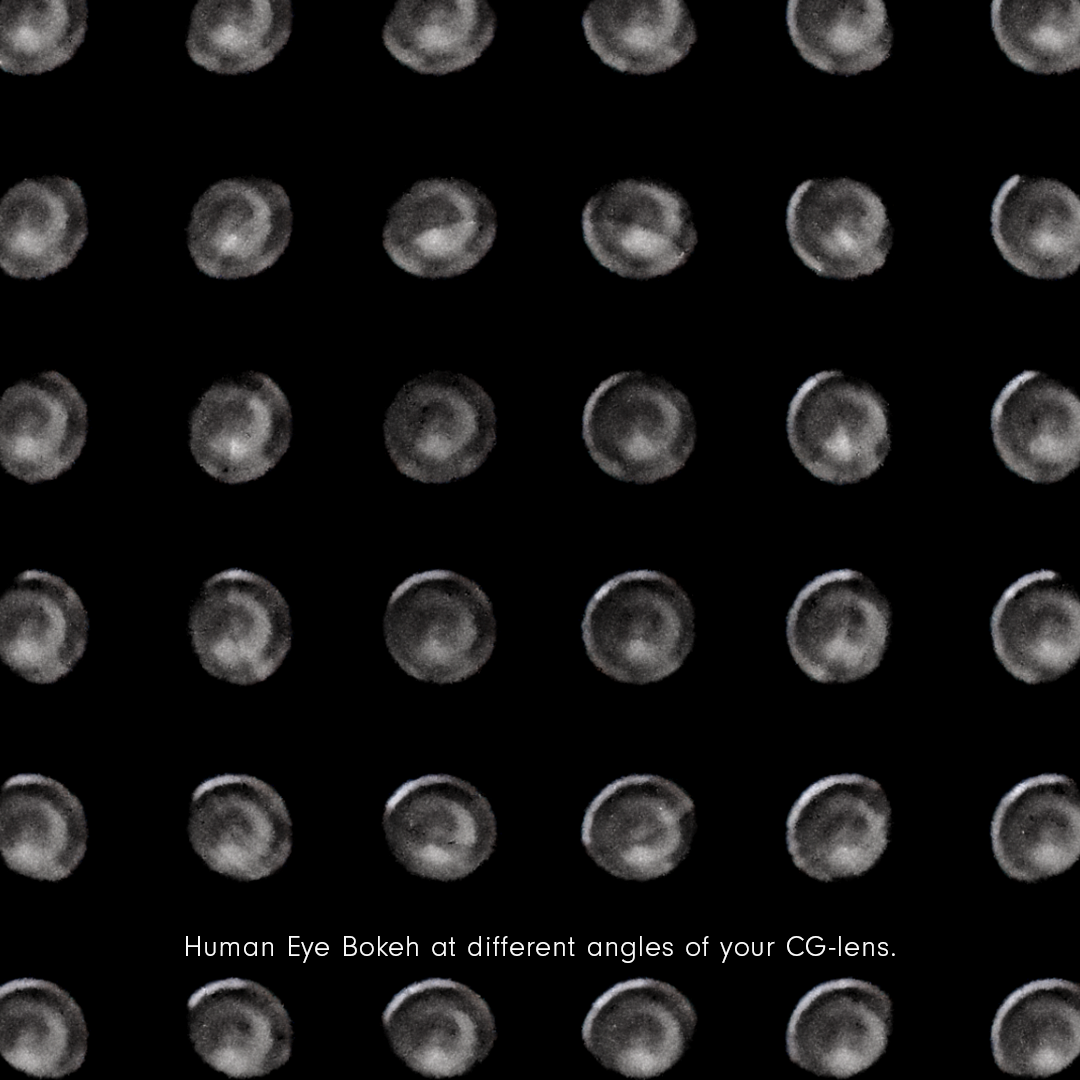
By customizing aperture maps, we were able to introduce irregular, distorted bokeh patterns, enhancing the dreamlike and surreal quality of the film. In some cases even going as far as hiding demonic faces inside the bokeh. This is such a subtle detail that really only starts being visible in the final render but it does make the film have a slightly distorted texture in everything that’s blurred out. It’s especially visible when you watch the film in the highest resolution you can find.
Texture Development Pipeline
As we knew that much of the film was going to be out of focus or moving, we could afford some resolution optimisation for many of the textures. However, it’s important to spend as much time as you have for texturing as this is where you can extract most detail out of your assets.
Texturing was approached in an expressive way to allow for a rich and unique look to the film.
The process was built on three core pillars:
- Sourcing high-quality texture maps
- Capturing custom photographic textures
- Developing bespoke brushes and detailing tools
Using the script breakdown as a foundation, each asset was broken down into their fundamental components. For example, a character such as Sad Tall would be broken down into:
- Sculpt and anatomical structure
- Skin detailing
- Clothing simulation
- Fabric textures
- Secondary detail layers
- Imperfections and wear
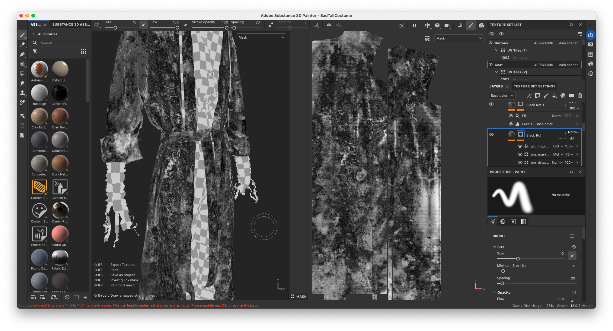
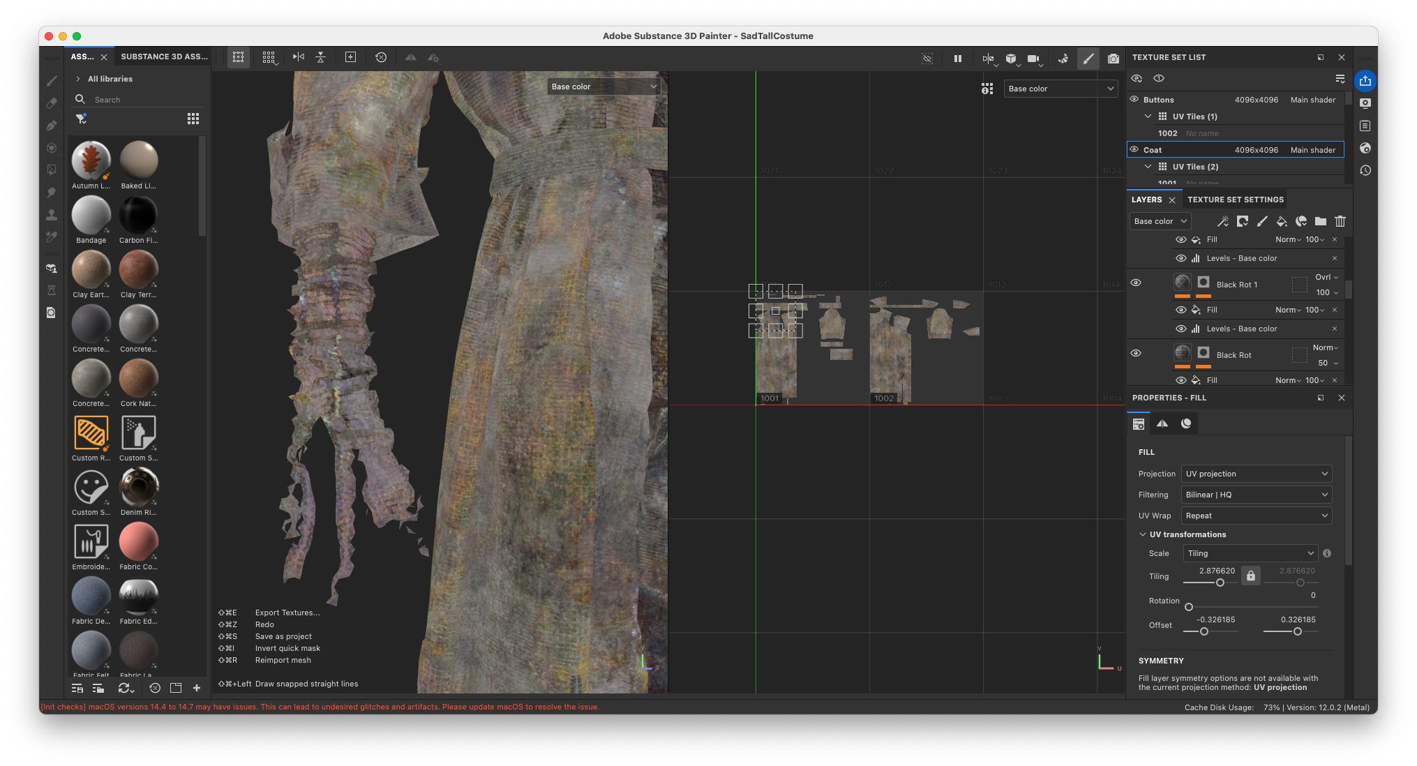
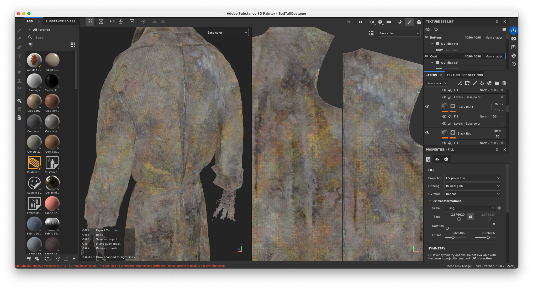
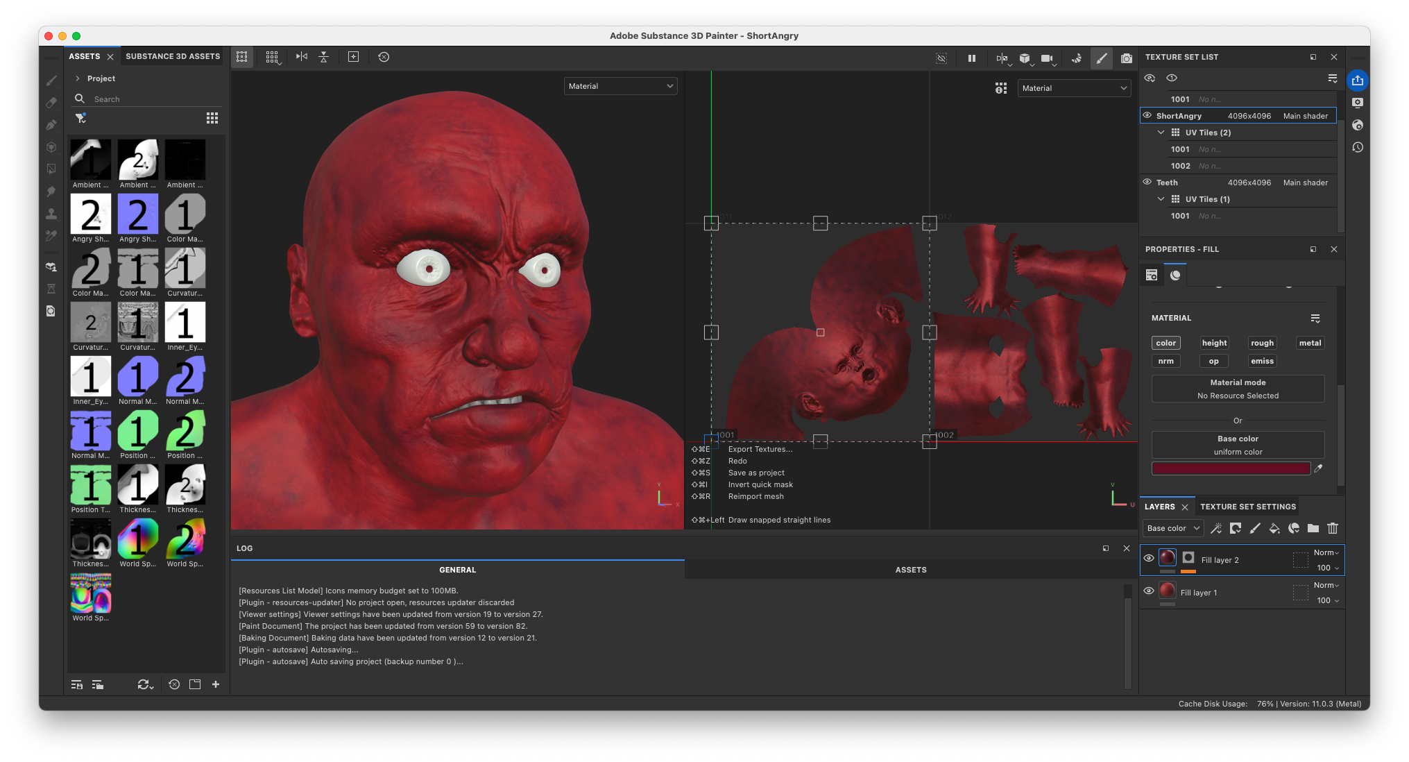
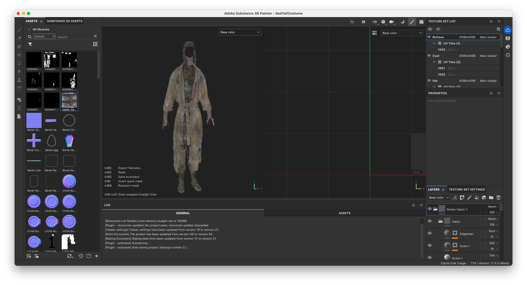
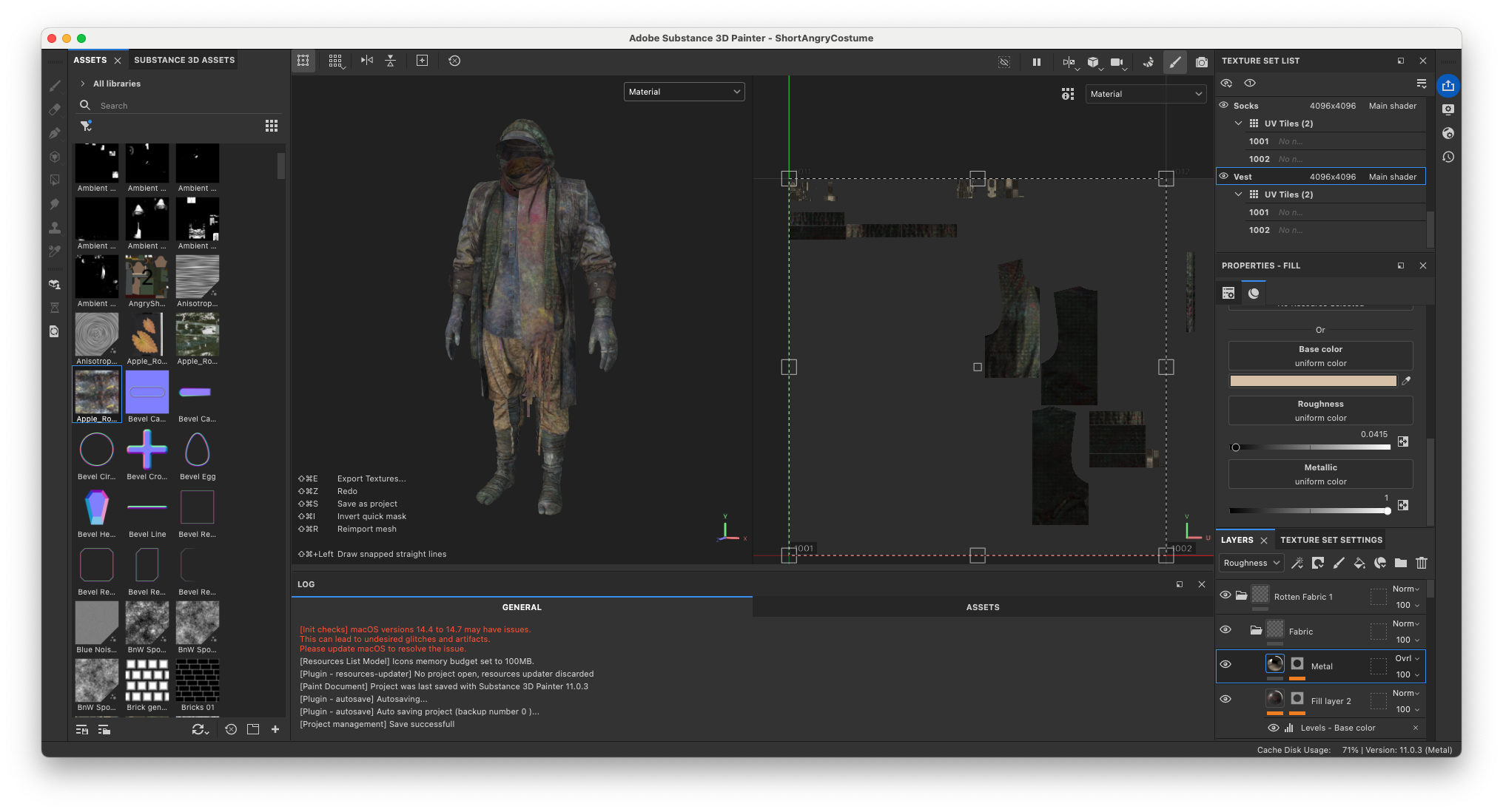
Through our collaboration with Bakermat Antwerp, we were able to access a wide range of high-quality fabric textures. This allowed us to use the exact fabrics we desired for each piece of clothing. These materials were then heavily processed in Adobe Substance 3D Painter. Layered, degraded and combined with our custom texture library of rotten materials to achieve the final look.
Through the power of Substance 3D Painter’s Anchor Points we could use the highly detailed Normal Maps from Bakermat as a driver for where to place the rotten textures. This allowed for custom details right on top of the threads of the fabrics.
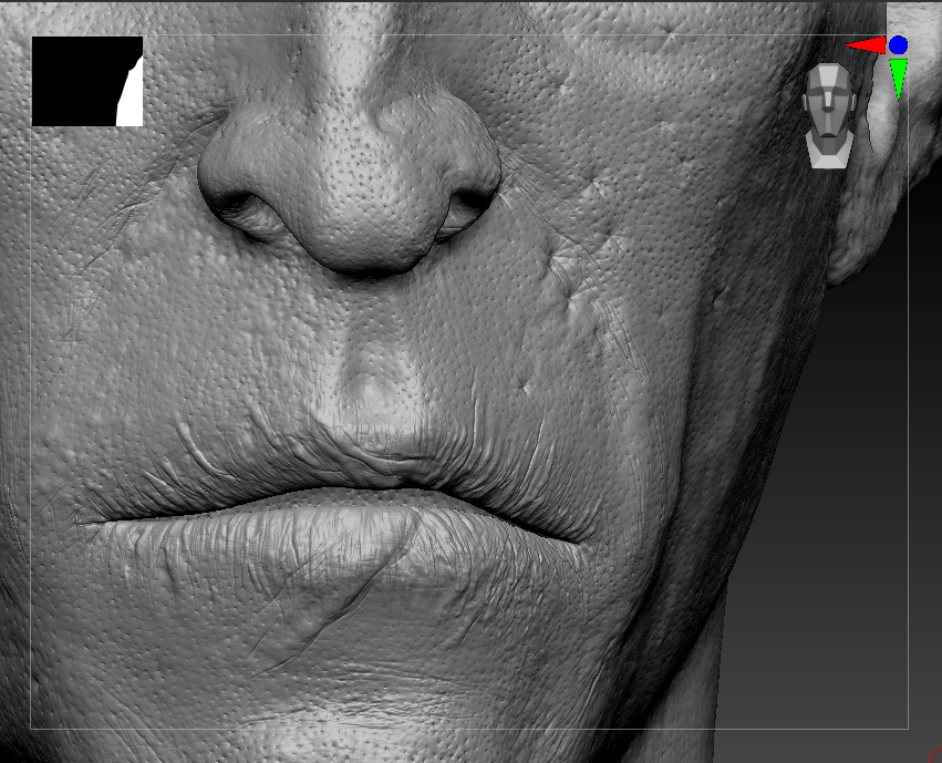
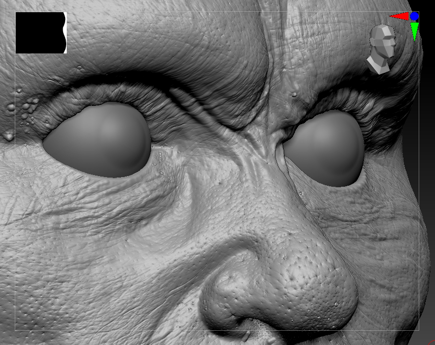
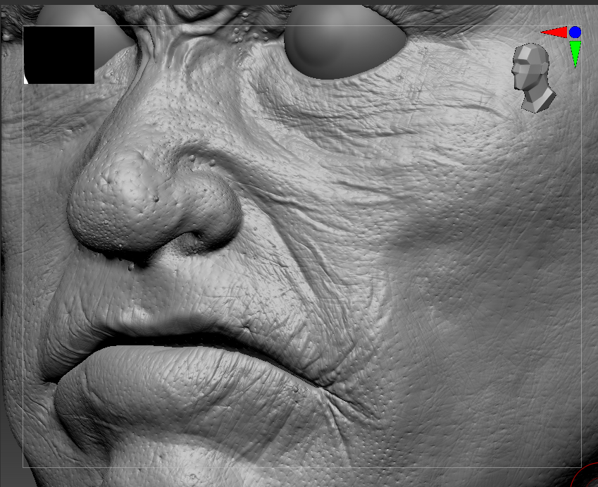
For skin detailing in Maxon ZBrush, we make extensive use of JHill’s Skin Details Kit brushes. It’s important to spend a good amount of time on adding low-frequency, mid-frequency and high-frequency details. All while not overdoing the details or letting one layer of detail overpower the next. During this process, Charlotte would share screenshots with us to evaluate progress. And we would Look-Dev the models in the final stages to decide on the final level of details.
All textures were painted and refined manually, with a strong emphasis on layering. By combining variations in color, roughness, height, and normal maps, we ensured that surfaces always had an interesting response to light. Especially ensuring it maintained visual interest in low-light conditions.
Original Score by King Khamen
A key aspect of the Apple Rot production is our long-term collaboration with King Khamen. Instead of treating the music as the final layer that is composed during post-production, we approach it parallel to the creative development. It evolves alongside the film’s design phase.
This collaboration is built on years of trust and open communication. We don’t over-direct the musical direction. Instead, we spend several sessions discussing the themes, story and atmosphere with King Khamen. We give very few specific notes to allow space for creative interpretation. The result is consistently surprising, yet perfectly aligned with the emotional and thematic core of the project.
The first time we had a listening session we were greeted with the tracklist:
I. Uno, II. Dos, III. Tres.
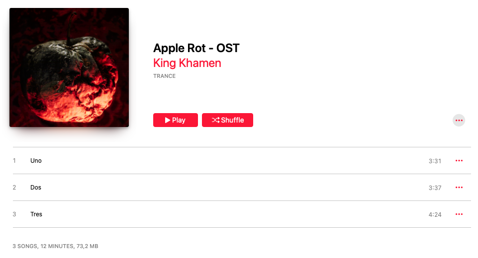
Even the name of the tracks somehow just felt right.
Album-First Scoring Approach
A key part of our workflow is to develop the score as a complete body of work, instead of scoring the film on a scene-by-scene basis. At the time of composing the music, the film had not yet been edited. Instead of waiting for all the scenes to be animated and rendered out as viewport renders, we provided the full narrative context of Apple Rot. This allowed the music to be created as an independent interpretation of the story.
This approach naturally results in recurring Leitmotifs across the soundtrack. These motifs are not exclusively assigned to specific scenes. However, they do serve as emotional anchors that can be intuitively placed in the right moments of the film during the editing process.
For us, this creates a much more fluid relationship between sound and image. Rather than forcing a soundtrack to adhere to the film, we allow the music to create something interesting. The juxtaposition of the music with the film organically transforms it into something new.
Music as Narrative Infrastructure
By the time we reached the editing stage of Apple Rot, we were incredibly familiar with the music. We understood the meditative and uncanny effects the music has and what parts would work well for different scenes. Once the pieces of music are selected and laid out on the timeline it always changes the flow. It informs pacing, emphasises emotional beats and fundamentally solidifies the pacing of the film.
This process allows for a more instinctive editing process:
- Beats in the scene are shaped around emotional flow
- Music is placed where it amplifies the scene
- Silence is equally as intentional as sound
The result is a soundtrack that feels inseparable from the film, despite being developed independently.
Long-Term IP Value
As the Original Score for Apple Rot exists as a standalone body of work, it continues to influence the broader Apple Rot IP way beyond the film itself. Especially internally we love listening to the Apple Rot score when developing new artwork, stories or any visual branding for the Apple Rot universe. It immediately transports us back into this nightmarish world.
This highlights an important principle:
Music is not only an accompaniment to the IP. It’s an extension.
The Waiting in Between
Between each of these development phases, there is a period that is often overlooked but critically important: the moment of reflection and alignment.
These are the moments in between.
We take the time to look back at what we’ve been building so far. Design, narrative, technical development and sound are discussed internally. We tend to go over the screenplay and script breakdown one more time to see how far off we are from our goals.
We ask ourselves several critical questions:
- Does the visual language support the narrative intent?
- Are the technical solutions enabling the creative vision?
- Is the emotional tone consistent across all elements?
For Apple Rot, this period helped us gain the confidence we needed. The film was now a cohesive project with an incredibly clear identity.
Reaching this point is essential. It proves to you and to the team that the project is ready to transition from exploration into action. We could now start the actual production.
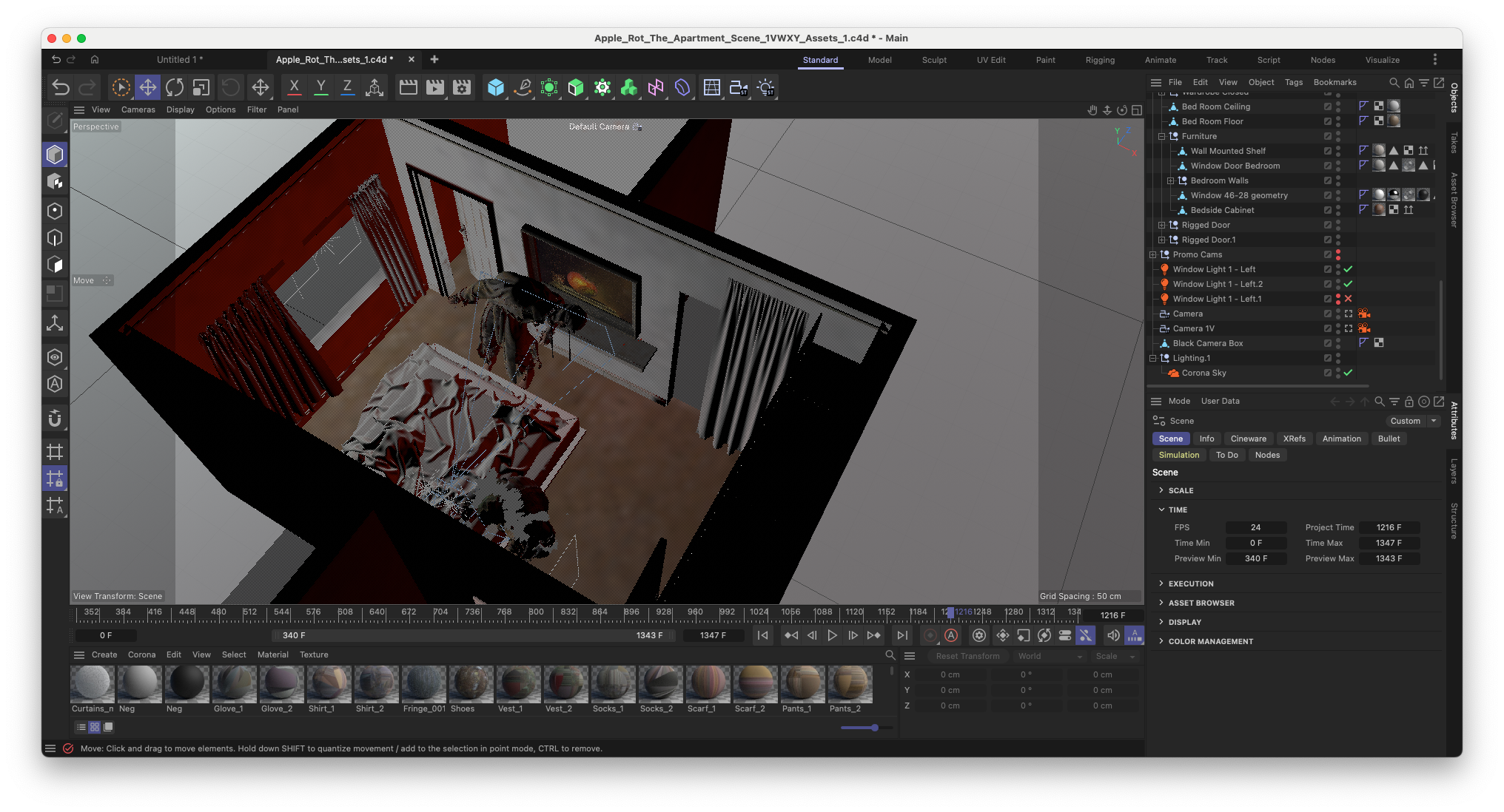
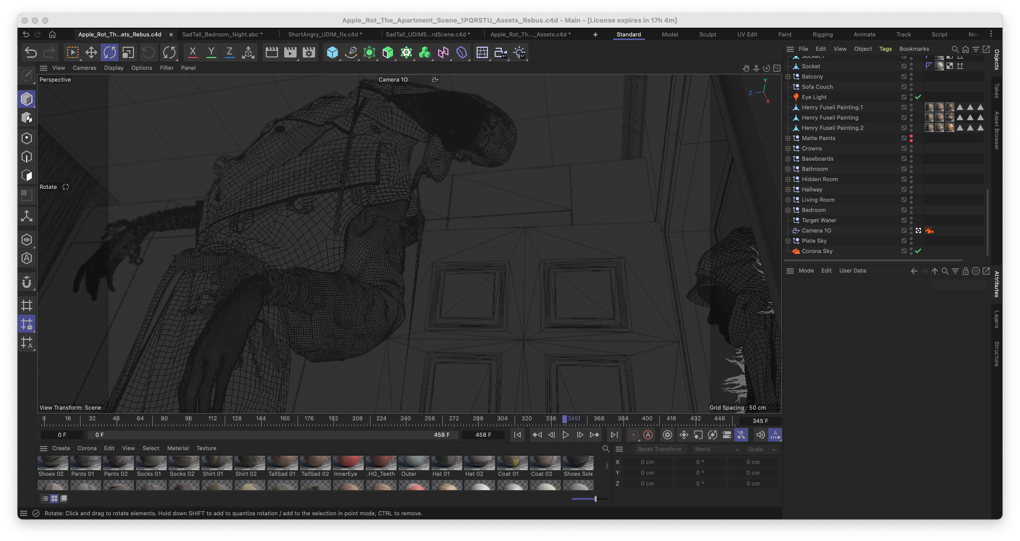
3D Animation Production Pipeline for Apple Rot
At some point in your early development journey you’ve set everything in place and are down to two final challenges to overcome: hours of labour and funding for production costs.
We had just reached this stage.
So it was time to make a clear assessment of what we had, and more importantly, what our rollout and distribution strategy was going to look like. Your ability to distribute a film is one of the most valuable levers you have when it comes to securing funding or partnerships. Especially in the independent film industry.
The good thing is that Blauw Films has always been built with distribution in mind. It’s an essential part of our business model. By distributing the film directly to our audience through Blauw Films, we avoid the middlemen and connect the work with people who actually care.
At the same time, Apple Rot is not a one-off release.
As we continue expanding the Apple Rot universe, new content continuously creates fresh entry points, bringing in new audiences while giving existing audiences reasons to return. Alongside digital distribution, we are also organizing physical screenings. These reach entirely different audience groups, creating a broader discovery and engagement ecosystem.
This ongoing cycle creates long-term exposure for both the film and the partners involved.

Partner Alignment
With this foundation in place, we reached out to the partners we already had strong relationships with:
For us, it’s essential that partners align with the mission and vision behind the project. It was amazing to see how both companies immediately understood what we were building and wanted to be involved.
Their support allowed us to:
- Offload the otherwise time-intensive rendering process
- Maintain access to the tools required to execute at a high level
By early September 2025, production was fully underway. Our goal was to complete the film by the end of October 2025.
Modelling the Apartment Locations
To emphasise the uncanny nature of the film, we designed the apartment with slightly exaggerated proportions.
- Higher ceilings
- Expanded spatial layout
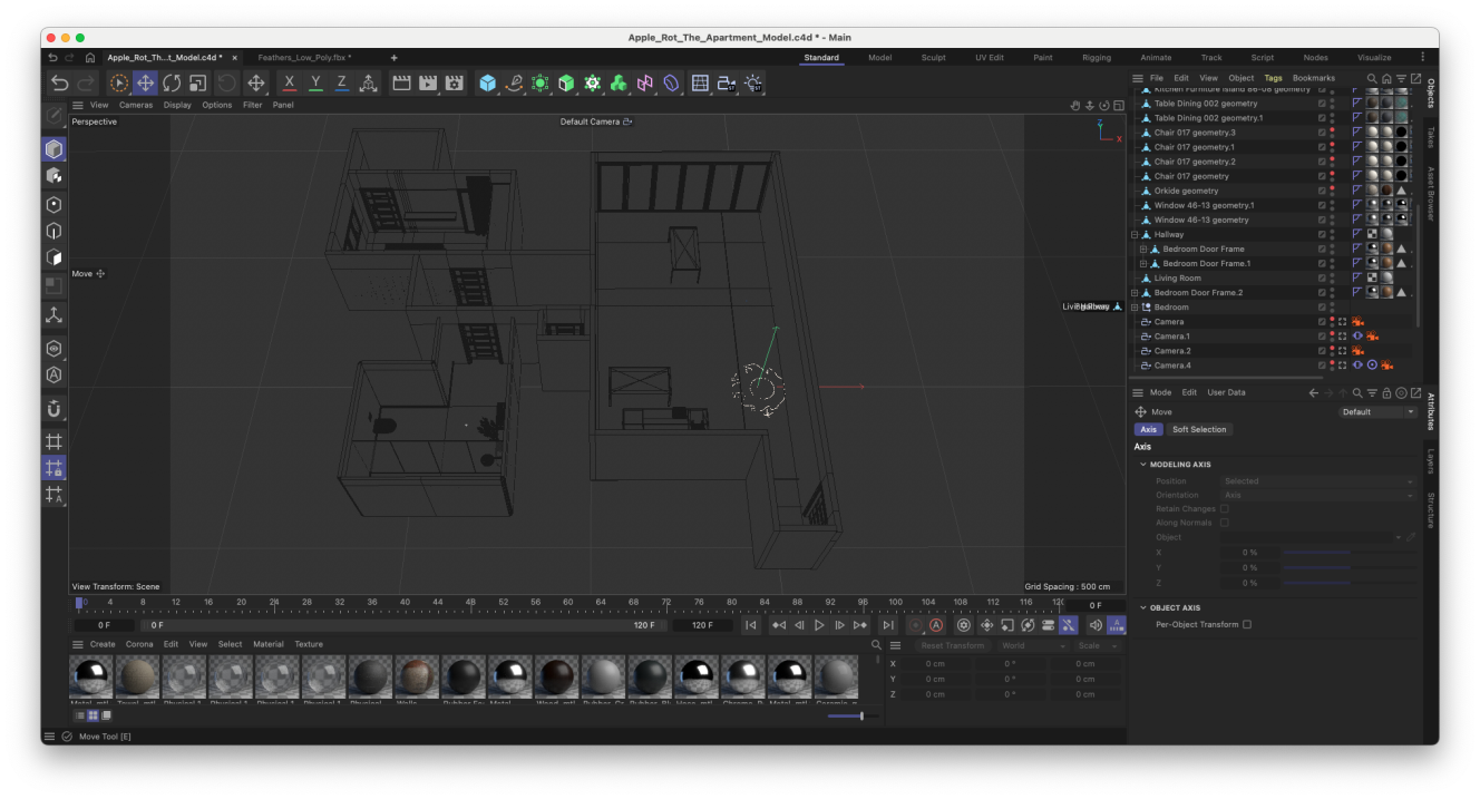
It’s a subtle change. Mostly unnoticeable. But it’s enough to create a sense that something isn’t quite right. At the same time, it allowed us to capture more within the frame while staying consistent with a 50mm lens.
Texturing the Apartment
The apartment environment is made up of a relatively small set of asset types:
Walls, floors, baseboards, crowns, and doors. This made it ideal to approach them using Smart Materials in Adobe Substance 3D Painter.
Each material:
- Started from a simple base (e.g. white plaster)
- Was layered with grunge maps to break uniformity
- Integrated color variation using our rotten texture library
Even the simplest materials start to feel alive when there is enough variation in every channel of the texture set. Each Smart Material references object-specific Normal Maps through Anchor Points, ensuring that detailing remains unique per asset.
After applying a Smart Material it becomes important to consider:
Is this asset background or is it a hero object?
Only a small number of assets required additional manual detailing. For those, I layered further detail until everything felt balanced and intentional.
Texturing the Props
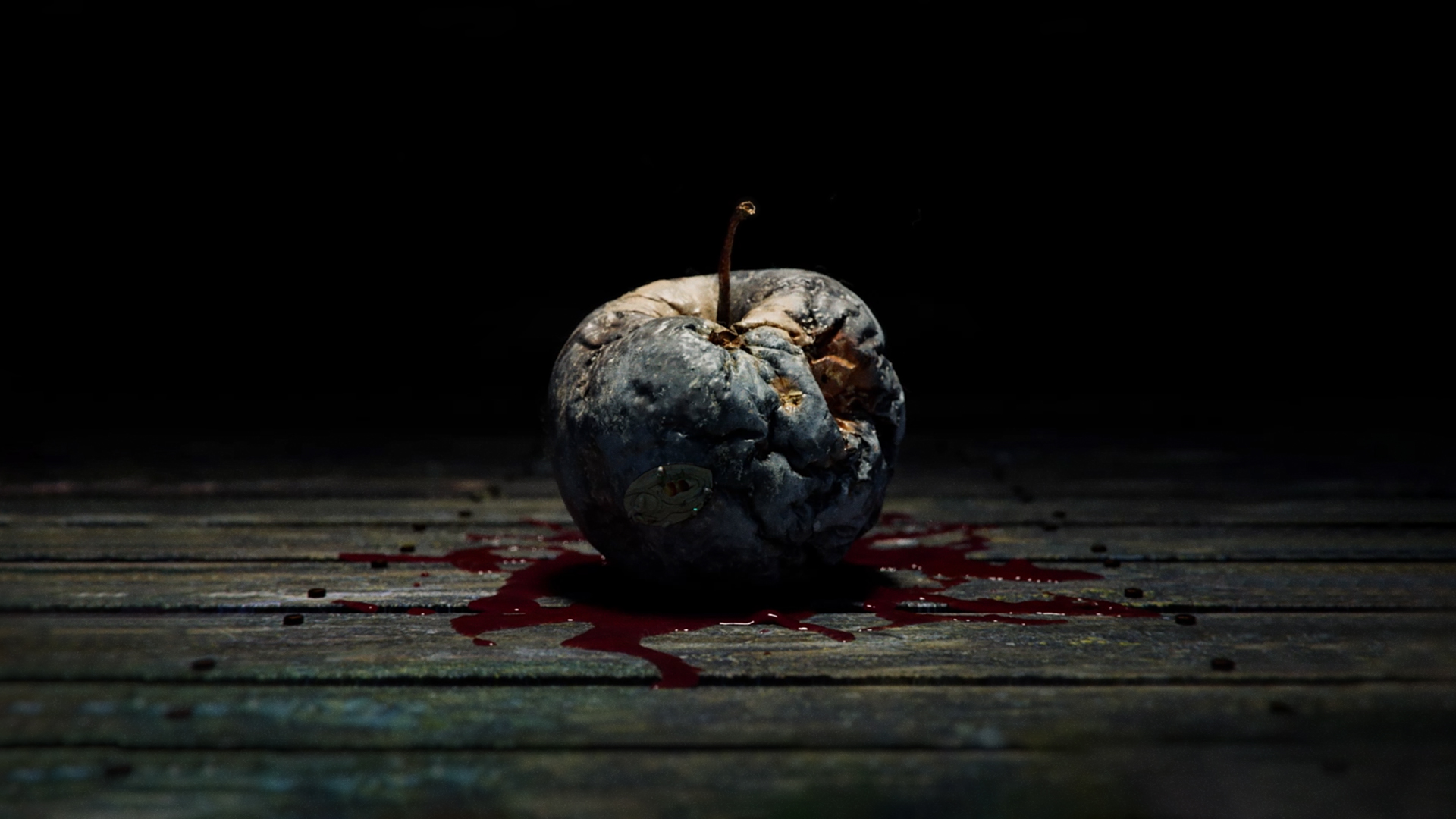
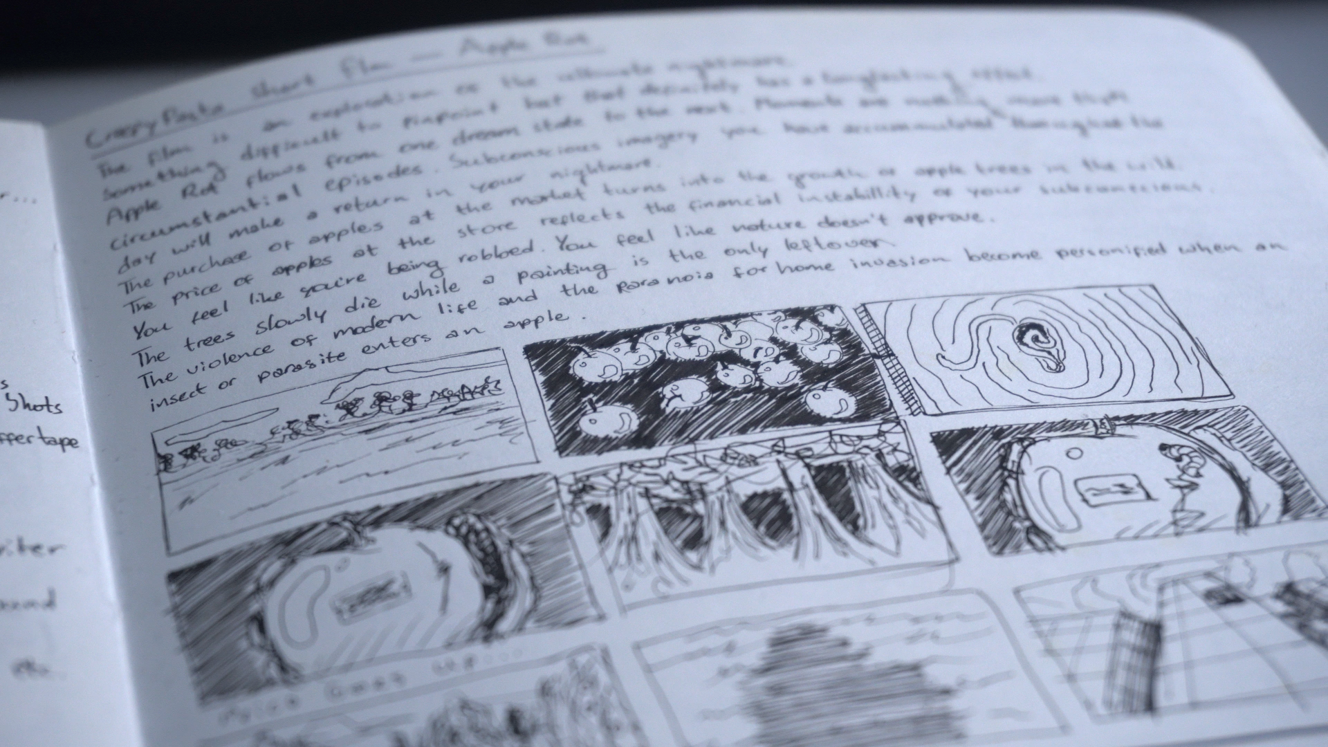
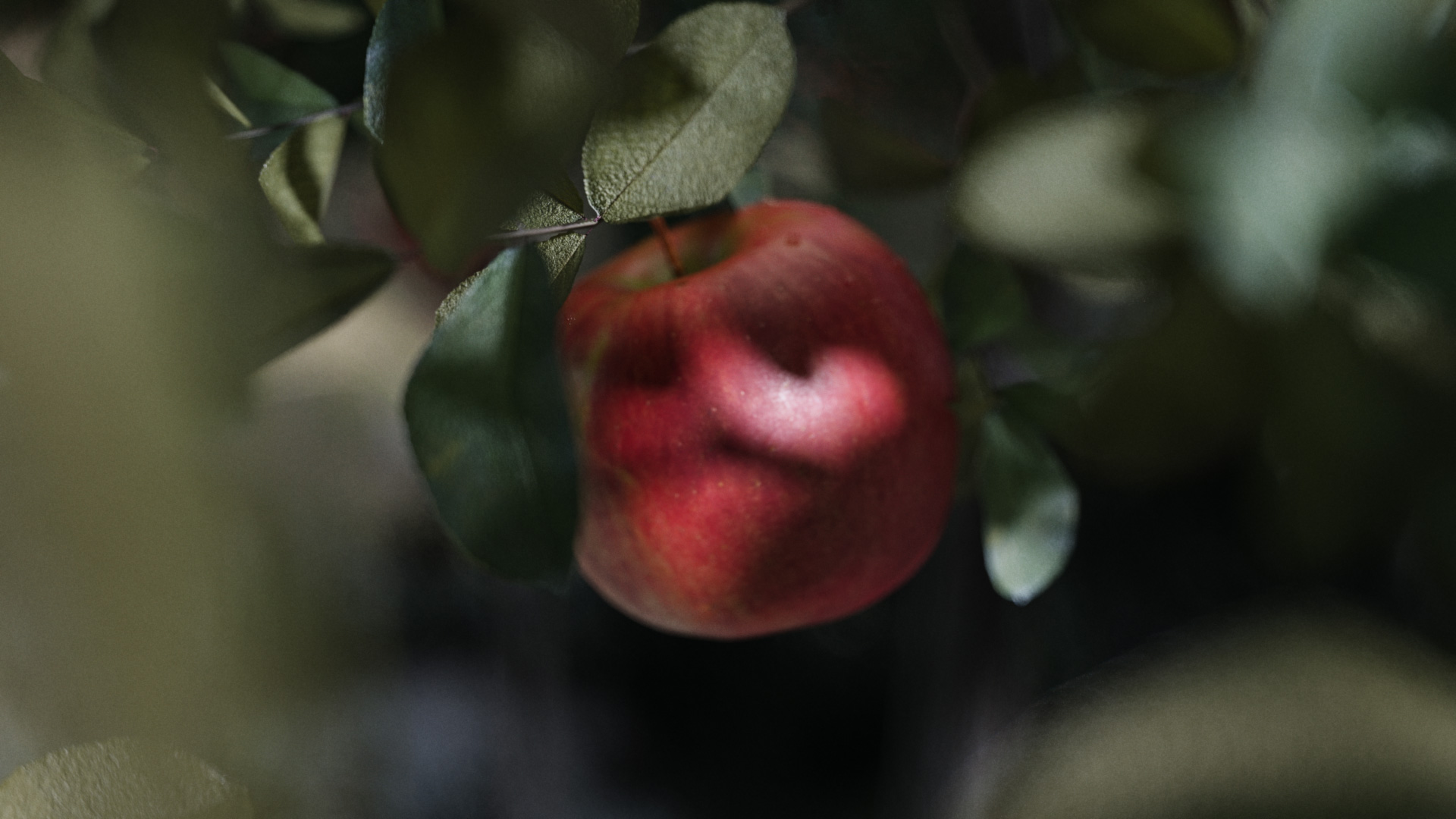
Throughout Apple Rot there are three important props. The apple from the Genesis Orchard, the apple painting in the bedroom and the Colt M1911 pistol that's carried by Short Angry.
Each of these elements were part of the initial nightmare that sparked the inspiration of Apple Rot. And their textural feeling was clearly present from the start as well.
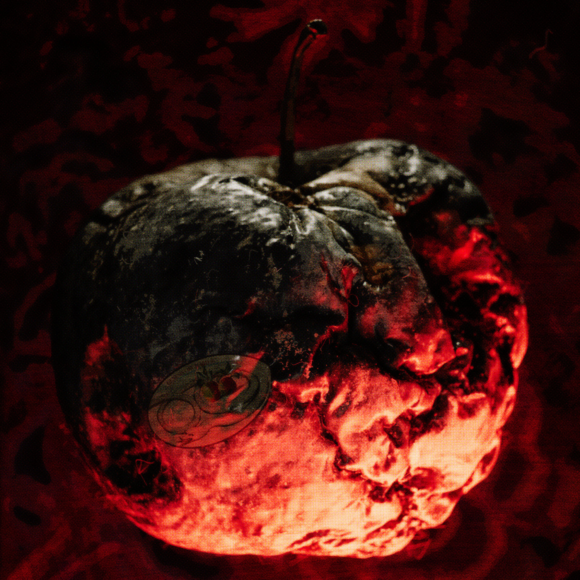
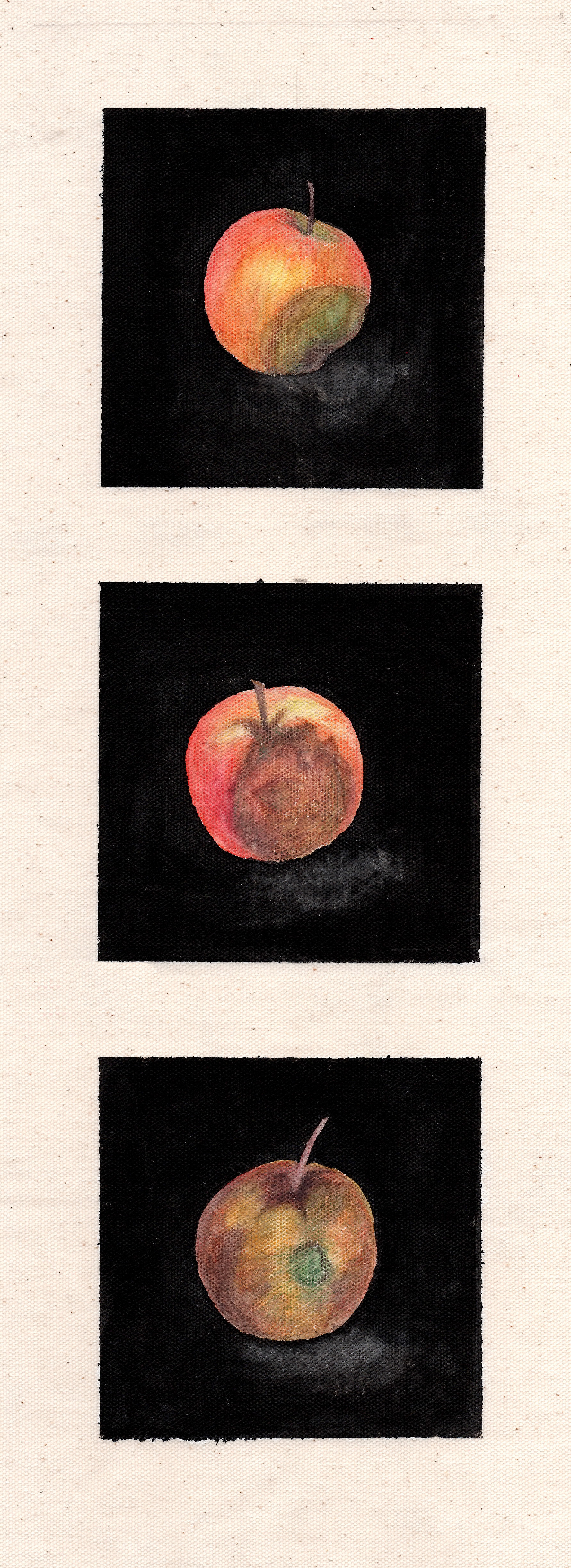
The Apple
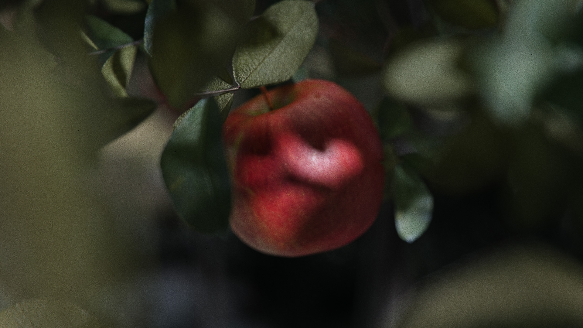
The most important prop being the apple that is plucked during the initial dream. It had to look fresh and alluring. The theory is that we can all be seduced by the Genesis Orchard. The power of temptation is so strong and nightmarish that it pulls us into taking a bite from the apple.
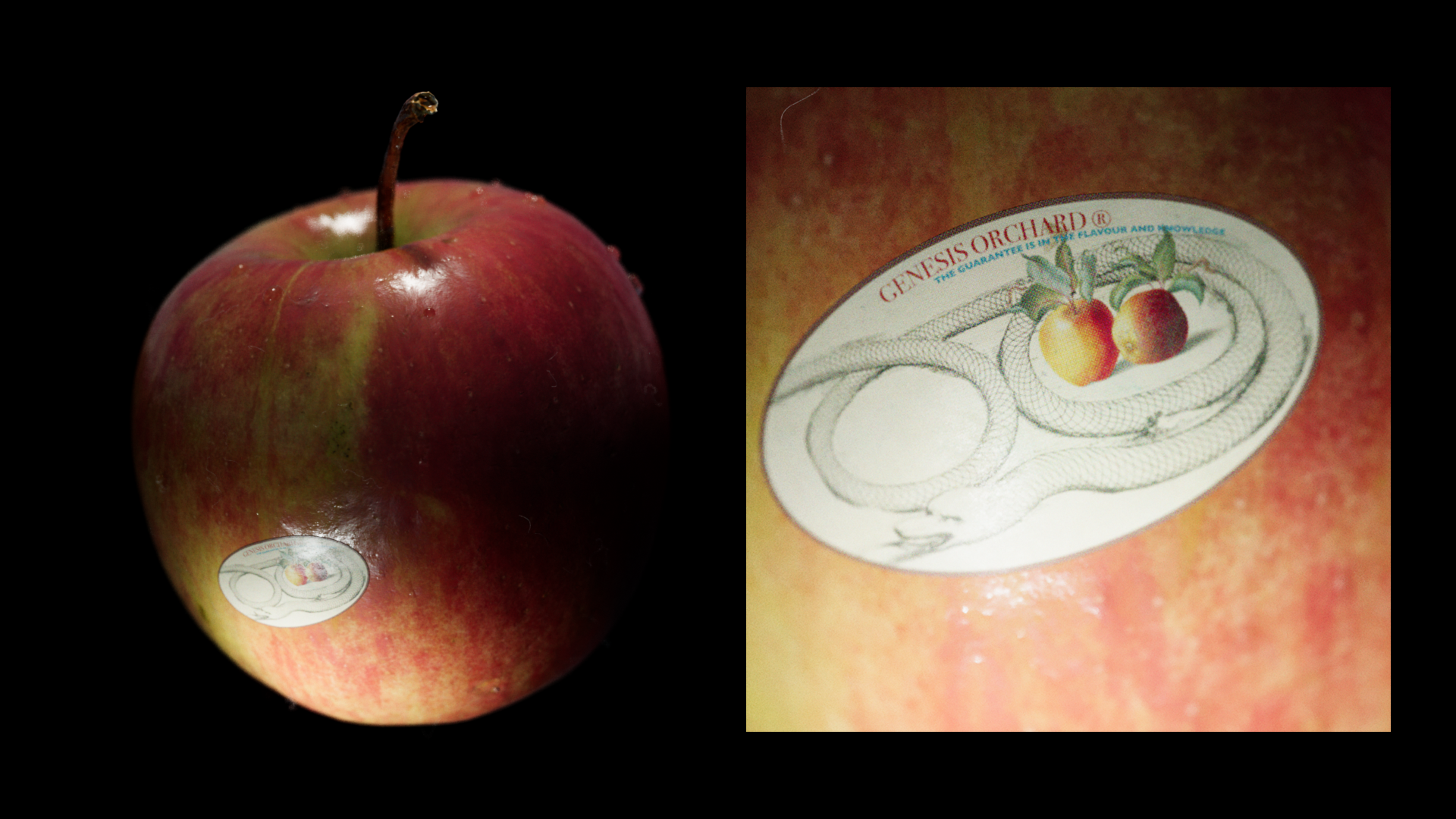
What makes an apple from the Genesis Orchard feel this enticing however? We started by making the apple a vibrant red with natural color variations to avoid looking artificial.
To ensure the apple looked even more appealing it was coated with a smooth wax layer. This makes it slightly glossier than what you would expect from a wild apple. On top of that we can use associative feelings to enhance the appeal of the apple even more. Texture evokes sensory responses straight from your memory bank, adding emotional depth to the object. For this reason the apple was covered in water drops. A washed apple is ready to be eaten. It’s a subtle textural detail that adds to the desire of eating it.
The apple from Genesis Orchard requires two additional details to be complete for the Apple Rot short film. A fruit sticker from the Genesis Orchard and a price sticker that displays an ever rising price.
As an allegorical tale of the rising prices of ever worsened goods in our economy, the price sticker not only rises in price but also rots right on top of the apple. Even at the highest price, the apple from the Genesis Orchard is still considered worth it. To achieve this effect I used Adobe After Effects to create the price-sticker and rising number. Then using multiple compositions I processed the sticker to give me a Diffuse, Roughness and Alpha map.
Finally, the entire timeline was exported as an image sequence which was used as an animation inside of Cinema 4D. As the hand of You turns the apple to give it a closer look, the price starts hiking to absurd numbers.
On a simpler note comes the fruit-sticker for the Genesis Orchard. We all knew we wanted something that included apples, a snake and a company tagline (as even the Genesis Orchard has to stay relevant). This design was roughly sketched out in my notebook after a short session of scrolling through the Internet Archive and Commons Wikimedia for potential image assets.
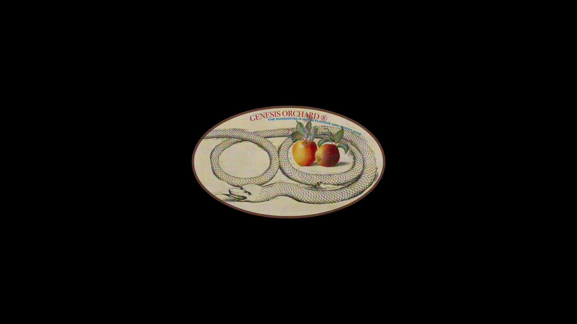
Continuing a theory we established when we created the Industrial Decals Resource: that often non-design (or design with little to no effort put into it) adds an unmatched level of realism in 3D. For that reason I simply designed the Genesis Orchard fruit sticker over the course of 30 minutes. I made sure to add a subtle half-tone effect that emphasized the printed nature of the sticker. And after that it was time to export all texture maps.
The fruit-sticker is added to the apple using a Corona Decal from Chaos Corona. This allows me to place the decal exactly where I want it on the apple while referencing a Shader for the look of the decal. And that’s the apple!

The apple is way more than a visual object. It’s the entry into the entire world of Apple Rot.

It represents both temptation and acceptance. Taking a bite is a choice, even though it’s a difficult one to reject.
For that reason, the apple had to feel desirable first. If the audience doesn’t understand why someone would want it, the underlying metaphor becomes empty.
The Painting
A more subtle prop is the rotting apple painting. First, the art frame was modelled and textured using a Smart Material in Adobe Substance 3D Painter. The painting itself was created in Adobe Photoshop using a combination of photobashing techniques and paint-over. There are 3 stages of the painting. When we first enter the bedroom of You and Eve, the painting is seen hanging on the back wall. We wanted an element in Apple Rot that subtly shows progress throughout the film, while also marking each chapter of the story as being in a worse state than before.
The rotten apple painting was an idea that made it from the first nightmare, to the screenplay and to the storyboard. Even though it does not have a literal narrative purpose and it might even bring up more questions than give answers, it’s still an allegorical detail. It adds a level of mysticism to the film. It adds atmosphere.
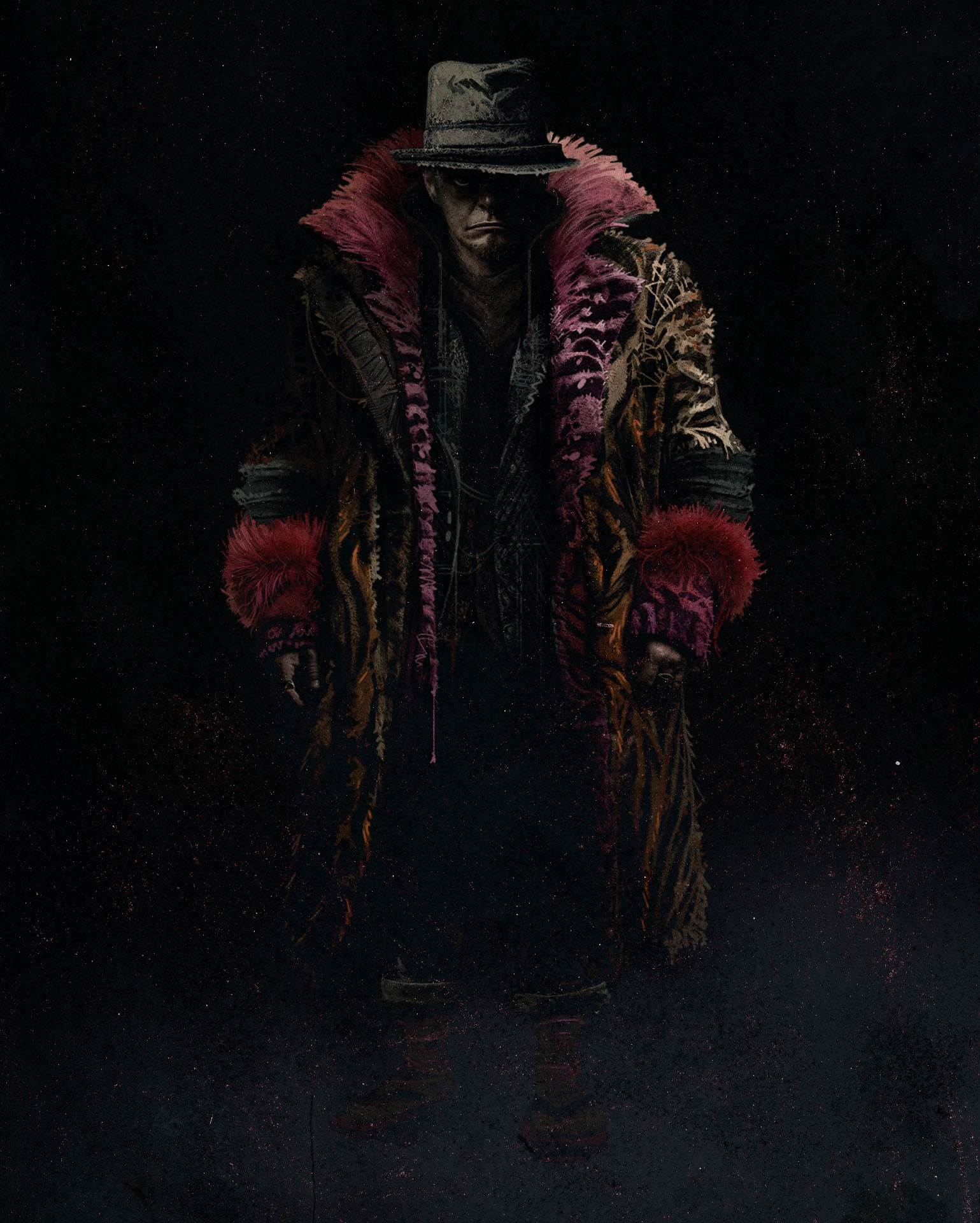
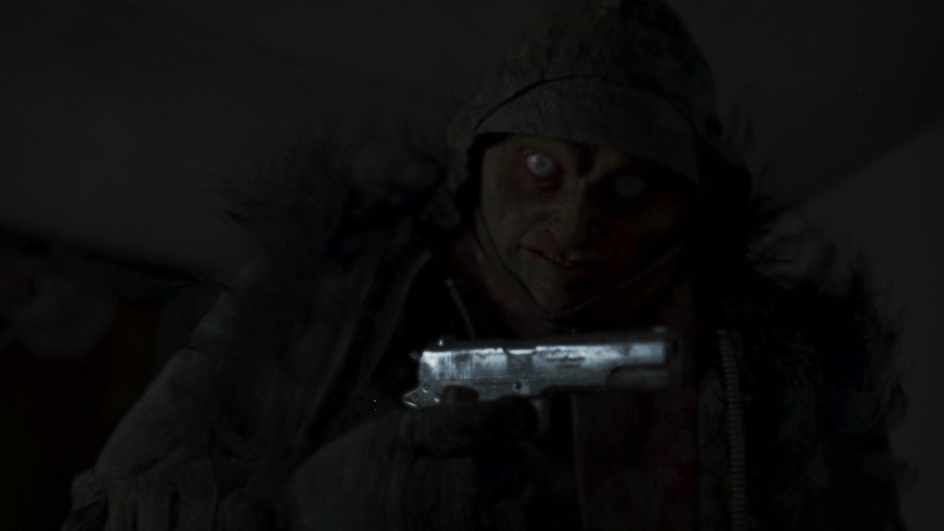
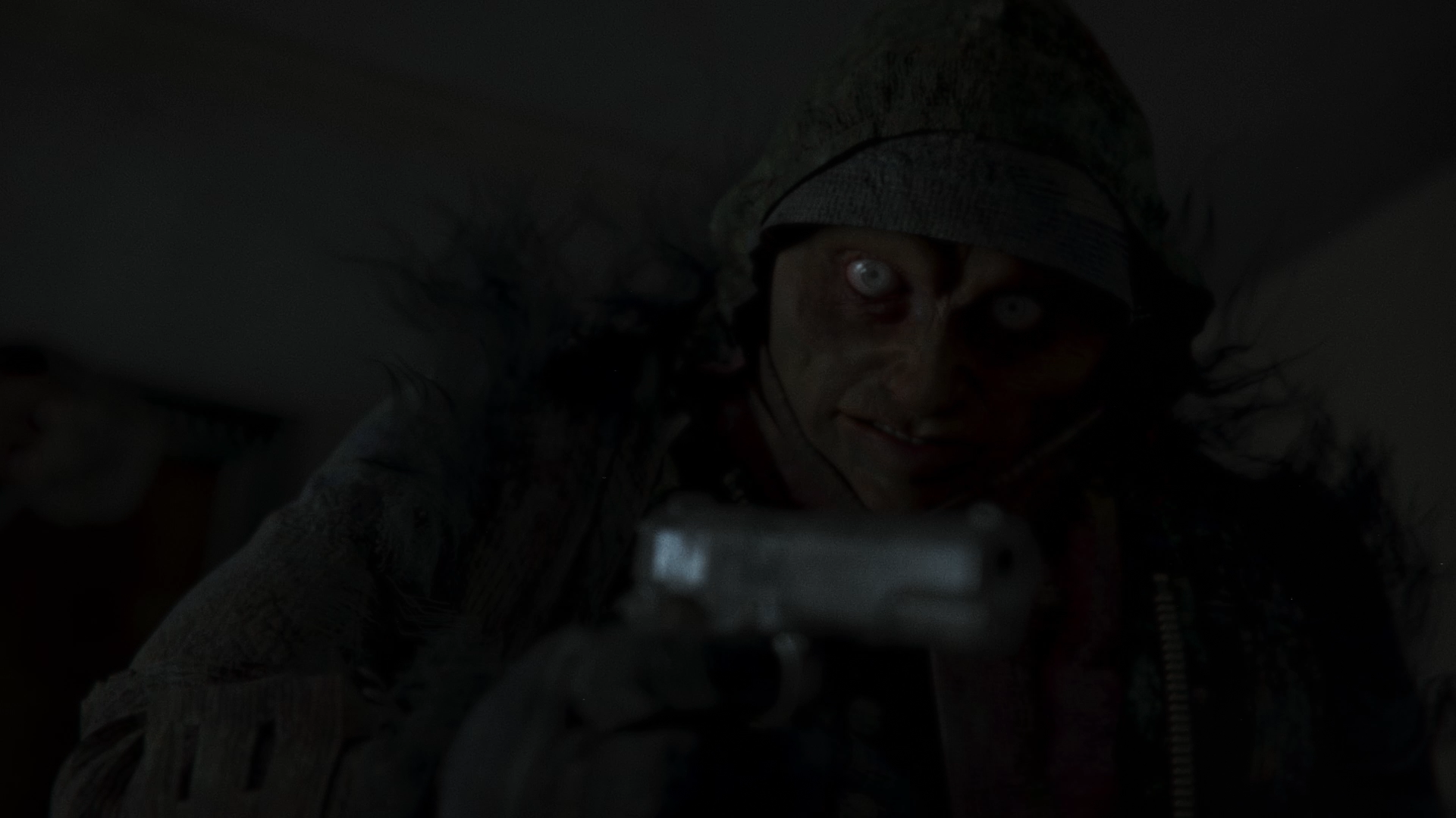
The Gun
Finally, an essential prop in the film is Short Angry’s gun. The Colt M1911 is pulled out of Short Angry’s jacket and then gets very close to the camera as Short Angry walks up to You and is ready to shoot. This is an important moment of the film as its exactly where the threat of the dream becomes real. The more this asset reads as a physical presence the more it conveys the psychological climax of the film. The viewer should feel the threat of the gun approaching.
So, what did we know was important for this scene? The gun had to shine, or better, glisten in the darkness when it’s pulled. And the gun had to have enough textural detail and imperfections to look interesting and menacing up close. Why was it specifically a Colt M1911? That I do not know. But that is what it was in the nightmare.
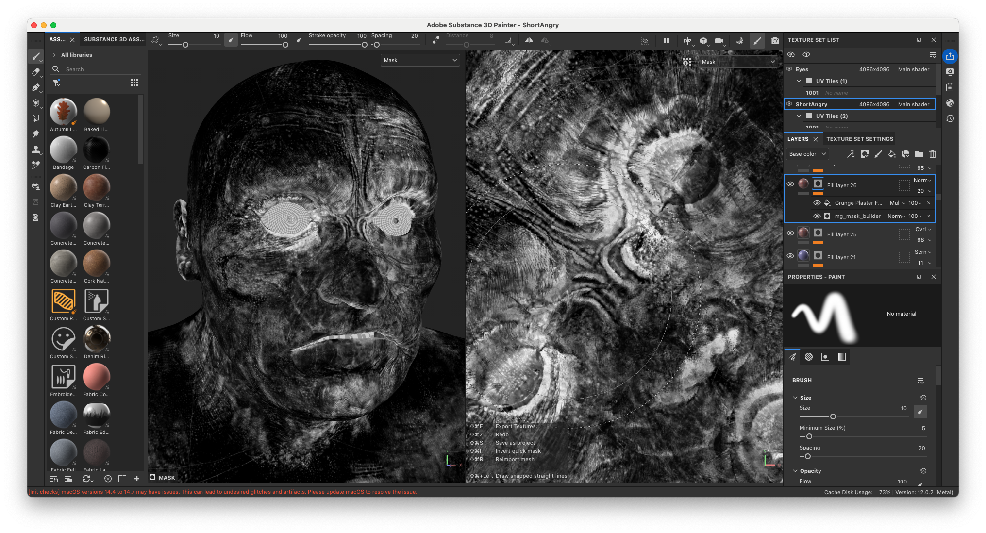
After first texturing the silver pistol to look brand new, I started layering edge-wear, rotten texture maps, rust and grime. By always using Anchor Points in Substance 3D Painter, the added details follow the shape language of the asset. Slowly but surely the asset started coming together. Throughout the entire texturing process I kept thinking about the journey this pistol had taken being a part of Short Angry. But the most important aspect was how it was going to feel in Short Angry’s hands. During several Look-Dev sessions we all agreed on the right level of detail and roughness.
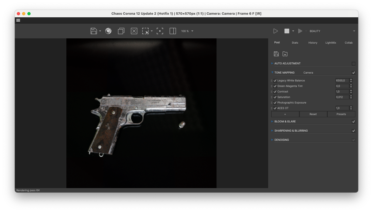
The gun is the closest object that gets to the camera in Apple Rot. It had to hold up. Even though the rest of the film leans into abstraction, the gun does the opposite. It anchors the scene in something truly and understandly dangerous.
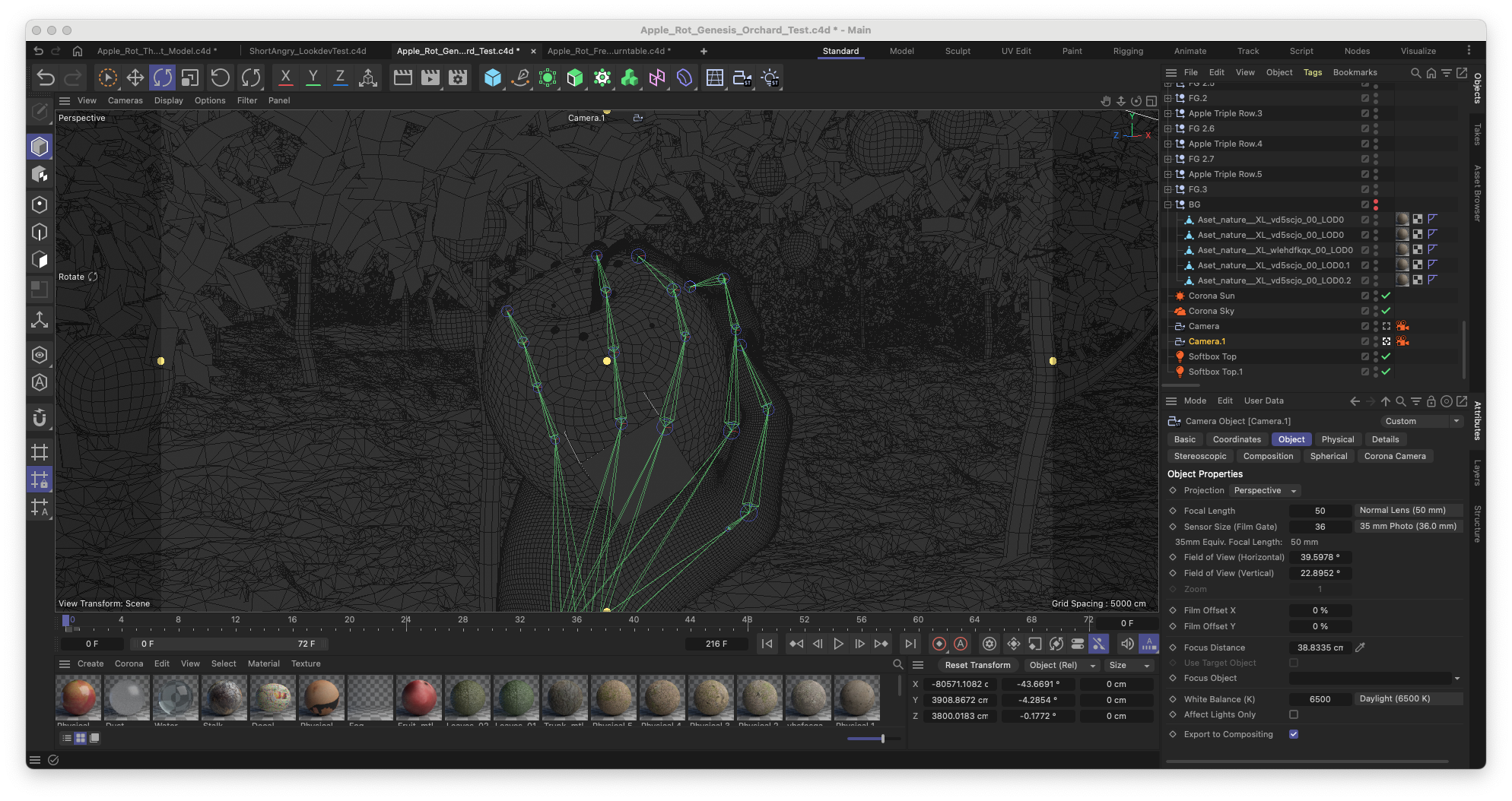
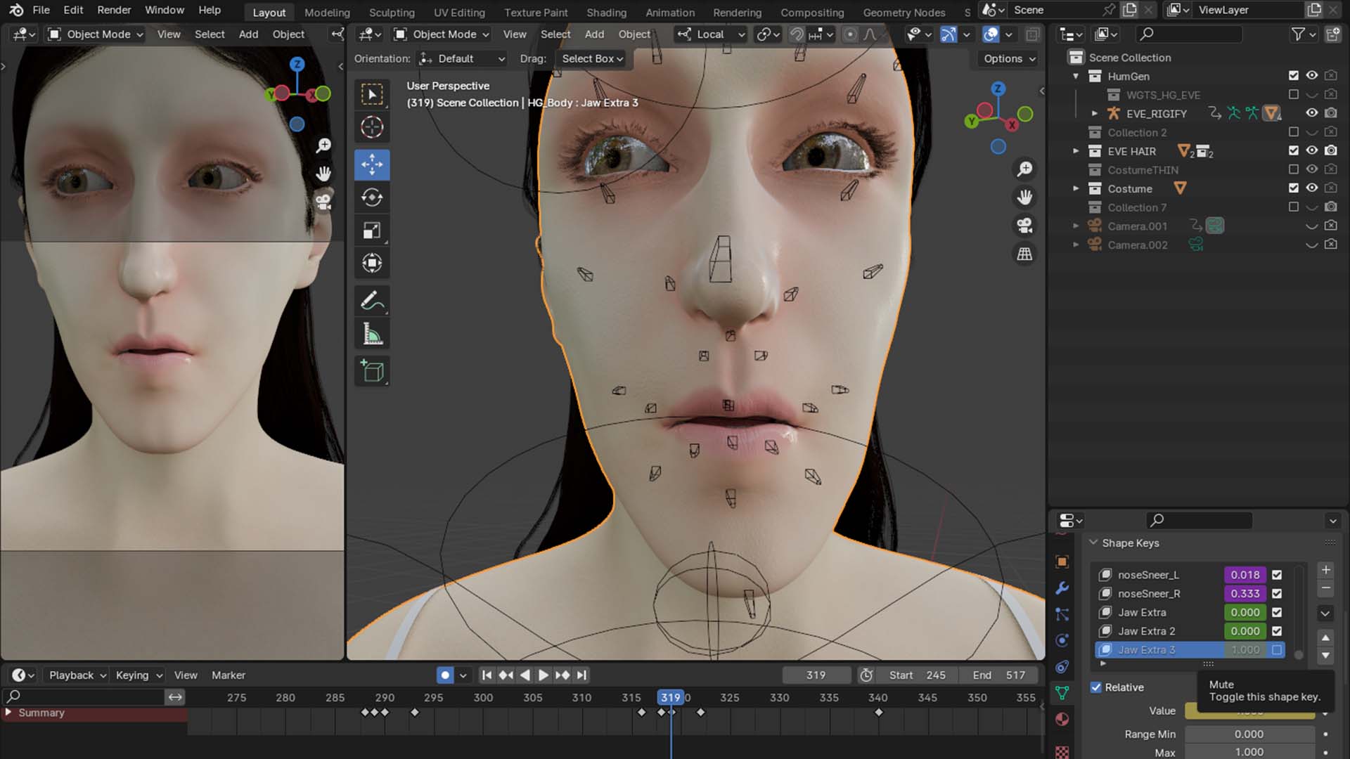
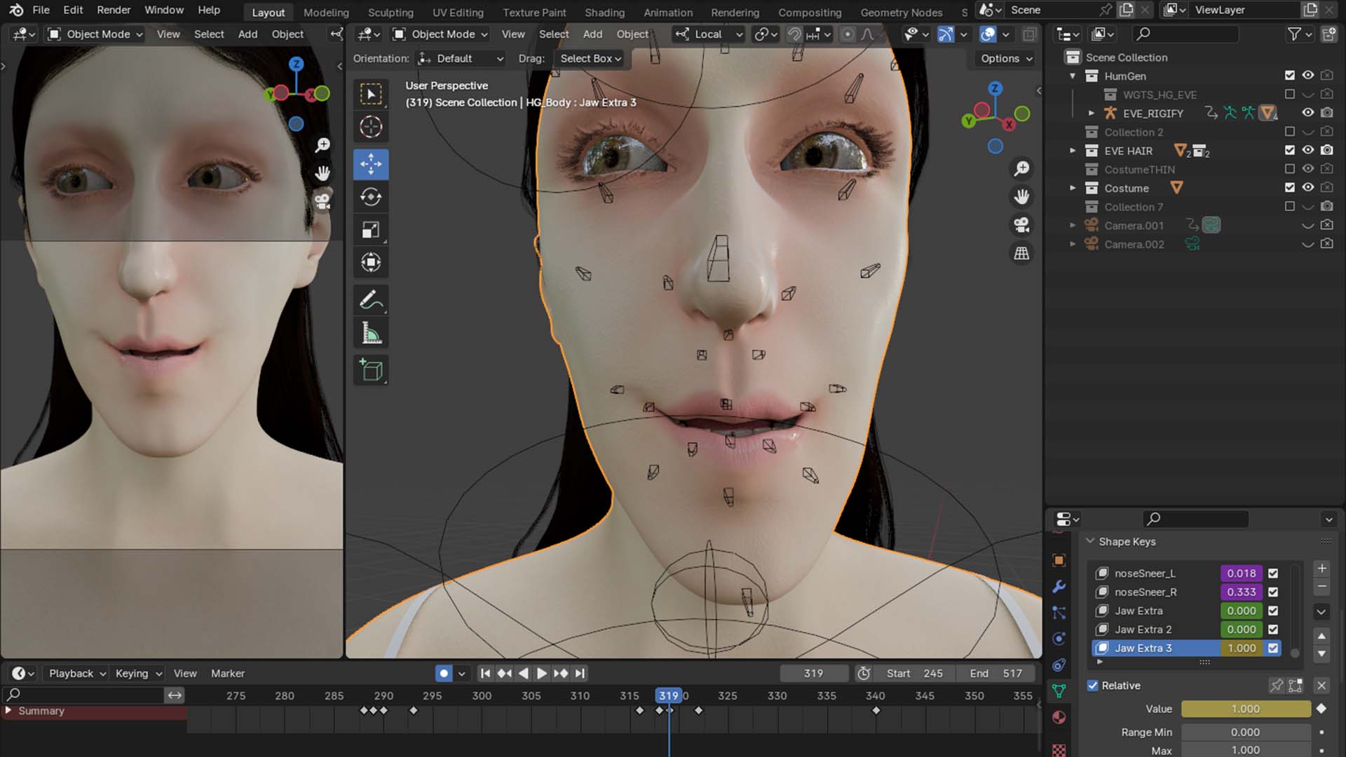
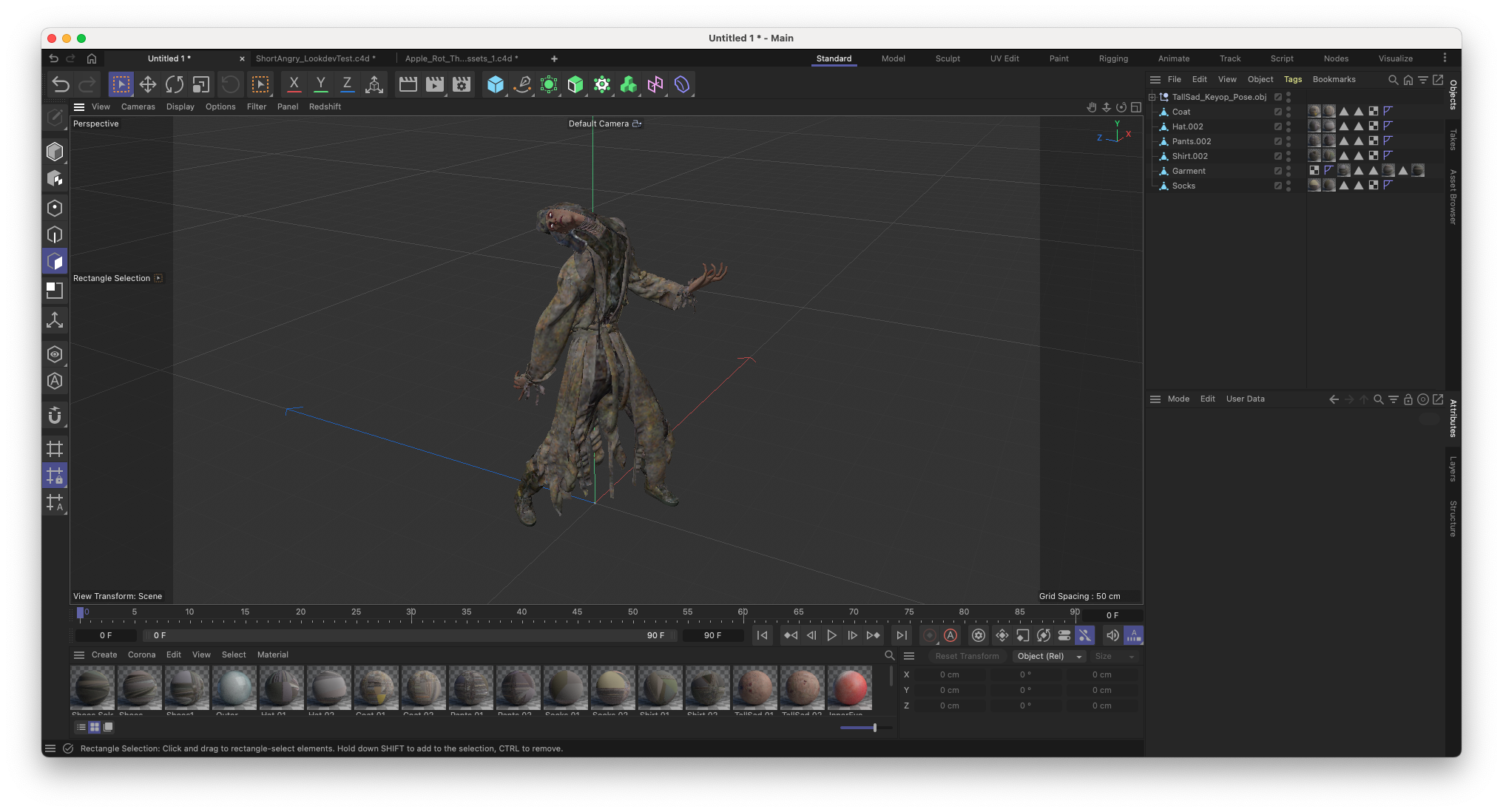
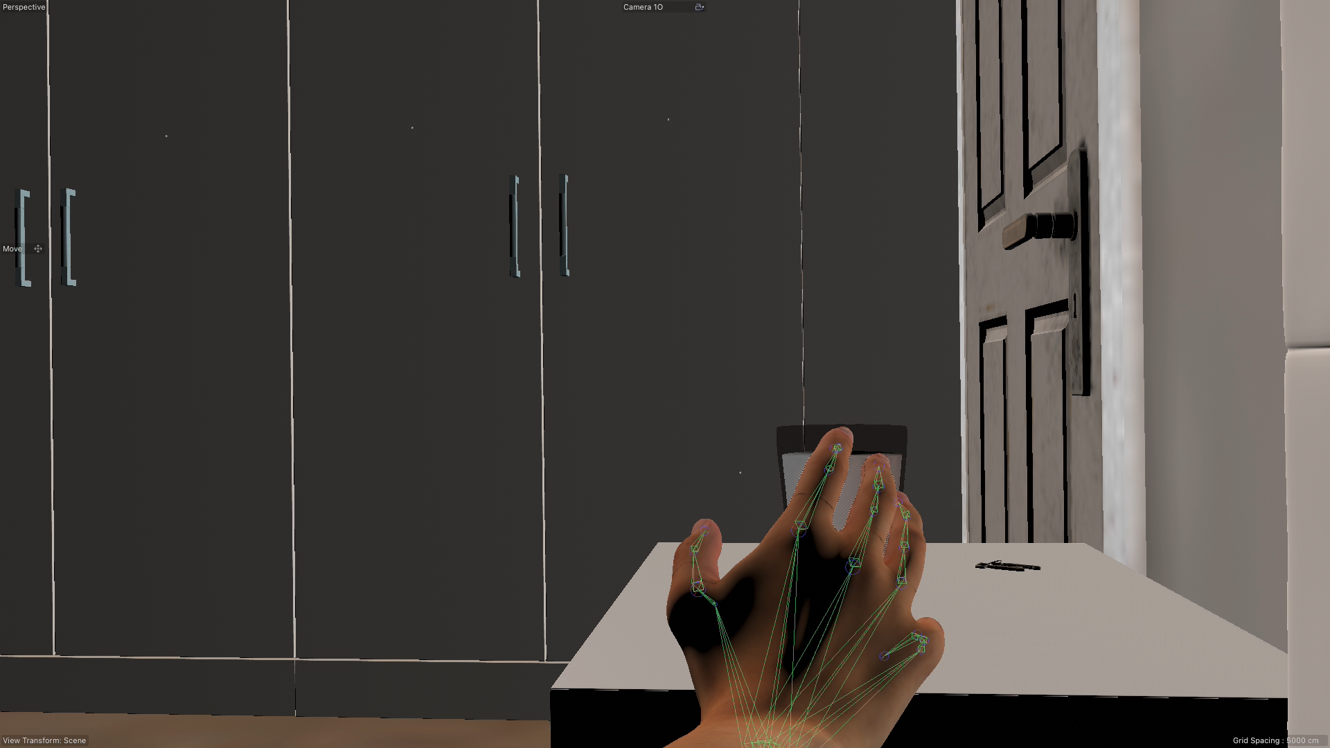
Sculpting the Characters
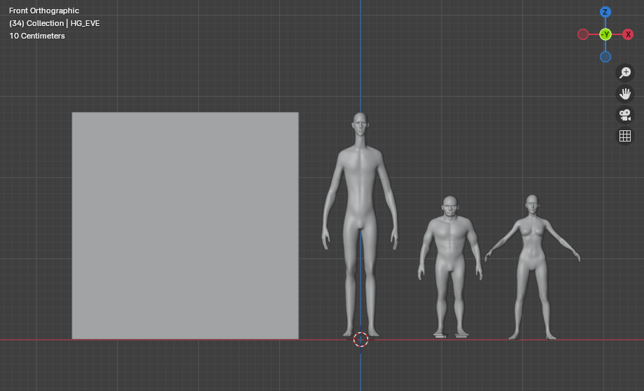
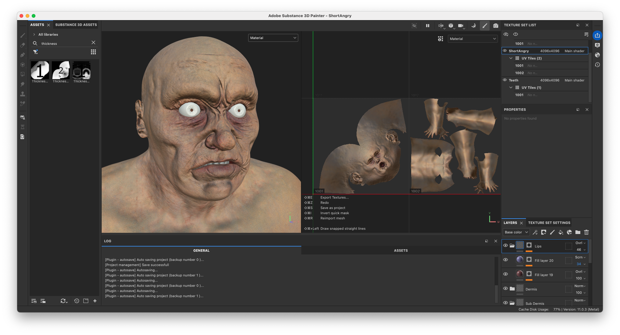
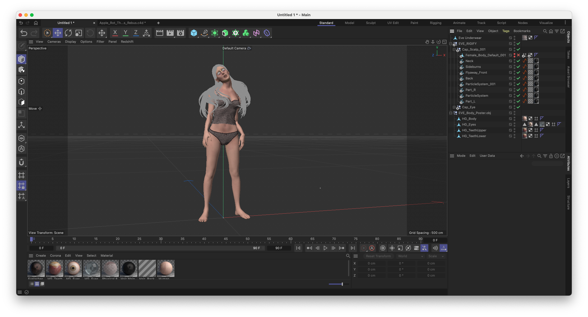
In a few weeks of work all three characters were completed by Charlotte. Both Sad Tall and Short Angry are made using the male character from JHill’s Basemesh Kit. This basemesh was heavily deformed using ZBrush.
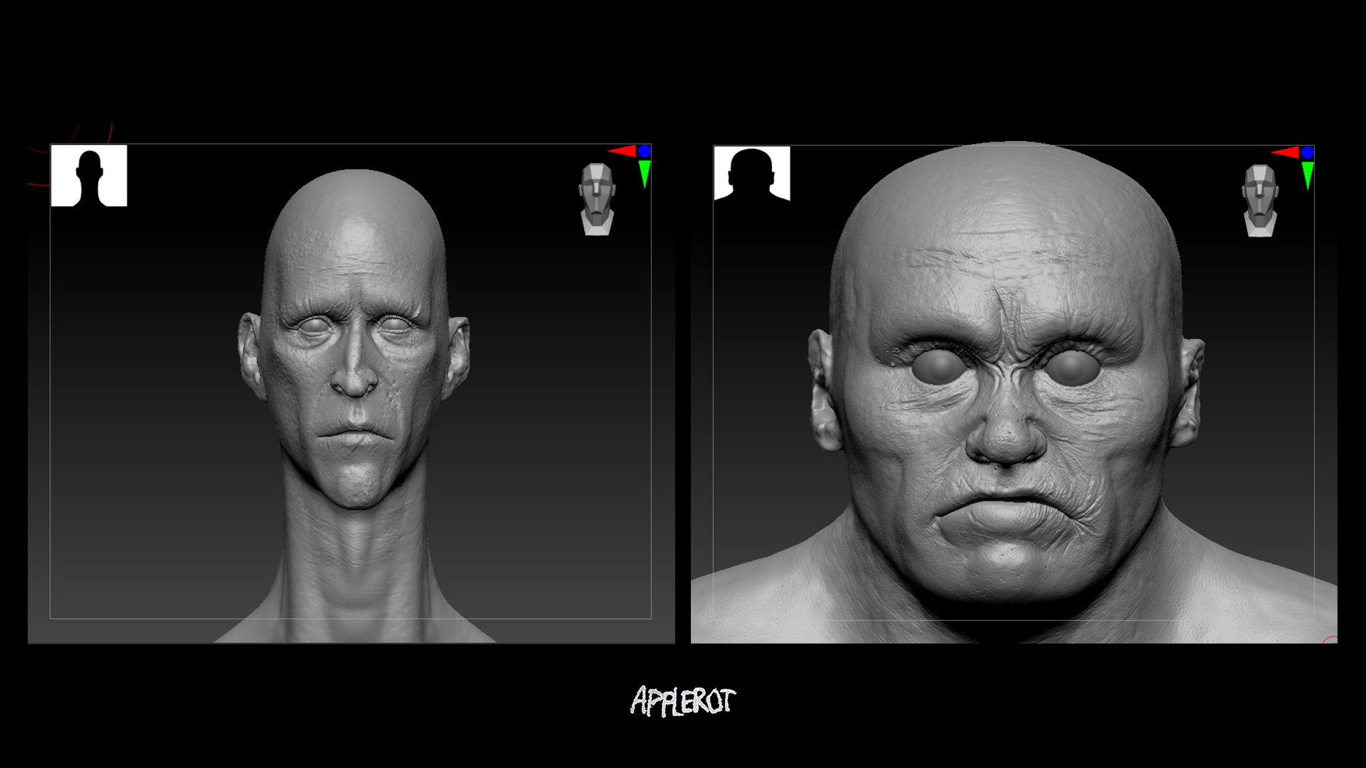
Sad Tall was stretched to fantastical proportions. Short Angry remained of realistic height, but his neck and arms were compressed to give him an exaggeratedly stocky silhouette. Eve was made using a HumanGenerator basemesh. Though she remains largely realistic, she was made to have long limbs and slender fingers, to push her silhouette in a ‘ghoul-ish’ direction.
Eve, Sad Tall’s and Short Angry’s facial features were further fleshed out using manual sculpting techniques inside Zbrush. The brushes from JHill’s Skin Details Kit provided the additional skin details needed for all three characters.
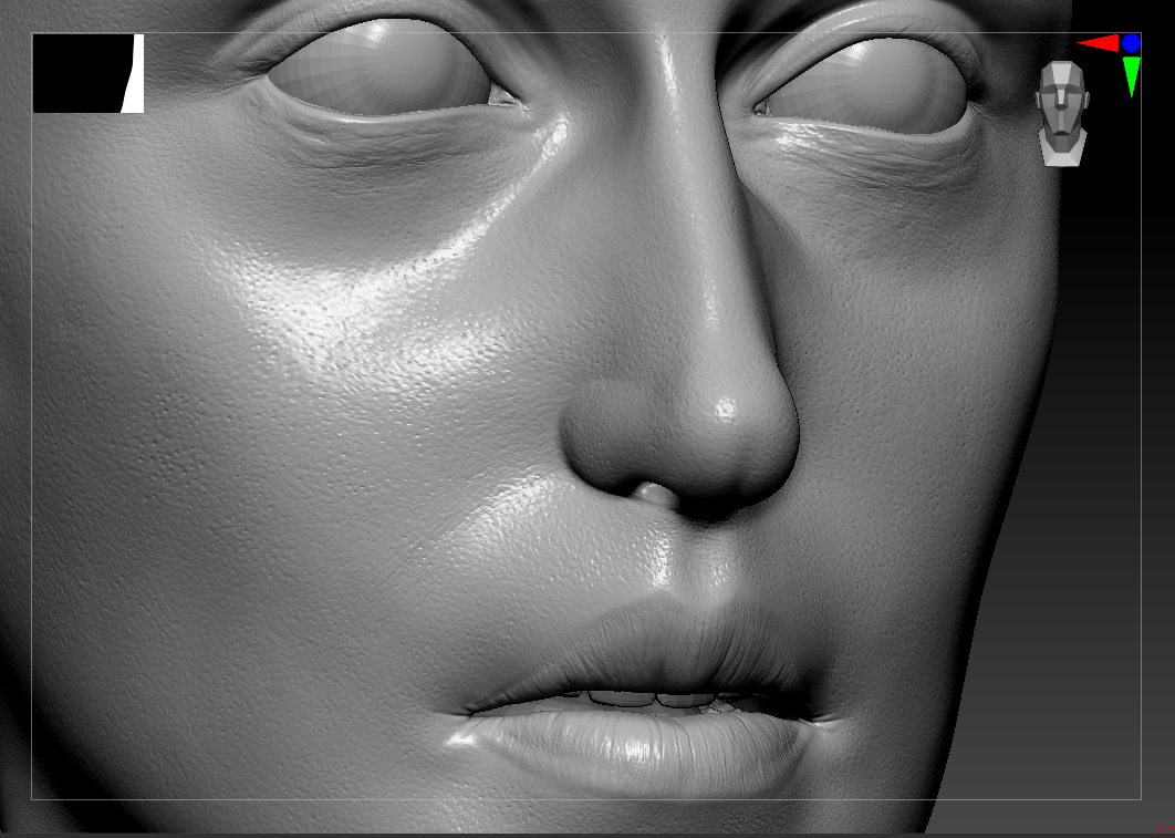
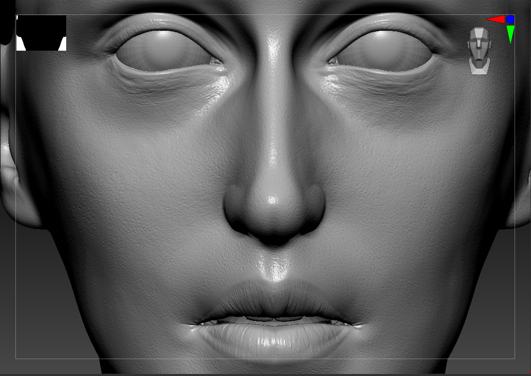

Texturing the Characters
Texturing is where the characters truly started to come alive. We extracted the sculpted detail from Maxon ZBrush into Normal Maps that were used in Substance 3D Painter as Anchor Points. This allowed us to build all high fidelity details right on top of the sculpted detail.
I started by layering up the Sub-Dermis colours of skin. These colours were masked using a variation of grunge maps and hand painted details:
- Deep reds
- Bright reds
- Dark purples
From there it’s time to add volume to the body by introducing additional colors:
- Light blues
- Greens
- Yellows
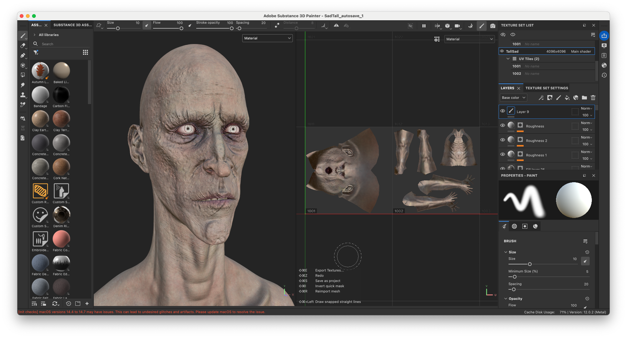
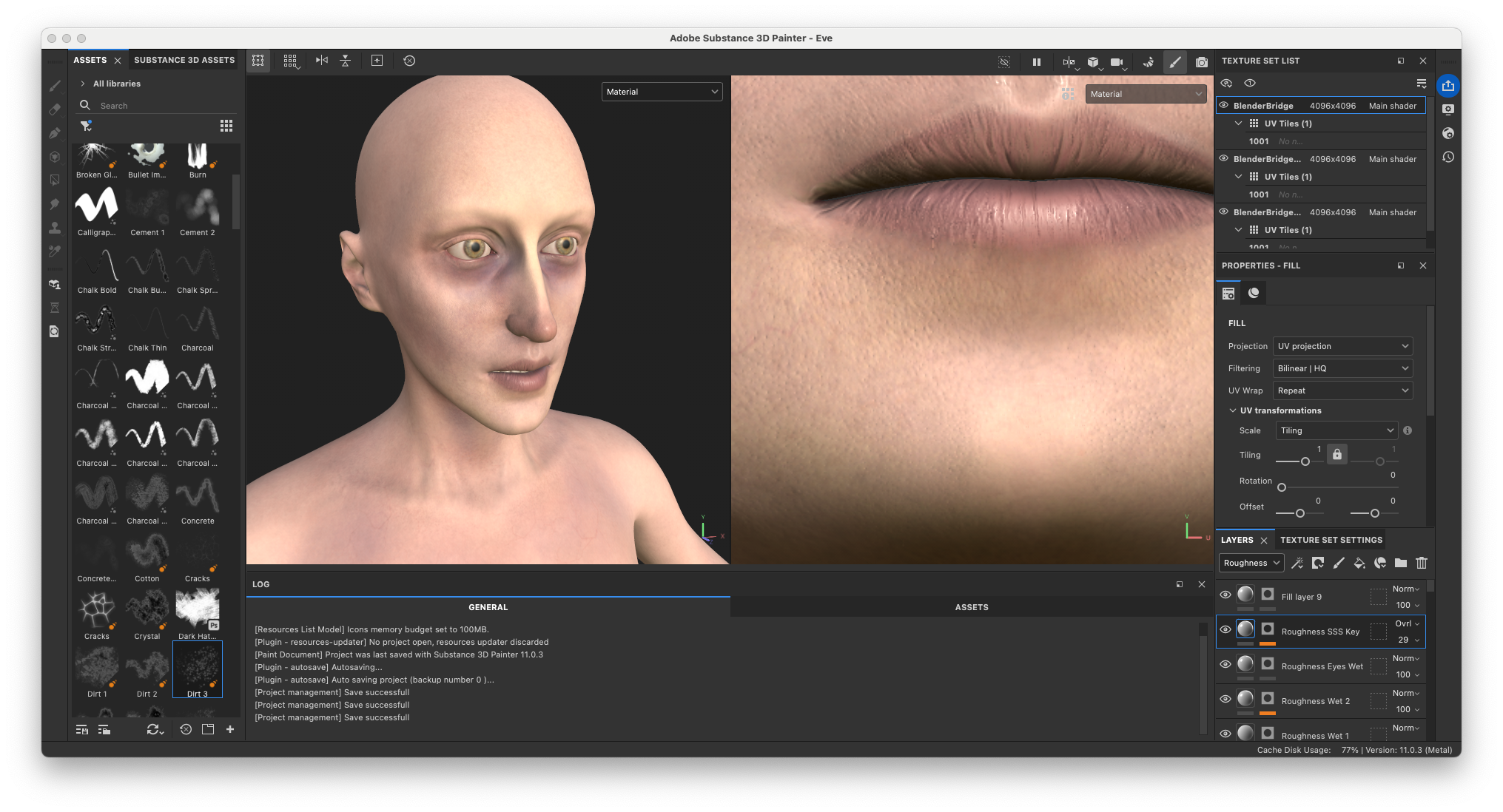

These colors give life to the skin. But by pushing them slightly too far, the result becomes sickly and uncanny. The areas under the eyes were intentionally exaggerated to reflect exhaustion or sleep deprivation. On top of that, we layered our rotten textures. This brought everything far closer to what I had seen in the dream.
The final stage involved refining:
- Roughness maps
- Subsurface Scattering Map
- Shaders in Look-dev

Modelling the Clothes
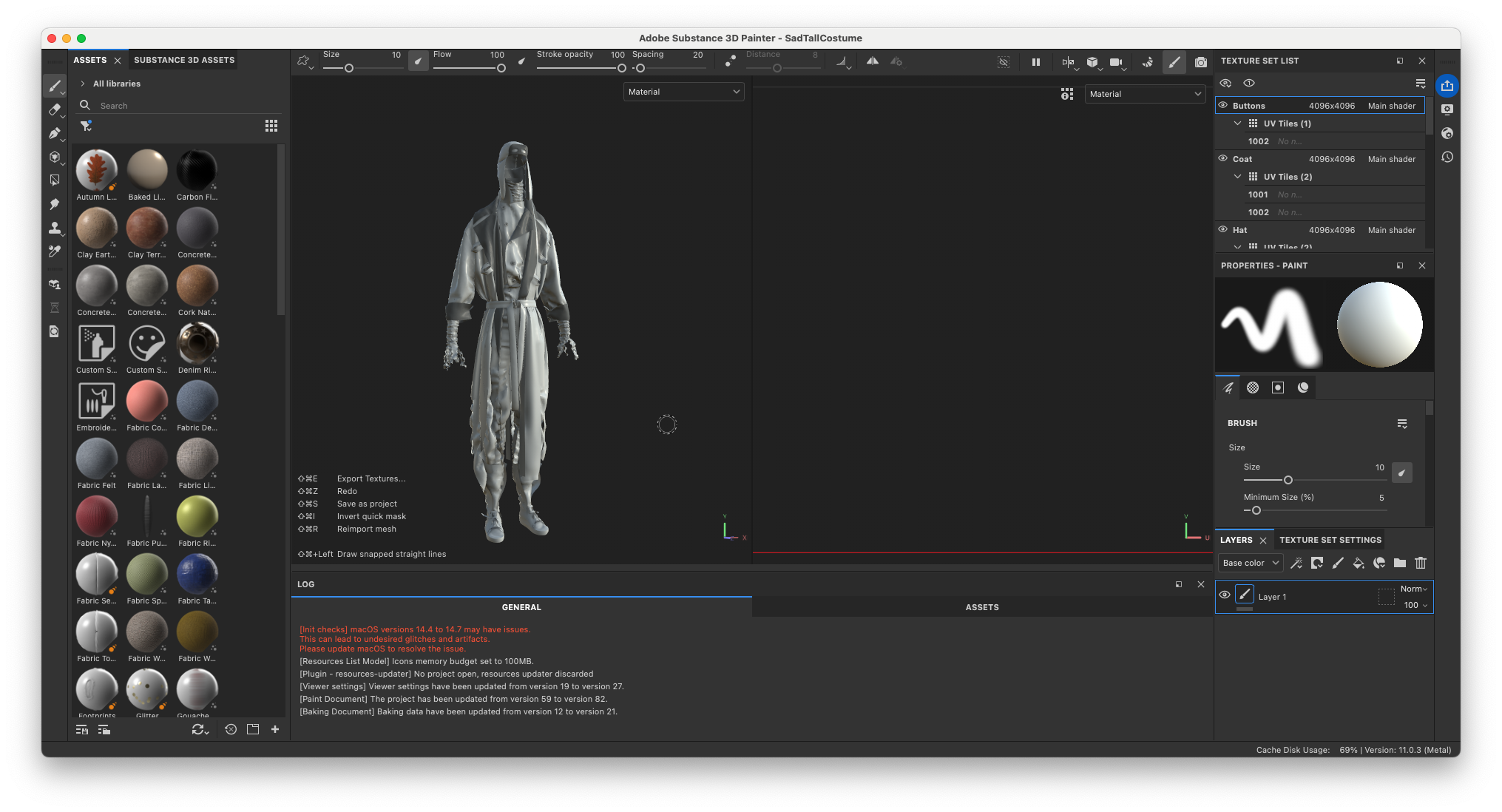
Before moving into 3D, Charlotte created technical sketches for each outfit. Especially for Sad Tall and Short Angry, this was essential. Their designs are complex, layered, and needed to be clearly broken down before production.


The clothing was then built and simulated in Style3D, shot by shot.
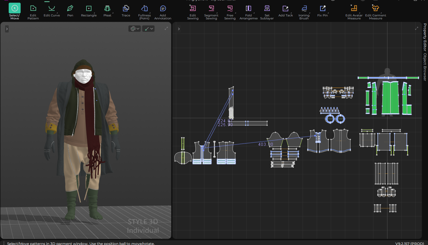
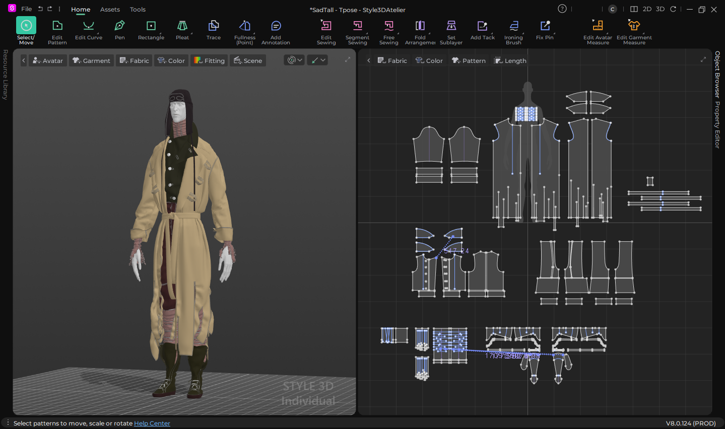


Texturing the Clothes
Creating realistic clothing in 3D is about way more that accurate patterning and simulation. When it comes to creating your shader it’s important to apply the correct level of Sheen and or Translucency/Opacity depending on the material it’s supposedly made of.
But before that it’s all about the quality of texture maps you’re using. Since the production of Syntactic Labyrinths we have been partnering with a luxury fabric store that specialises in digitising fabrics into PBR materials, Bakermat. Using fabric scans from Bakermat Antwerp, we could quickly establish a strong and believable base.
In Adobe Substance 3D Painter it's important to get a good quality bake of your mesh. I then like to create a base material for each texture set that lays out the general materials. Where possible I create an Anchor Point for each fabric texture. At each future state it will be beneficial to reference the Anchor Point for creating masks or texture variations.
From there, it’s a process of layering:
- Wear and tear
- Dirt and aging
- Rotten textures
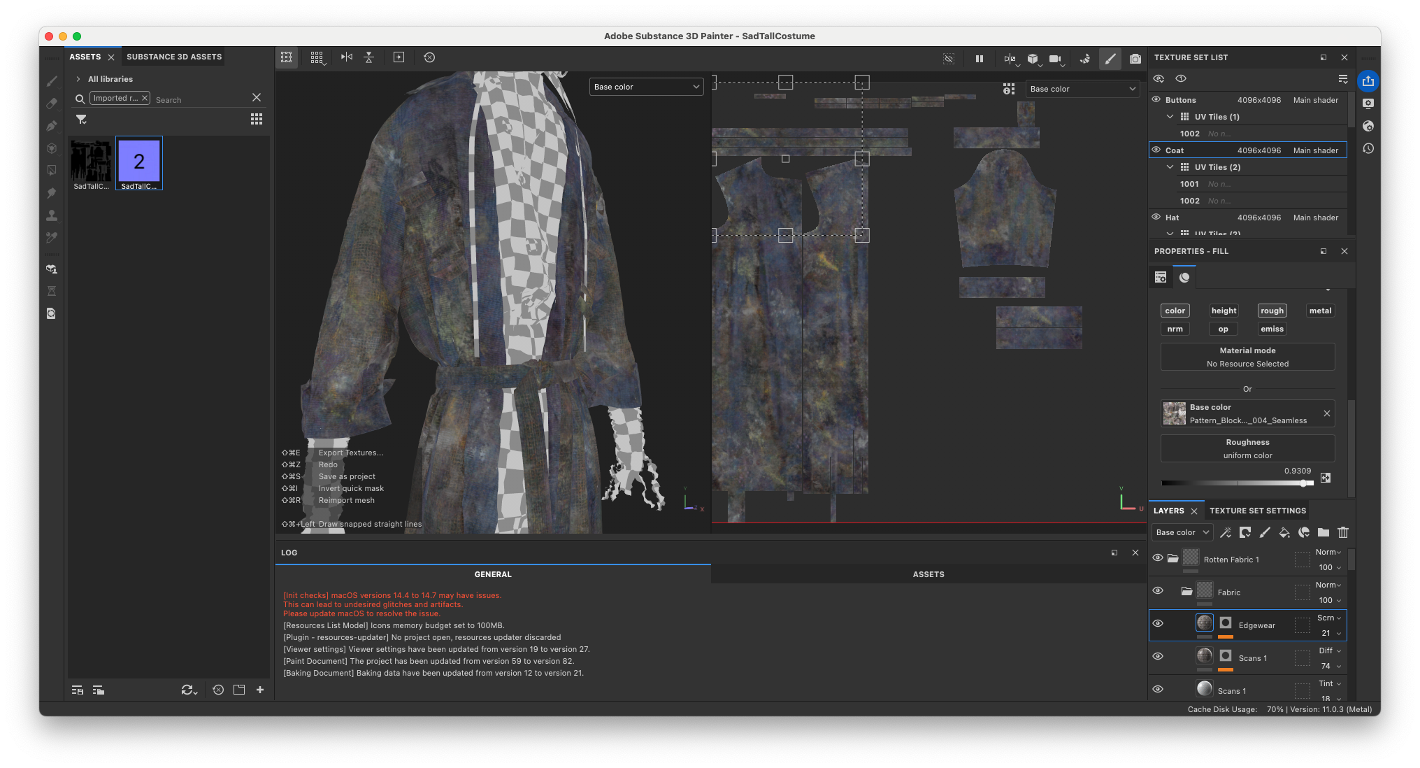
Each layer introduces variation in:
- Color
- Roughness
- Normal Maps/Height Maps
This ensures that even in low light, the materials respond in interesting ways when the characters move.

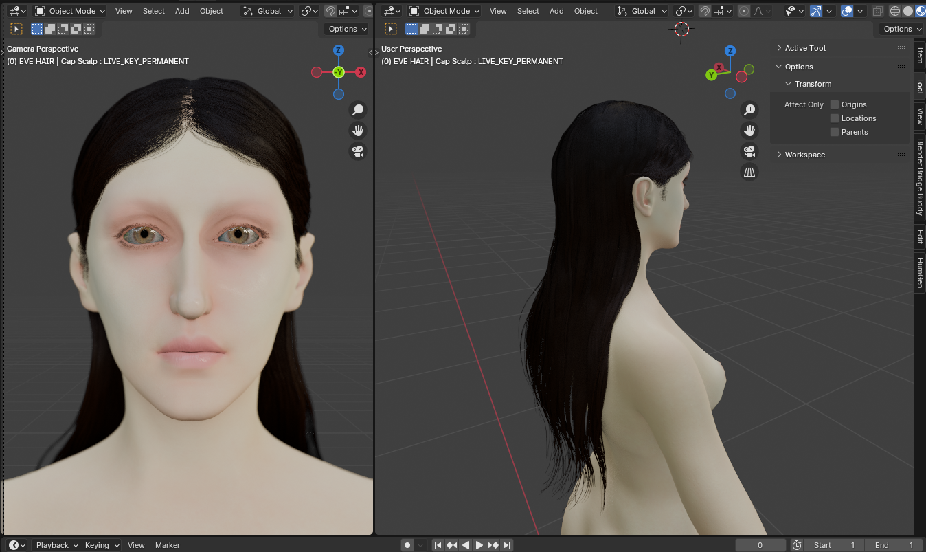
Hair Simulation
Inside Blender Charlotte added and groomed the long black hair of Eve and the fur lining on Short Angry’s coat and gloves. Since Eve’s animation in most scenes was relatively minimal, we opted to not simulate the hair, as Blender’s hair particle system can generate rather unreliable simulation results.
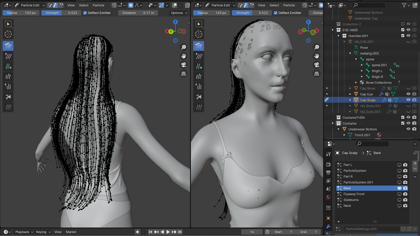

Furthermore, Eve’s hair was adjusted for each scene she appeared in.
The hair particles were exported as alembic files and imported into Cinema 4D as splines.

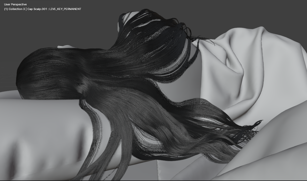
Finally, inside of Cinema 4D and Chaos Corona we created the shader of the hair in its different states. This meant a wet hair and a dry hair shader for Eve.

Animation of the Characters
Movement. Personality. Acting. These were the pillars ever present in our minds when working on the animation of the characters. How does one create a performance for your characters in animation that communicates on a cinematic level. In each scene, the characters have an objective they want to reach. But the obstacles in their way, both physical and emotional, have to be overcome honestly.
The truth of an actor lies behind the eyes. And so does the truth of a character. Sad Tall and Short Angry live on opposite sides of the spectrum emotionally. But they have a similar want. They are collecting your dreams. Invading your dark sleep. But after they have taken you with them tonight, they want to escape.
The pain needs to come out. It needs to be expressed. However subtle it ends up on the screen. Change in the character’s expression is what communicates their inner journey.
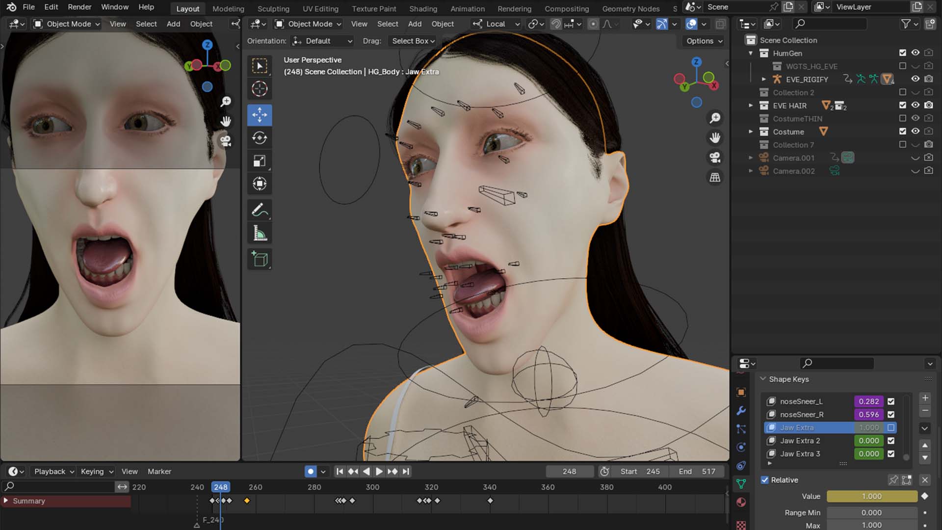

To truly give the audience a sense of catharsis, the character should express a deep desire for their goals in the moment.
This can be as subtle as the dilating of the pupils when a Short Angry has finally locked his aim on You. The intention becomes clear. His wants become beyond clear. And taking action becomes inevitable.
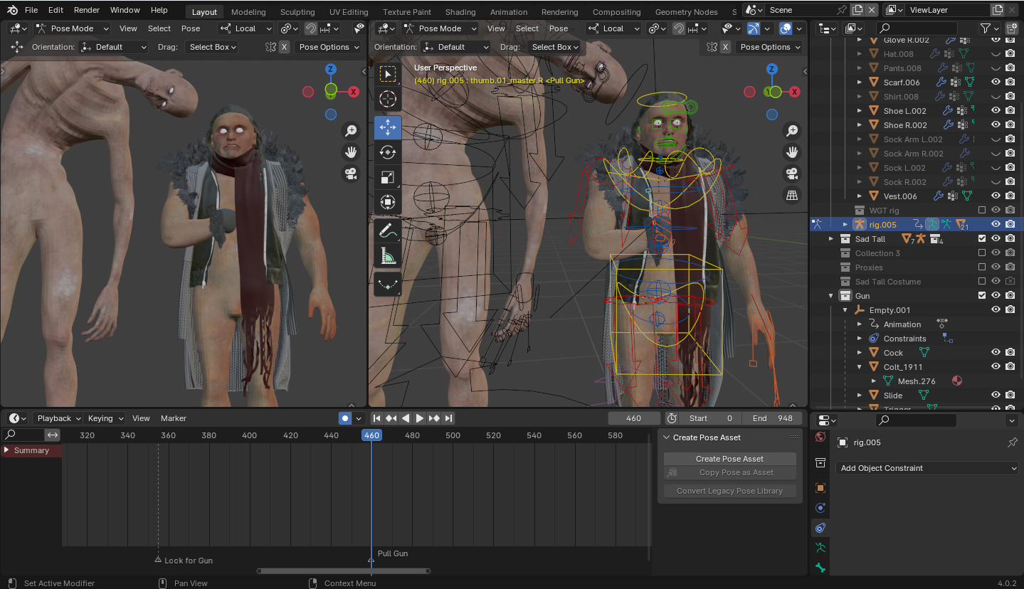
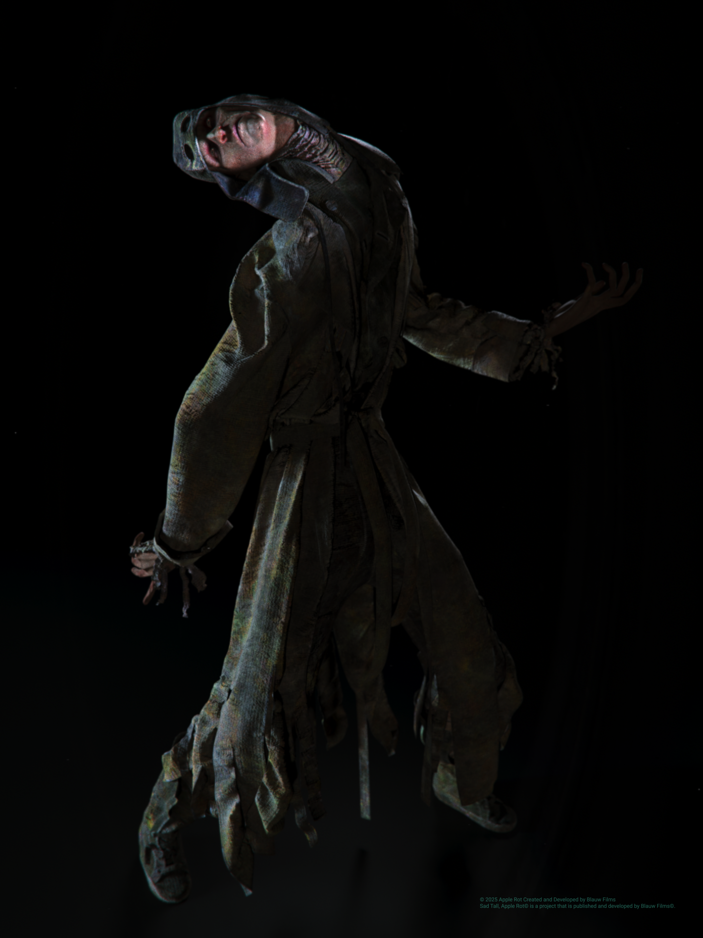
Sad Tall carried a terrifying feeling with it, ever since that first nightmare. When the door slowly unlocked I first saw its hands. The movements were slow while being unpredictable. In the moment of the nightmare it was very clear how this character moved. However, when we were in animation it was important to relive that moment over and over again and distill the acting from it.
The length of Sad Tall and its twisting body that moves strangely through the room were key characteristics of this being. In the dream, the figure felt way too large for the space it was in. It didn’t fit.

In animation, that feeling needed to be translated into something readable. The unfolding motion exaggerates that idea. The character does not belong within the size-limits of the room.
We explored more subtle versions, but they felt too natural. Too human. By pushing the motion further, it becomes uncomfortable to watch. And that discomfort is exactly what we were looking for in the scene.
It’s important to always let the emotions of a scene extend beyond the beginning and the ending of that scene. Not only do you avoid breaking the flow of each individual scene by not letting emotions start up again every time, you also give the emotions the space to linger beyond the scene.
Animation of the Camera
How you tell a story with the camera completely changes how that story is perceived. Over the years of making films you start to learn what your personal style of visual-storytelling is. What is the juxtaposition of imagery you like to use to communicate a scene? Do you like moving cameras or locked-off cameras? How about the focal lengths? Are you flexible and use whatever gets you the best shot? Do you have a clear preference for one over the other?
Just like any other decision in the vast ocean of choices you have as an artist, this one defines your work.
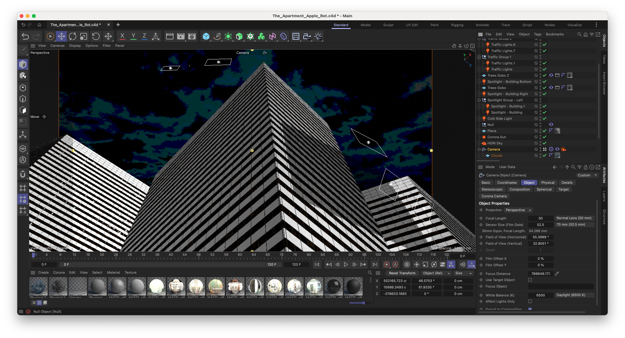
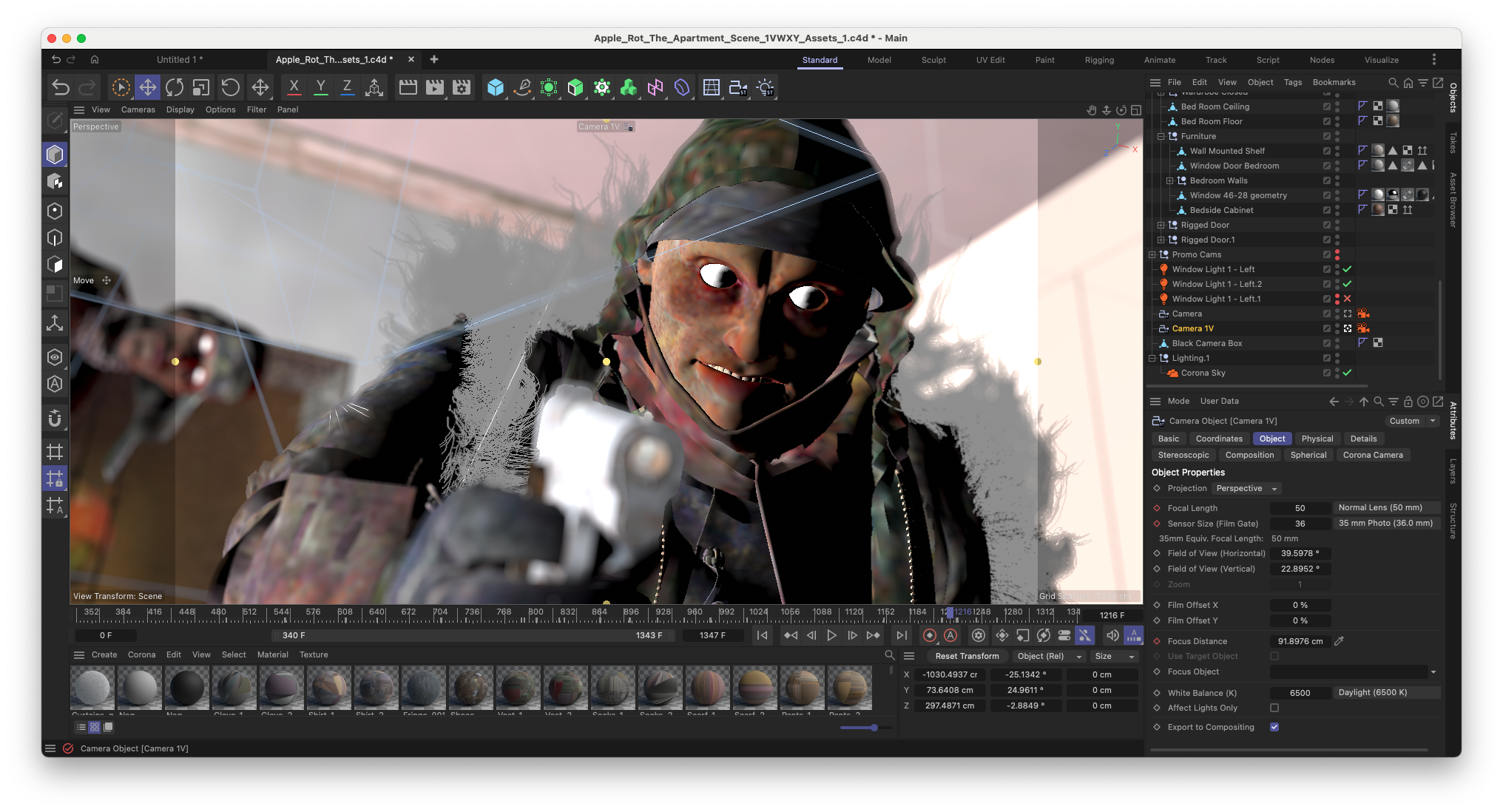
Personally I have always gravitated towards the 50mm lens. Its lack of distortion gives shots a naturalistic look. This emphasises the transcendental style storytelling and slower pace of the edit.
The choice of a 50mm lens is not only aesthetic. It places the viewer at a natural observational distance. Wider lenses would introduce distortion, making the experience feel more stylized. Longer lenses would compress space, reducing spatial awareness. The 50mm sits in between. It keeps the world believable, which makes everything happening within it feel more immediate.
When it comes to camera movements I’m personally the biggest fan of locked shots as they give more space and time for the composition and movement within the shot. However, as the protagonist of Apple Rot, You, is experiencing the film from a first person view there is a great opportunity to introduce moving shots.
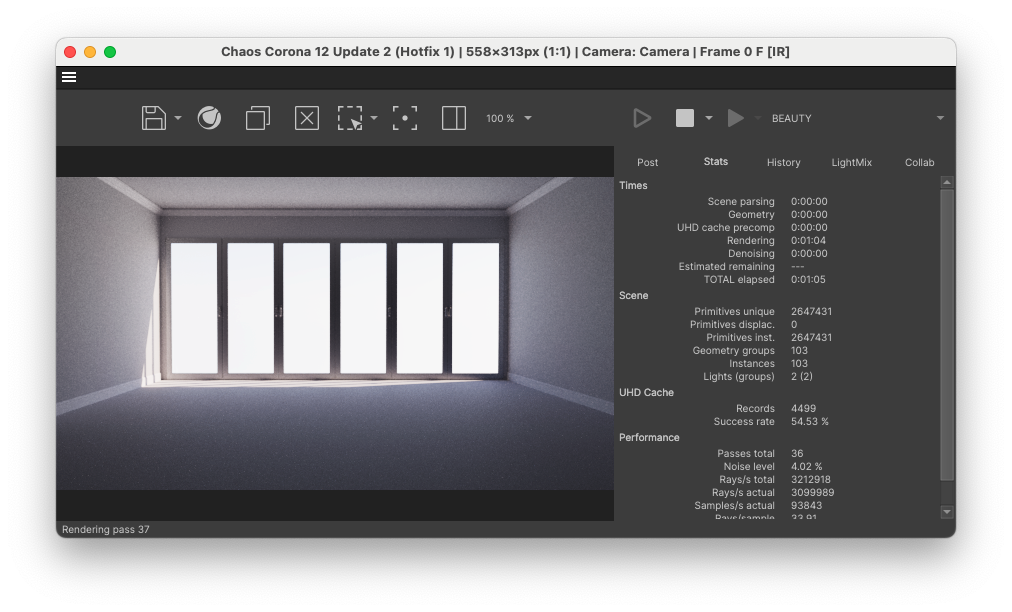
Lighting and Atmosphere
Erratic focus pulls were achieved by connecting the Focus Point of the camera to a Null object that was animated and then enhanced with a Vibrate tag that was moving it along its Z-axis. This means there is a controlled overall motion that we animated through the Null which ensures the correct things are in focus at the right time. But the additional vibrate tag gives slight jitters and imperfections in the vision, thus giving both a dreamlike state and a disoriented effect.
From the moment we started the production on Apple Rot, we knew it was going to be a quite dark film. A lot of it was going to be indoors during nighttime with only a few windows to light up the interior. Cinematically speaking I wasn’t looking for a very stylized version of the night. Instead I was looking for a noisy, desaturated look that uses moving traffic lights and a soft glowing atmosphere to portray.
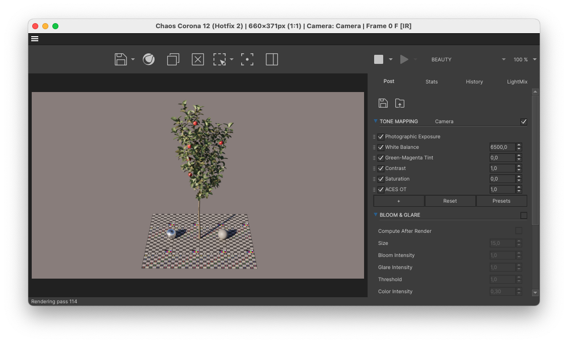
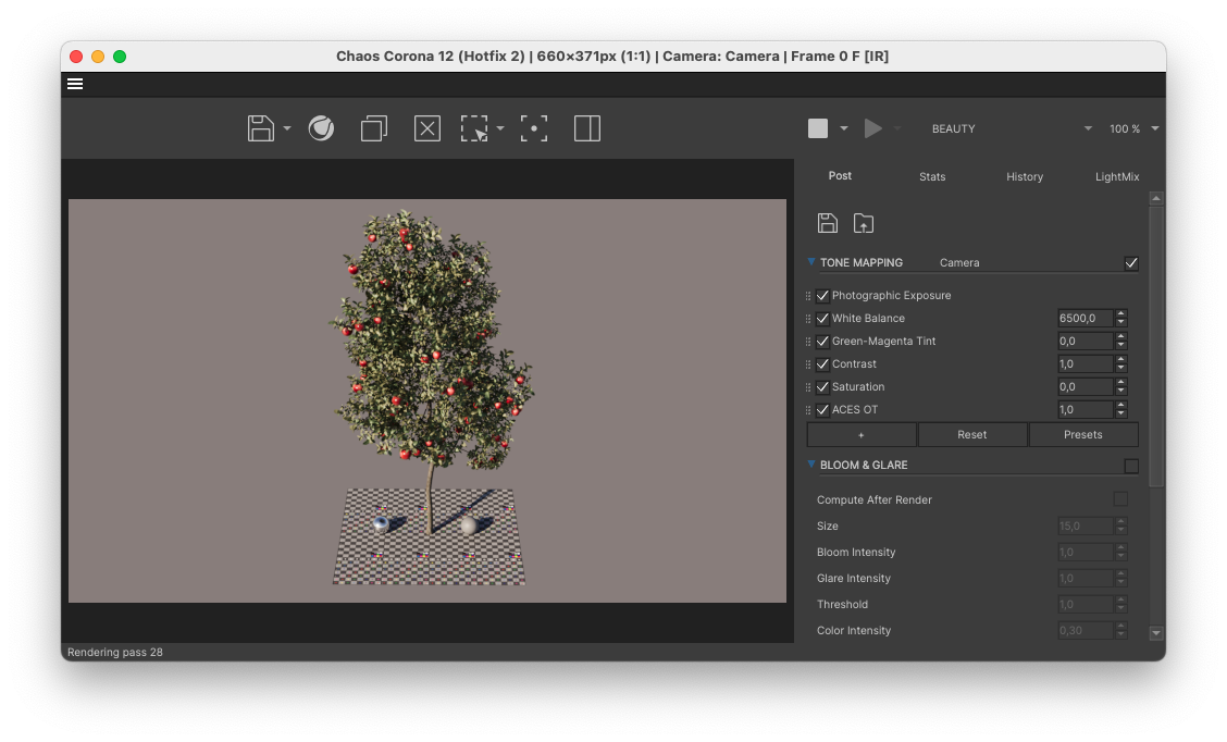
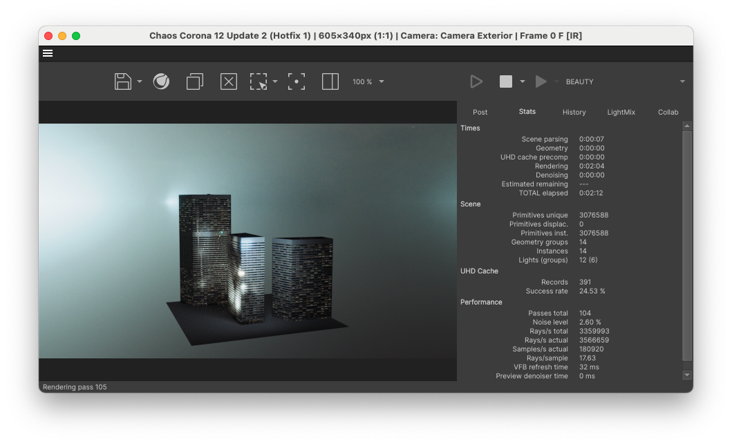
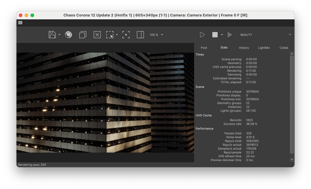
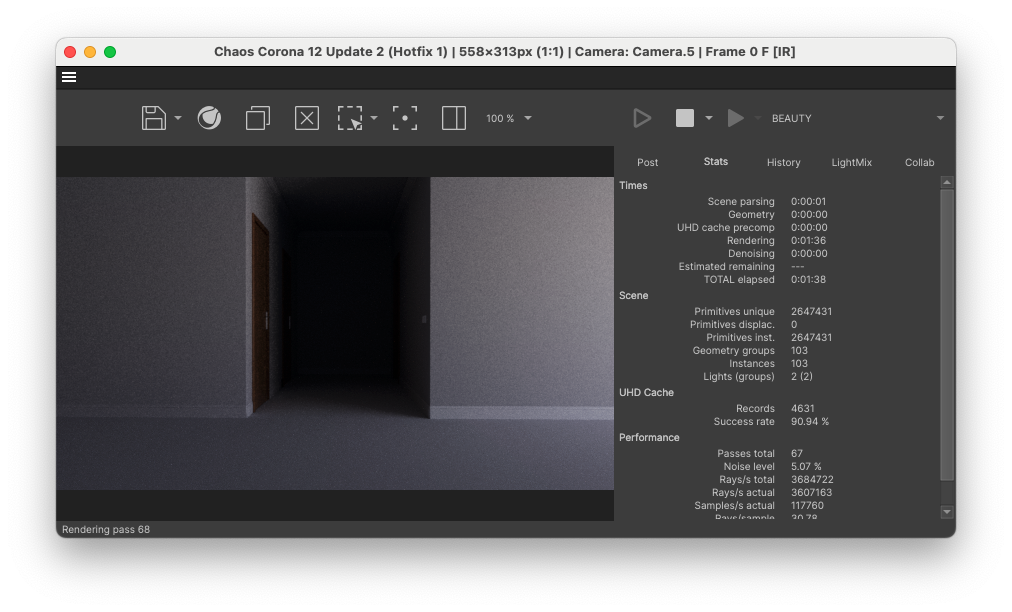
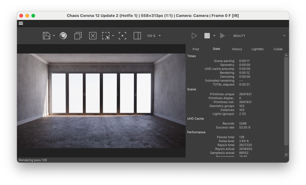
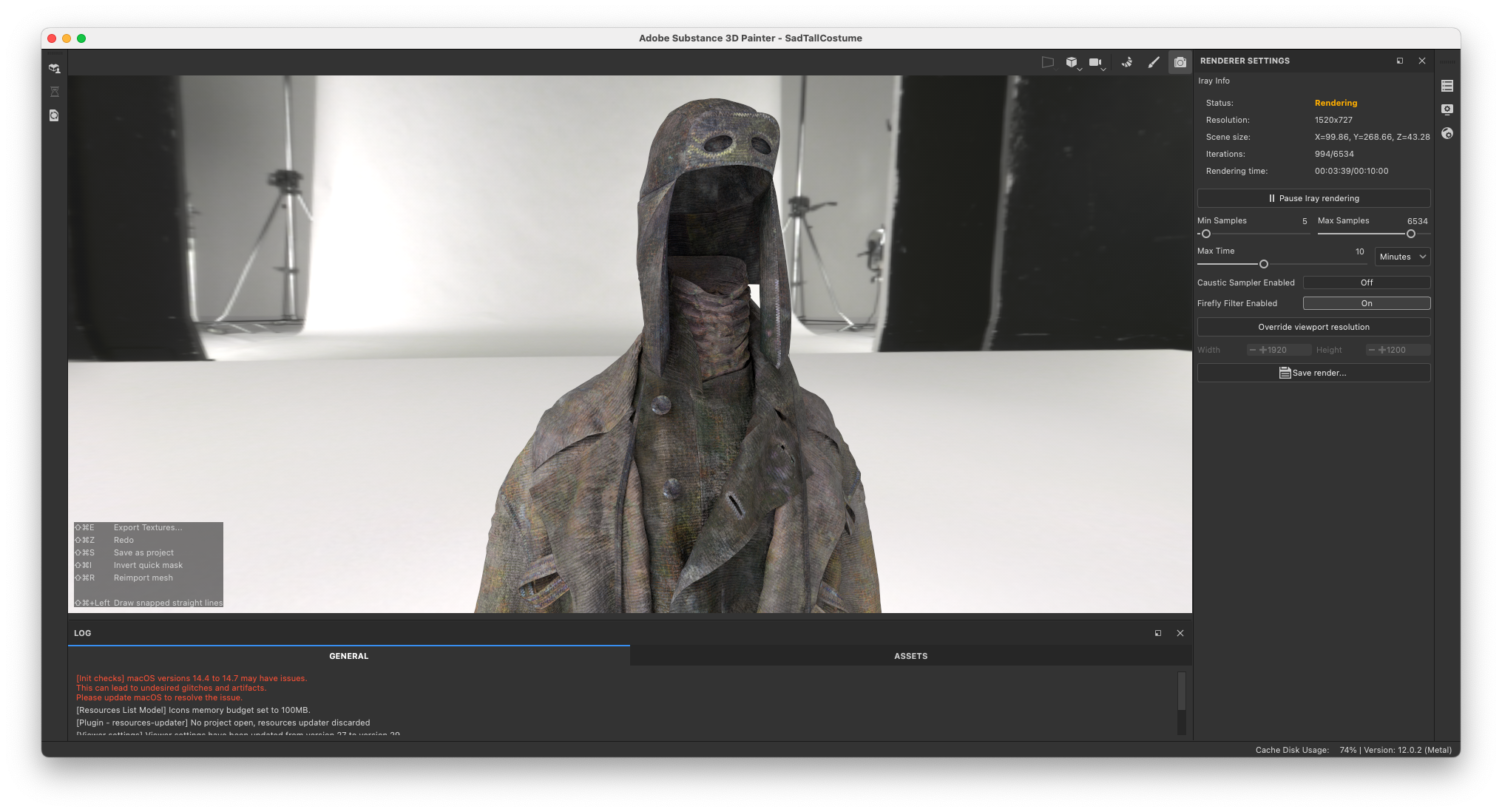
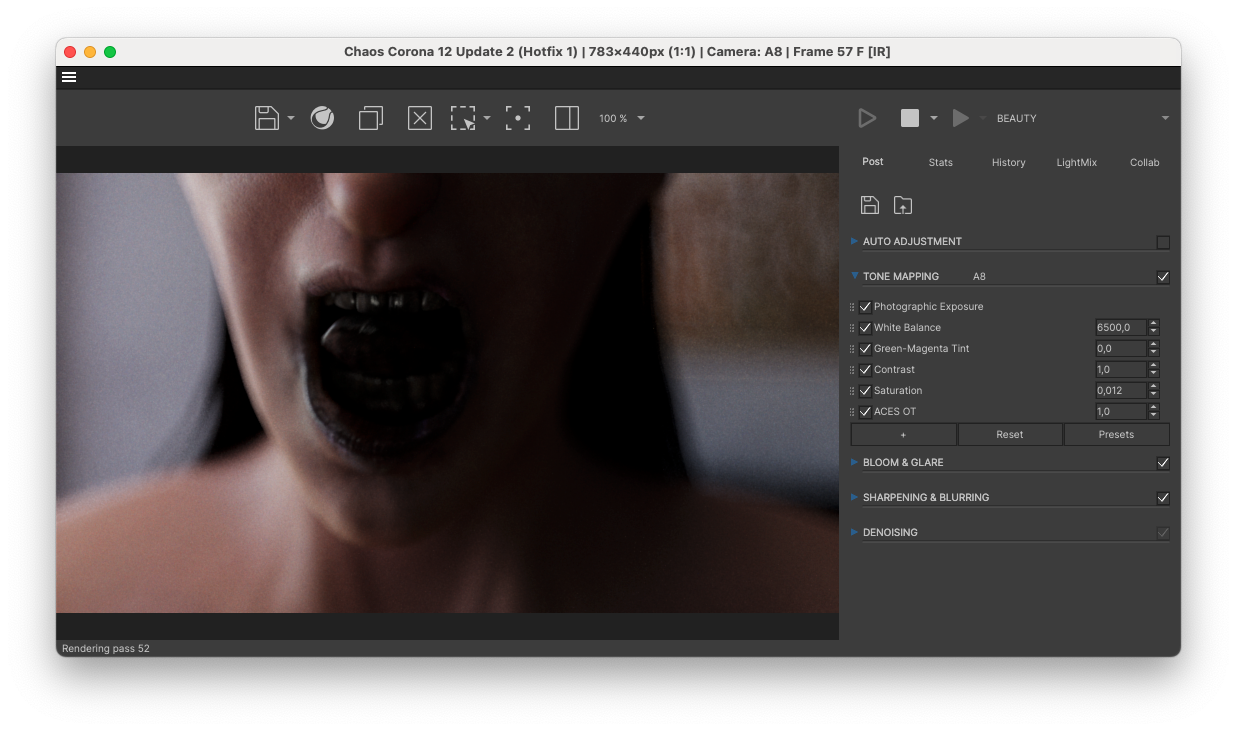
Rendering with RebusFarm
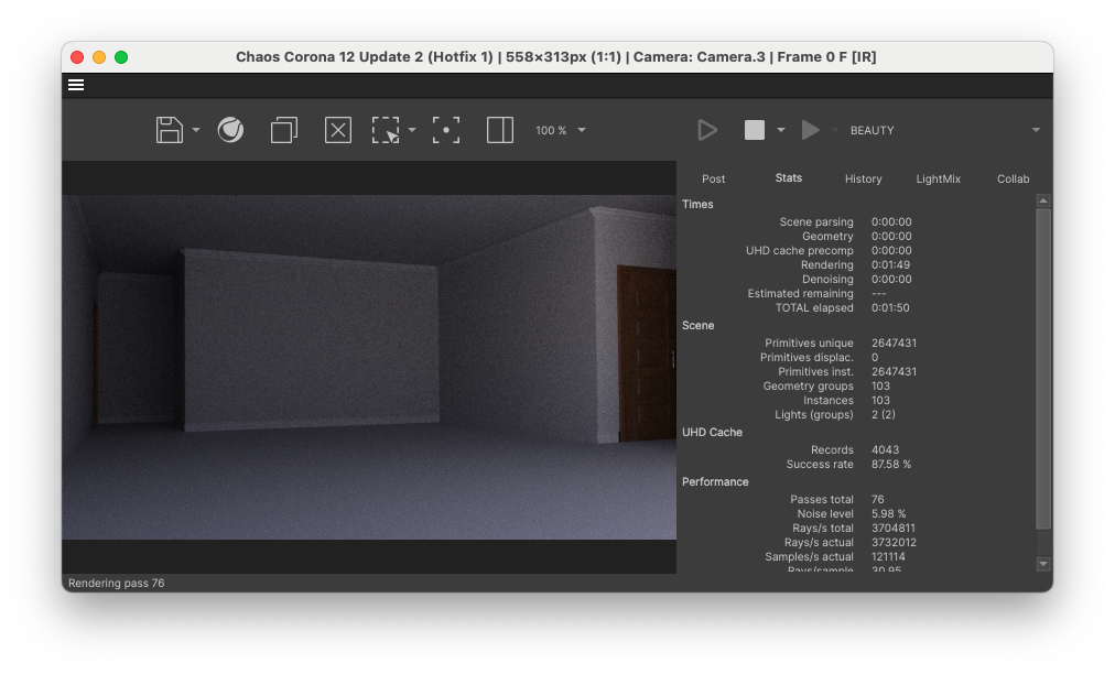
With all the shots animated, lit and ready for rendering it was time to send them to RebusFarm. The entirety of Apple Rot was made on limited hardware. One Mac Mini M2 (2023) and one MSI laptop with an i7 from (2021). During the production we were truly reaching the limits of what our hardware could handle. We were always aware that there would be no way we would be able to render the film on our own hardware. So the partnership with RebusFarm was not only a lifesaver, it also allowed us to truly reach the limits of what our hardware could do as we knew that rendering would be taken care of.
This also fundamentally changed how we approached production.
Knowing that rendering was not a limiting factor allowed us to make creative decisions without constantly optimizing for the hardware we personally own. Instead of simplifying scenes to fit our machines, we could build towards the final image from the start.
As shots were being completed and approved by everyone involved, they would be sent off to RebusFarm. We didn’t run into any rendering issues. It’s always such an amazing feeling to start seeing final shots arriving on your harddrive. There is only so much planning and preparation you can do when making 3D animated films. When you see the shots actually living up to the vision you had, you have proof that the thesis is correct.
The grungy bokeh was showing up exactly how we wanted it. The focus pulls were truly giving a dreamy feeling. The moving lights were creating a wonderful cinematic atmosphere that gave life to the scenes even when the camera was not moving.
The only challenge we ran into momentarily was that the Chaos Corona hair splines were not being transferred to the farm correctly at first. Then the customer support team of RebusFarm provided us with an updated script for their file-uploader RebusDrop. This solved the issue and we could continue as if nothing happened.
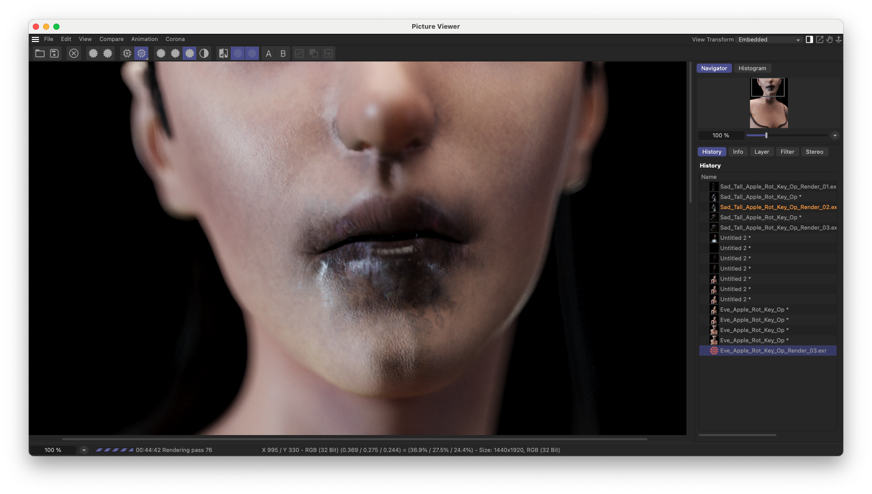
Now we had the entire film as 32-bit .exr image sequences. Now it was time for compositing.
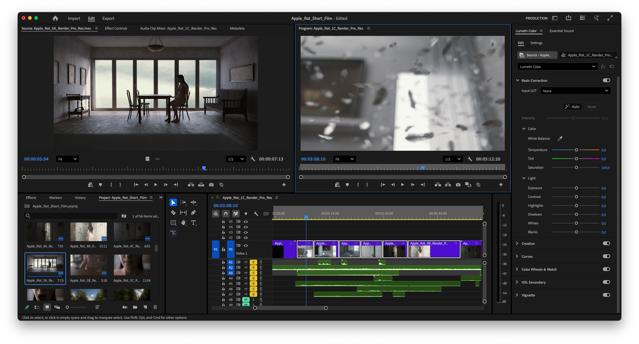
Compositing and Editing a 3D Animated Horror Film
By this point we had already edited the film using viewport renders. This served two purposes:
- It confirmed that the story was working
- It reduced unnecessary render output
On a practical note:
I recommend always rendering with 5–10 frames of handles on either side of each clip.
It gives you flexibility in the edit. Whether that’s adjusting pacing or giving performances a bit more breathing room.
Compositing Workflow
For compositing I imported every clip into After Effects. I’ve been using After Effects for over a decade now and it’s most definitely the compositing software I’m most familiar with. I start by taking one shot from every scene and building out a full compositing stack on each of those shots. Always thinking of modularity so that adjustments can be made easily on a shot by shot basis.
I create a stack of Adjustment Layers each controlling a specific aspect of the shot. From the bottom to top I use an Adjustment Layer for Shadows, Highlights, HSV, Saturation, Medium Density Curves, Bleach Bypass, Halation R, Halation G, Halation B and Blur. Each adjustment layer, except for Blur, is referencing a Track Matte which is a copy of the original clip with additional effects on top. For example, Shadows, Highlights and Saturation are all Luma Matted by the shot with different settings on the Exposure and Tint effect. This way you can create an extremely controlled stack of adjustments for each of your shots.
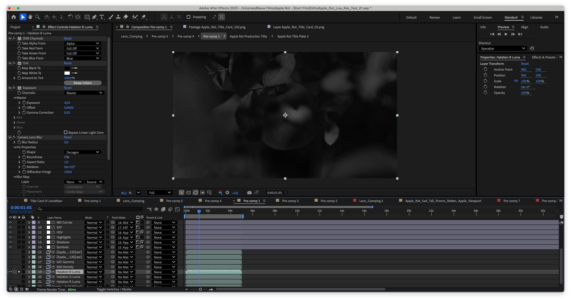
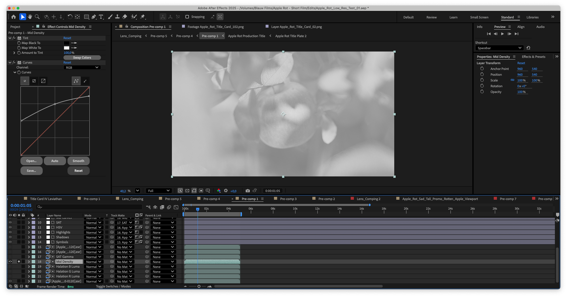
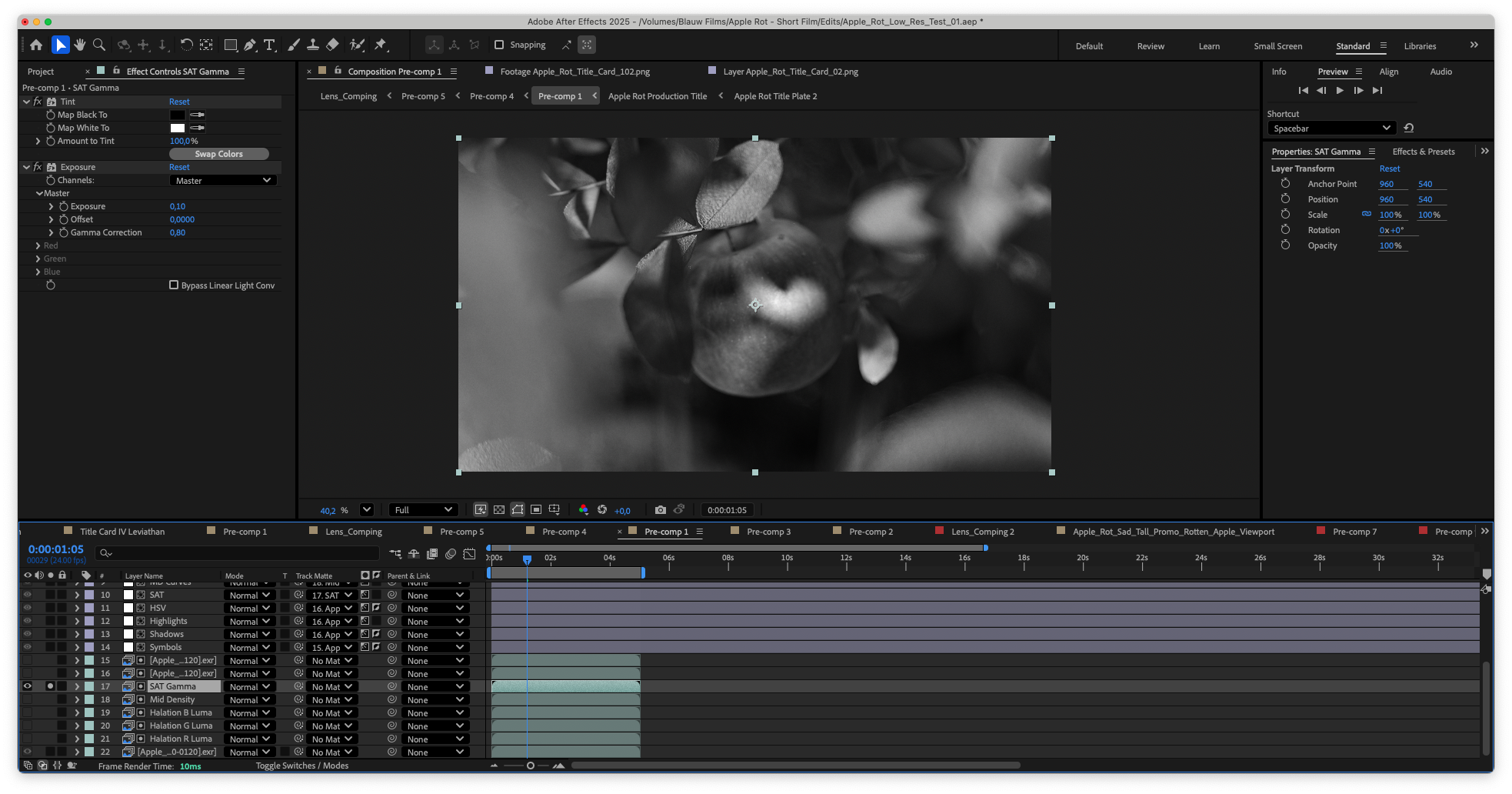
The greens and the blues in the shadows are slightly lifted. And the highlights are slightly warmed up with an orange-purple hue. I also slightly increased the Red and Green gamma equally, which gives a bit of an oker yellow pass on the footage. The Vibrance was increased in the highlights of the shots. Followed by decreasing the Vibrance and increasing the contrast in different areas of the shot using a different Luma matte.
Finally, I added halation to each channel of the footage specifically. A duplicate of the clip which was to be used as a Luma Matte is blurred slightly and filtered using a Shift Channel effect to isolate the R, G or B channel.
Then the Adjustment layer can control the color of those areas individually. On top of everything there is a super subtle blur that breaks up the sharpness of CG renders.
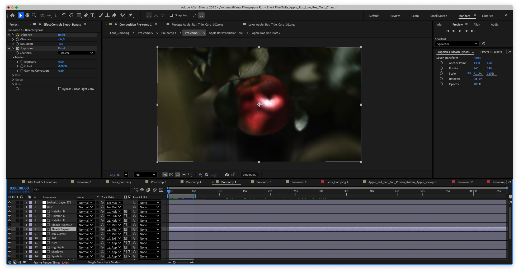
This modular stack was pre-composed, split into R, G and B layers with Optics Compensation and then set to Add. Now we have a slight chromatic aberration on the footage. A Vignette with darkening and blur was added on top of that. And finally, the aggressive digital noise overlays from our Digital Camera Noise Resource.
This level of control is important because the final look of the film is not created in a single step. It’s a process of destroying the footage in a layered way. Each adjustment slightly pushes the image away from a clean digital render and closer to something that feels captured, processed and imperfect. The specific combination of effects is what defines the look of Apple Rot.
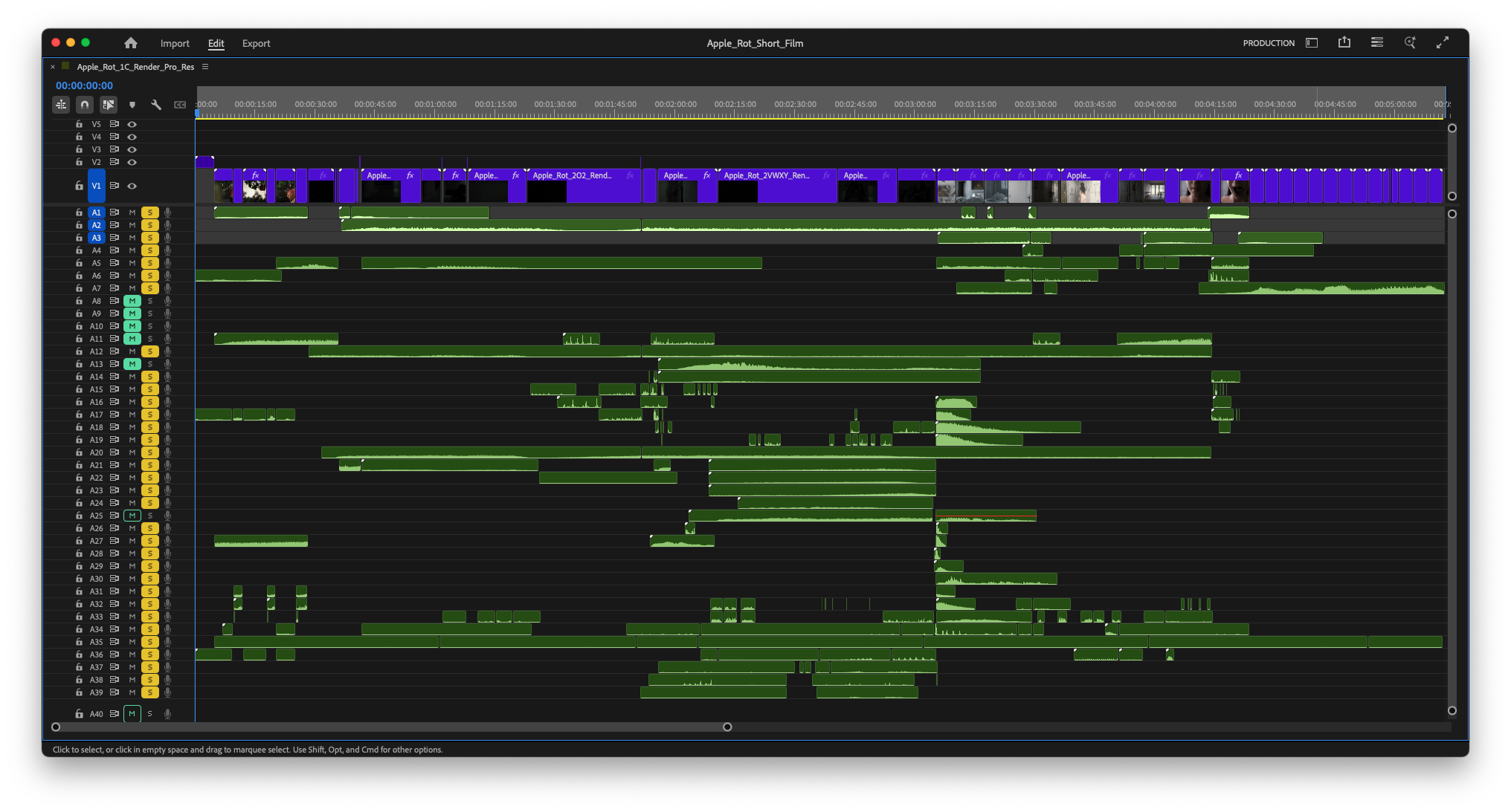
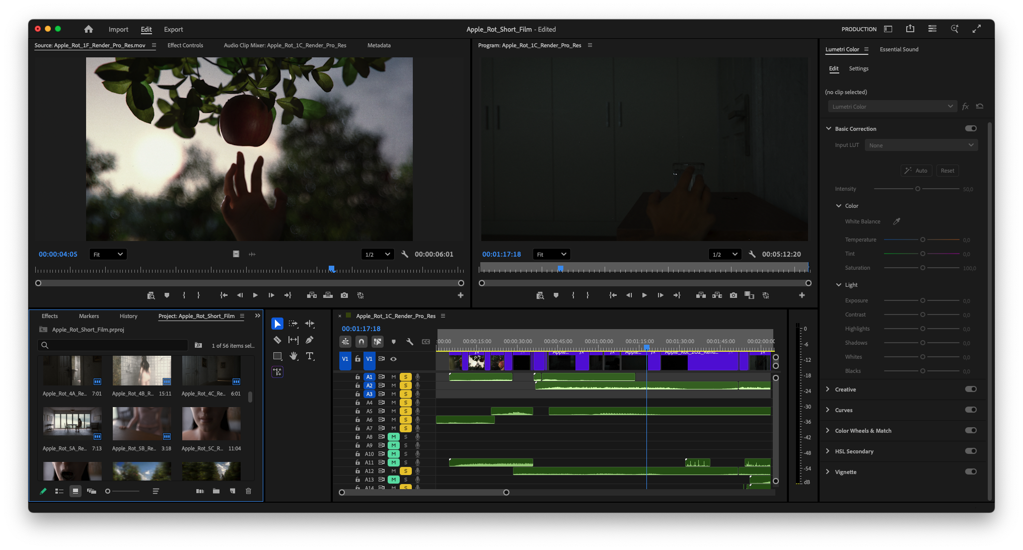
From here, each clip was added to the set-up, fine-tuned to match the rest, and exported in Pro-Res 4444 to be added to the Editing timeline in Premiere Pro.
For the editing we looked for three things: transcendentalism, awkward edits and tension. Now this might sound contradictory in places. However, this editing and narrative flow was already established way back in the screenplay and in the storyboards. It was just about finding that same pacing in the juxtaposition of shots on the timeline. To maintain a sense of transcendentalism I’ve found a powerful technique is to keep the lengths of shots relatively similar. It allows the viewer to get used to the pacing of the cutting.
With the viewer in a rhythm it’s possible to break that rhythm through the use of longer or shorter shots. By slightly extending shots, especially when building tension, the moment of the cut gets obscured. The opposite is also true. We for example cut certain moments right on the end of a line. This creates an extension of the emotion. The previous scene is cut short but the next shot is an empty pillow shot, thus giving the previous shot time to breathe.
Rhythm is what conditions the viewer. Once a pattern is established, even small deviations become noticeable. By controlling that rhythm, we can guide attention without relying on explicit narrative cues. The audience starts to feel when something is off, even if they can’t immediately explain why.
It’s a fine balance that is best experienced rather than described. For this reason we exported scenes a few times throughout the editing process just to watch it back and feel it.
Sound Design & Performances
We reached the final laps of completing Apple Rot. We were all so excited to see the film come together. A project that had been years in the making was now about to be completed.
For each of the characters we connected with wonderful voice-actors who truly went all out to embody their characters.
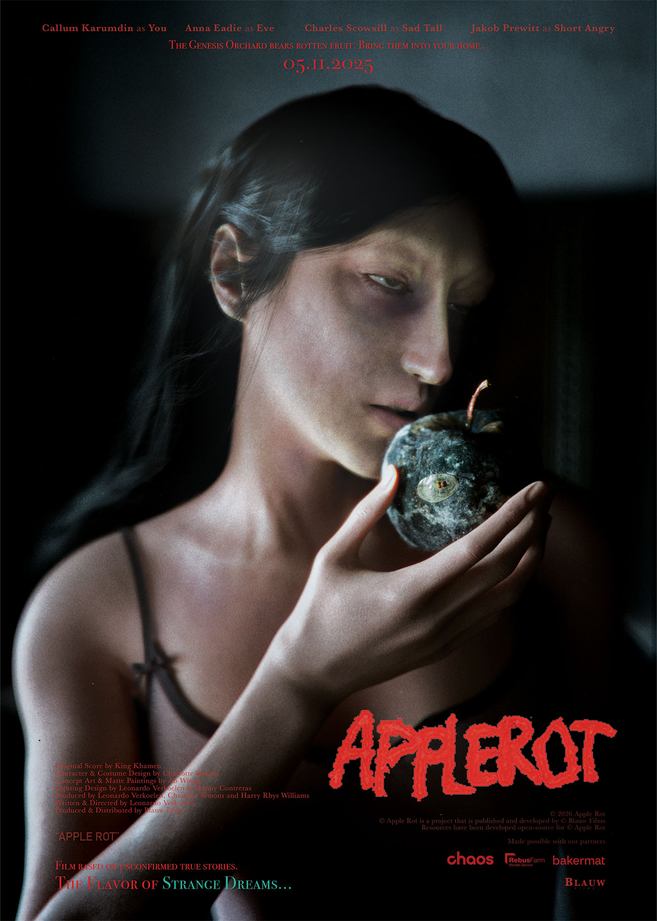
Starring
Callum Karumdin as You
Anna Eadie as Eve
Charles Scowsill as Sad Tall
Jakob Prewitt as Short Angry
For each character I wrote an in-depth director’s statement. This covers their struggles, personality type, and emotional range during each scene. Instead of locking the actors into a motivation they have for the scene, I preferred having them understand their character intrinsically and then get a feel for the range within which they should experiment.
We gave them each images of the characters and previews of the scenes they’d be recording. Then we let them cook.
In the meantime we started recording foley for the entirety of the film. Luckily our office has quite the creaky wooden floor. This was absolutely perfect for Apple Rot. We used a variety of shoes for the different characters. As well as a mix of heavy and soft fabrics to record all the character movements.
About a week later we had received all the different performances from the actors. And that was the absolute cherry on the cake. From each actor we received a wide exploration of the same line-reads. This was perfect to cut the exact pieces that we needed together into one cohesive performance.

By giving the actors space to explore, we ended up with variations that introduced subtle unpredictability, which gives you a much better chance of finding something interesting that fits the film.
Now suddenly all the characters truly come alive. They have personality. They have a soul.
Partner Contributions
Apple Rot was made possible through strategic collaborations with industry partners:
RebusFarm
Provided high-performance cloud rendering infrastructure. RebusFarm enabled us to render the film at full quality despite limited local hardware.
Chaos Group
Chaos Group supported the production through industry-standard rendering tools, allowing us to achieve the cinematic look and lighting fidelity required for the film.
These partnerships allowed us to push beyond technical limitations and focus entirely on creative execution.
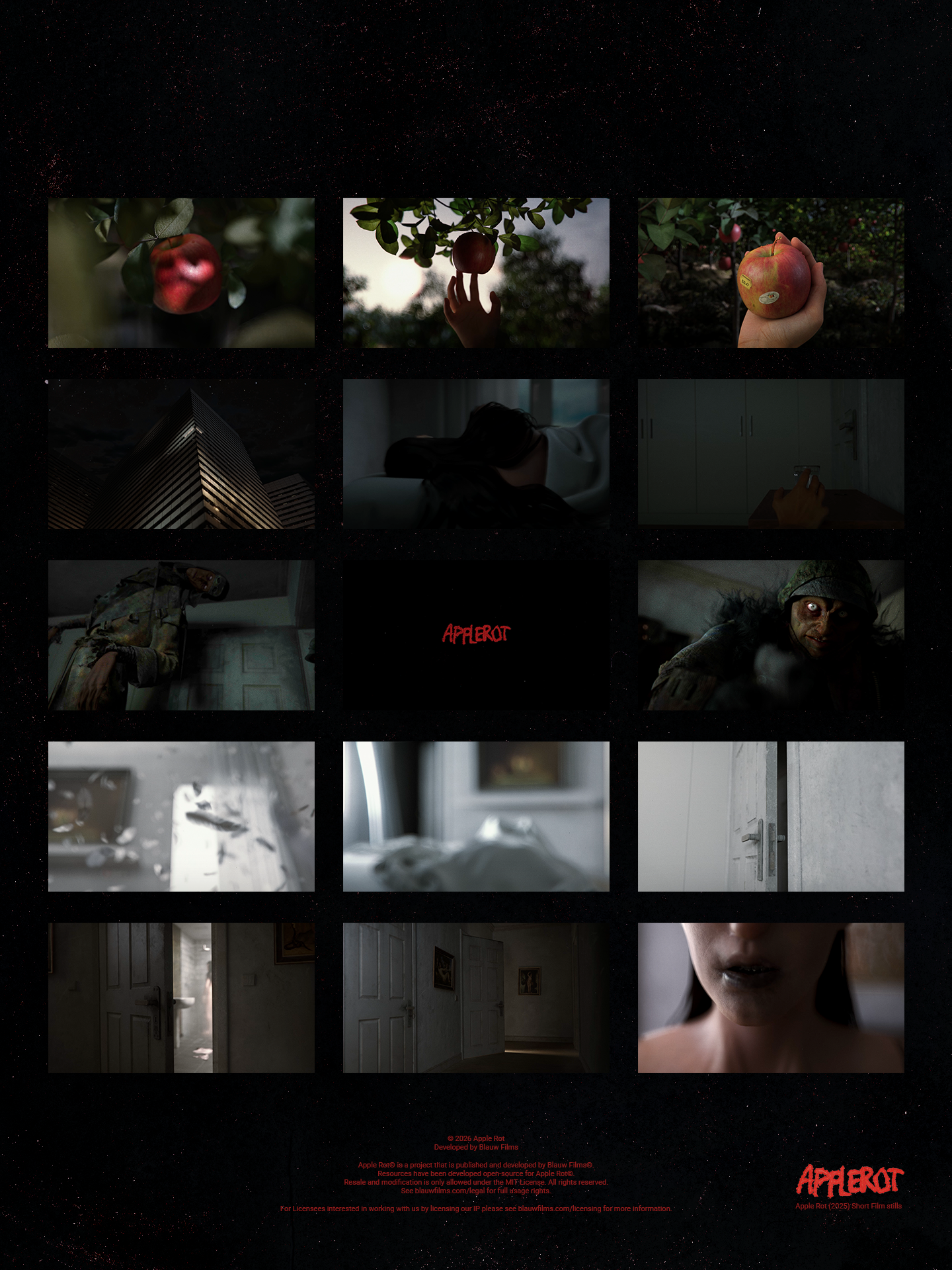
The Final Result
In the end, there it was. Apple Rot (2025), the first official 3D animated short film by Blauw Films. A dream multiple years in the making is now out and living its own life. For years to come we’re going to continue exploring the Apple Rot universe. And this short film will always represent the founding pillar of Apple Rot.
We’re incredibly happy with the reception of the film. As of this writing the film has been distributed on YouTube and as a Free Download to Own file. The next steps are physical screenings, high resolution streams on our Blauw Player and a limited run of Blu-Rays with lots of Bonus Content.
Explore the Apple Rot Universe
Apple Rot is an evolving universe. This film is only the beginning.
Challenges & Constraints
- Limited hardware (Mac Mini + MSI Laptop)
- Complex character clothing simulations
- Managing render limitations
- Balancing realism with stylization
- Maintaining narrative clarity in a non-linear structure
These constraints shaped many of the creative and technical decisions throughout production.
Software Used
The digital production of Apple Rot was made possible by using a lean but complete tech-stack.
3D Software: Maxon Cinema 4D
Render Engine: Chaos Corona
Render Farm: RebusFarm
Sculpting: Maxon ZBrush
Cloth Modelling and Simulation: Style3D
Modelling, Rigging, Animation: Blender
Asset Production: Adobe Photoshop
Texturing: Adobe Substance 3D Painter
Compositing: Adobe After Effects
Editing: Adobe Premiere Pro
We believe that this tech-stack is incredibly versatile and can get you to make incredible independent productions at any level of execution. Especially for Apple Rot this was absolutely perfect. It allowed us to create the film we dreamt of making without overcomplicating the pipeline. Each software was chosen for its task not only for its ability to achieve high quality results in that field, but also due to the familiarity we have to the tools and how to achieve unique results with personality in each of them. The most important part of choosing your tech-stack is that the tools should directly align with your artistic abilities. The tools should not be stopping you from expressing the art you want to express. And these tools achieve that for us.
Conclusion
Technological innovation and artistic innovation do not oppose one another. Especially in 3D animation, they are inseparable. Artistic intent is the driving force. Technology is what allows that intent to take shape.
Independent filmmaking is no longer limited by access to massive infrastructure.
A small team with conviction can now build worlds that once required entire studios. The tools are here. The pipelines are here. The audience is here. What matters now is taste, identity and the willingness to stay obsessed long enough to finish the vision.
That’s the shift happening underneath the surface of the industry.
We believe the world is ready for a new wave of original IPs. A new generation of filmmakers, animators and digital artists are building sustainable ecosystems around their work, combining storytelling, technology, community and direct distribution in ways that were far less accessible only a few years ago.
We expect a renaissance.
Apple Rot was born from a nightmare. And it proved something to us that we felt was true but needed to confirm. It solidified production methodologies, strengthened creative partnerships and proved that a lean independent pipeline can support deeply atmospheric and technically ambitious storytelling.
Some ideas haunt you until you build them.
Apple Rot was one of those ideas.
That’s why it feels alive to us.
Now it’s time to let Apple Rot live out in the open.


0 Comments