Bringing Sad Tall and Short Angry to Life
A Character Design Collaboration
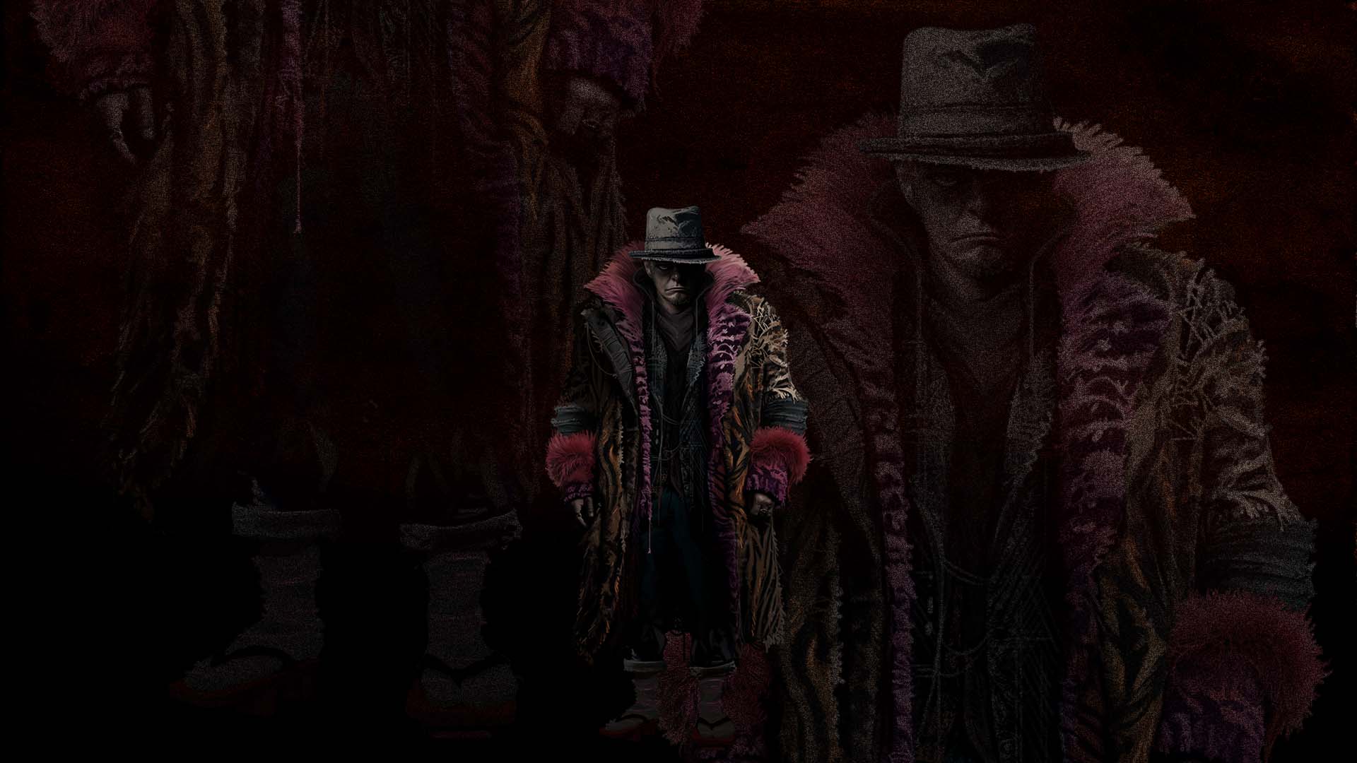
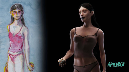
Apple Rot


I had the pleasure of working with Leo and Charlotte on a project that instantly sparked my curiosity. We first met at an event called THU in Portugal, where they pitched a concept titled Apple Rot, a horror short film idea that grabbed me right away. Charlotte showed me some early sketches, exploring shape language and color palettes. Even then, I could feel the potential.


A bit later, Leo and Charlotte shared more detailed development around two unsettling humanoid characters named “Sad Tall” and “Short Angry”. The tone, the design choices, the mood, it all felt very much in my creative wheelhouse. We started chatting more seriously, and that’s where the collaboration really kicked off.
Our first proper meeting was all about the characters, who they were, how they moved, and what they wore. We dug into posture, behavior, textures, and clothing choices. These details became the foundation of how these two strange figures came to life.

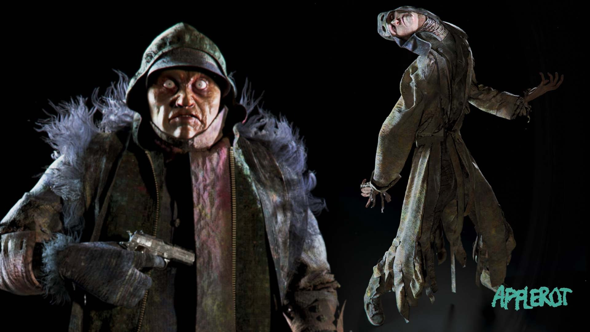
Designing Sad Tall
I started with Sad Tall. I was already a fan of Charlotte’s original design, so I didn’t want to change too much, I just wanted to build on it. Funny enough, I ended up using myself as a reference. Not because I’m especially creepy (at least I hope not), but because I wanted to understand how a very tall person might carry themselves when burdened by emotion or physical weight.
Charlotte had already layered the character in heavy clothing, which made him feel bulky and grounded. I leaned into that, emphasizing the feeling of exhaustion, arms that look too heavy to lift, clothes that seem to pull him downward. Everything about him needed to feel slow, sad, and heavy. Still, if I saw him standing at the end of a dark alley, I’d probably turn around.


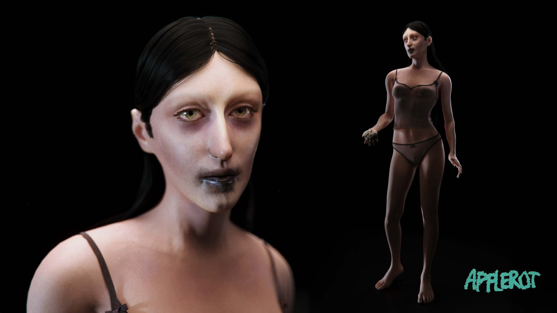
Designing Short Angry
Short Angry was a slower process for me. Maybe it’s because I couldn’t reference myself the same way. I struggled a bit with making him small and bulky without slipping into comedy. In the end, I made him slightly taller than Charlotte’s original sketch, which helped balance the proportions and gave him a more menacing presence.

Embracing the Chaos
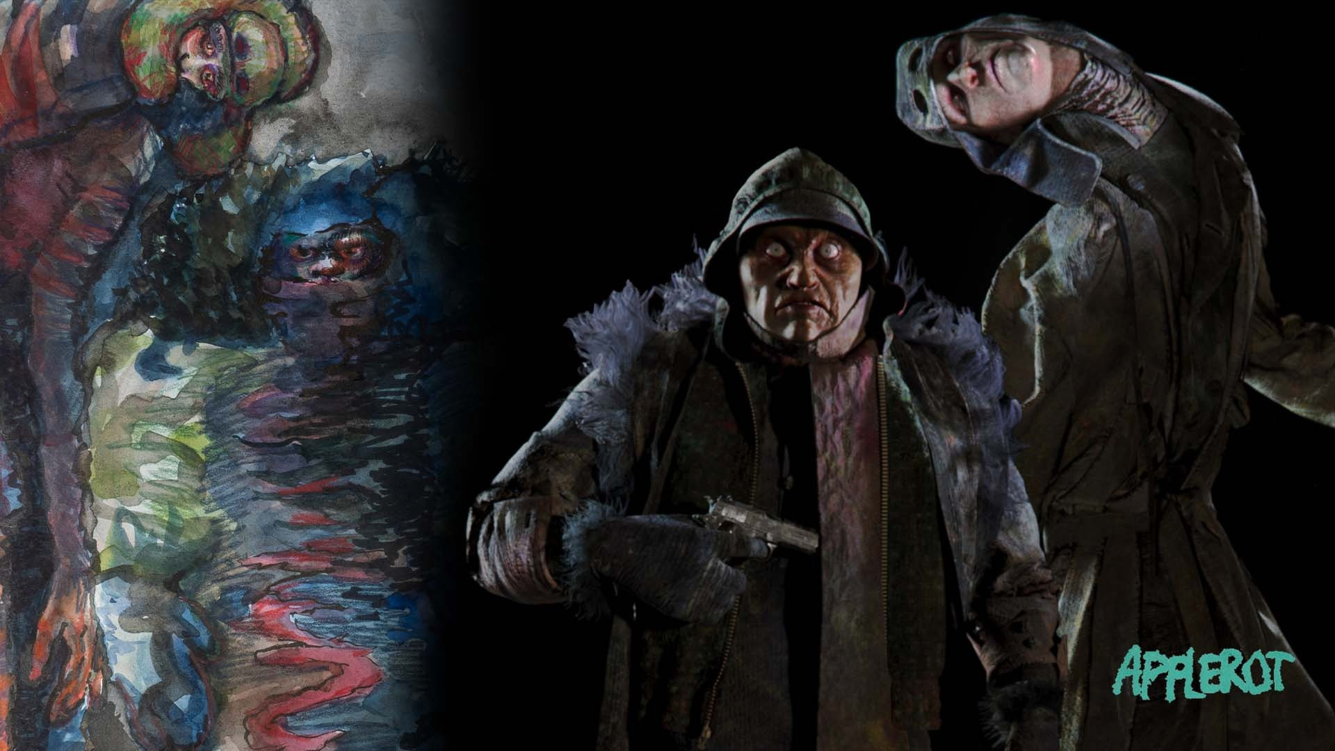
Both characters were heavily photo-bashed, layering bits and pieces of mismatched clothing to reflect the chaotic energy in the designs. One of the strengths in these designs is that sense of disordered realism, nothing fits quite right, but that’s what makes it work. I really wanted to lean into that, experimenting with textures and shapes to maintain the original spirit of the designs.
My process is usually pretty chaotic, I tend to start with something loose and iterate until it feels right. It’s not always the most efficient method, but for these two characters, it was perfect. That chaos stayed in the final designs, giving them a strange, off-kilter feeling that makes them seem like they’re not entirely from this world.


Reading List
References


%20by%20Ivan%20Aivazovsky.jpg)


0 Comments